Below is a table of 100 “Microsoft Fabric and Power BI” terms and definitions, sorted alphabetically (except for the first two entries). You can use it as a reference to get a quick idea of what something is or means, and also as a way to identify topics to research.
#
Term
Definition & Example
1
Microsoft Fabric
Unified analytics platform combining data engineering, warehousing, science, and BI. Example: Building pipelines and dashboards in one workspace.
2
Power BI
Microsoft’s business intelligence visualization tool. Example: Sales dashboards.
Below are the free Exam Prep Hubs currently available on The Data Community. Bookmark the hubs you are interested in and use them to ensure you are fully prepared for the respective exam.
Each hub contains:
The topic-by-topic (from the official study guide) coverage of the material, making it easy for you to ensure you are covering all aspects of the exam material.
Practice exam questions for each section.
Bonus material to help you prepare
Two (2) Practice Exams with 60 questions each, along with answer keys.
Links to useful resources, such as Microsoft Learn content, YouTube video series, and more.
Power BI provides multiple ways to explore data interactively. Two of the most commonly confused features are drilldown and drill-through. While both allow users to move from high-level insights to more detailed data, they serve different purposes and behave differently.
This article explains what drilldown and drill-through are, when to use each, how to configure them, and how they compare.
What Is Drilldown in Power BI?
Drilldown allows users to navigate within the same visual to explore data at progressively lower levels of detail using a predefined hierarchy.
Key Characteristics
Happens inside a single visual
Uses hierarchies (date, geography, product, etc.)
Does not navigate to another page
Best for progressive exploration
Example
A column chart showing:
Year → Quarter → Month → Day A user clicks on 2024 to drill down into quarters, then into months.
Use drilldown for simple, hierarchical exploration
Use drill-through for rich, detailed analysis
Clearly label drill-through pages
Add Back buttons for usability
Avoid overloading a single visual with too many drill levels
Common Mistakes
Using drilldown when a detail page is needed
Forgetting to configure drill-through filters
Hiding drill-through functionality from users
Mixing drilldown and drill-through without clear design intent
Summary
Drilldown = explore deeper within the same visual
Drill-through = navigate to a dedicated detail page
Drilldown is best for hierarchies and trends
Drill-through is best for focused, detailed analysis
Understanding when and how to use each feature is essential for building intuitive, powerful Power BI reports—and it’s a common topic tested in Power BI certification exams.
Thanks for reading and good luck on your data journey!
Below are some commonly asked questions about the PL-300: Microsoft Power BI Data Analyst certification exam. Upon successfully passing this exam, you earn the Microsoft Certified: Power BI Data Analyst Associate certification.
What is the PL-300 certification exam?
The PL-300: Microsoft Power BI Data Analyst exam validates your ability to prepare, model, visualize, analyze, and secure data using Microsoft Power BI.
Candidates who pass the exam demonstrate proficiency in:
Connecting to and transforming data from multiple sources
Designing and building efficient data models
Creating compelling and insightful reports and dashboards
Applying DAX calculations and measures
Implementing security, governance, and deployment best practices in Power BI
This certification is designed for professionals who work with data and use Power BI to deliver business insights. Upon successfully passing this exam, candidates earn the Microsoft Certified: Power BI Data Analyst Associate certification.
Is the PL-300 certification exam worth it?
The short answer is yes.
Preparing for the PL-300 exam provides significant value, even beyond the certification itself. The study process exposes you to Power BI features, patterns, and best practices that you may not encounter in day-to-day work. This often results in:
Stronger data modeling and DAX skills
Better-performing and more maintainable Power BI solutions
Increased confidence when designing analytics solutions
Greater credibility with stakeholders, employers, and clients
For many professionals, the exam also serves as a structured learning path that fills in knowledge gaps and reinforces real-world experience.
How many questions are on the PL-300 exam?
The PL-300 exam typically contains between 40 and 60 questions.
The questions may appear in several formats, including:
Single-choice and multiple-choice questions
Multi-select questions
Drag-and-drop or matching questions
Case studies with multiple questions
The exact number and format can vary slightly from exam to exam.
How hard is the PL-300 exam?
The PL-300 exam is considered moderately to highly challenging, especially for candidates without hands-on Power BI experience.
The difficulty comes from:
The breadth of topics covered
Scenario-based questions that test applied knowledge
Time pressure during the exam
However, the challenge is also what gives the certification its value. With proper preparation and practice, the exam is very achievable.
As of January 1, 2026, the standard exam pricing is:
United States: $165 USD
Australia: $140 USD
Canada: $140 USD
India: $4,865 INR
China: $83 USD
United Kingdom: £106 GBP
Other countries: Pricing varies based on country and region
Microsoft occasionally offers discounts, student pricing, or exam vouchers, so it is worth checking the official Microsoft certification site before scheduling your exam.
How do I prepare for the Microsoft PL-300 certification exam?
The most important advice is do not rush to sit the exam. Take time to cover all topic areas thoroughly before taking the exam.
Practice building Power BI reports end-to-end using real or sample data.
Strengthen weak areas such as DAX, data modeling, or security.
Take practice exams to validate your readiness. Microsoft Learn’s PL-300 practice exam is available here; and there are 2 practice exams available on The Data Community’s PL-300 Exam Prep Hub.
Scenario-based questions that test understanding rather than memorization
Legitimate practice materials help you build real skills that are valuable beyond the exam itself.
How long should I study for the PL-300 exam?
Study time varies depending on your background and experience.
General guidelines:
Experienced Power BI users: 4–6 weeks of focused preparation
Moderate experience: 6–8 weeks of focused preparation
Beginners or limited experience: 8–12 weeks or more of focused preparation
Rather than focusing on time alone, because it will vary broadly based on several factors, aim to fully understand all exam topics and perform well on practice exams before scheduling the test.
Where can I find training or a course for the PL-300 exam?
Training options include:
Microsoft Learn: Free, official learning path
Online learning platforms: Udemy, Coursera, and similar providers
YouTube: Free playlists and walkthroughs covering PL-300 topics
Subscription platforms: Datacamp and others offering Power BI courses
Microsoft partners: Instructor-led and enterprise-focused training
A combination of structured learning and hands-on practice tends to work best.
What skills should I have before taking the PL-300 exam?
Before attempting the exam, you should be comfortable with:
Basic data concepts (tables, relationships, measures)
Power BI Desktop and Power BI Service
Power Query for data transformation
DAX fundamentals
Basic understanding of data modeling and analytics concepts
You do not need to be an expert in all areas, but hands-on familiarity is important.
What score do I need to pass the PL-300 exam?
Microsoft exams are scored on a scale of 1–1000, and a score of 700 or higher is required to pass.
The score is scaled, meaning it is based on question difficulty rather than a simple percentage of correct answers.
How long is the PL-300 exam?
You are given approximately 120 minutes to complete the exam, including time to review instructions and case studies.
Time management is very important, especially for scenario-based questions.
How long is the PL-300 certification valid?
The Microsoft Certified: Power BI Data Analyst Associate certification is valid for one year.
To maintain your certification, you must complete a free online renewal assessment before the expiration date.
Is PL-300 suitable for beginners?
PL-300 is beginner-friendly in structure but assumes some hands-on experience.
Beginners can absolutely pass the exam, but they should expect to spend additional time practicing with Power BI and learning foundational concepts.
What roles benefit most from the PL-300 certification?
The PL-300 certification is especially valuable for:
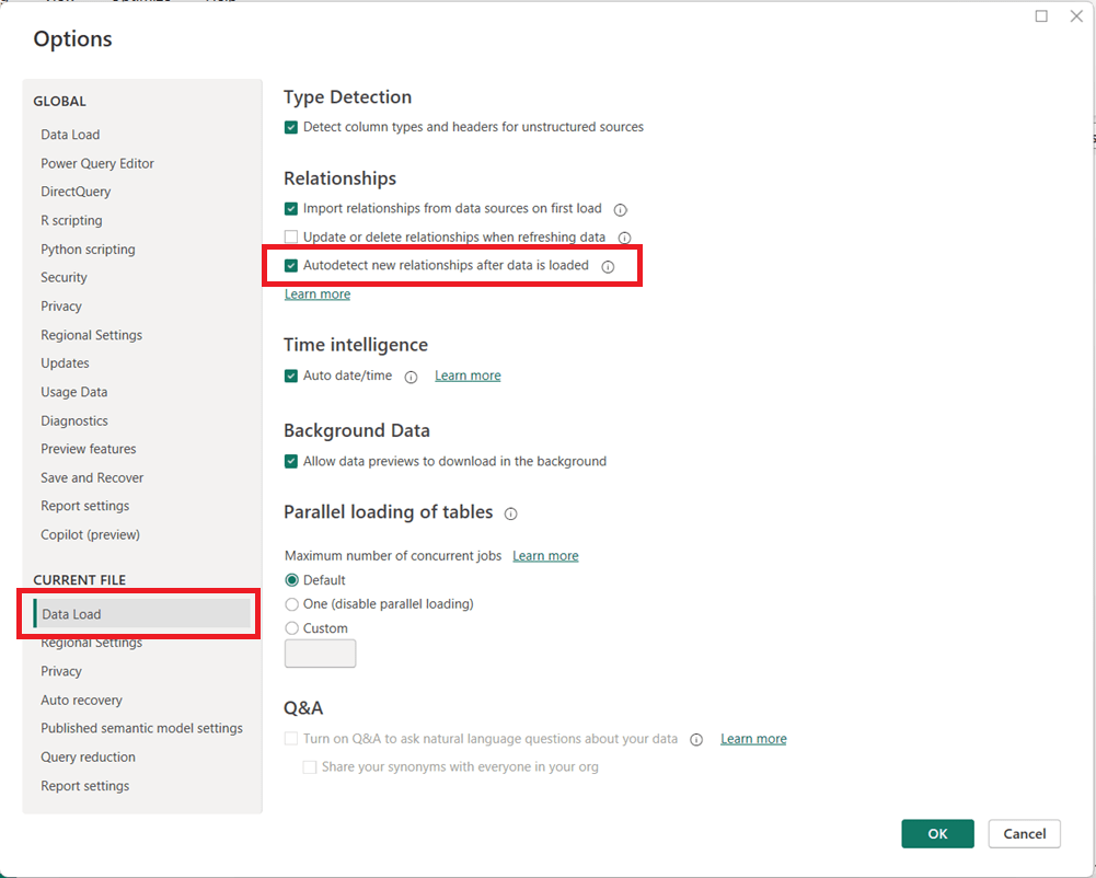
Power BI includes a feature called Autodetect new relationships that automatically creates relationships between tables when new data is loaded into a model. While convenient for simple datasets, this setting can cause unexpected behavior in more advanced data models.
How to Turn Off Autodetect New Relationships
You can disable this feature directly from Power BI Desktop:
Open Power BI Desktop
Go to File → Options and settings → Options
In the left pane, under CURRENT FILE, select Data Load
Then in the page’s main area, under the Relationships section, uncheck:
Autodetect new relationships after data is loaded
Click OK
Note that you may need to refresh your model for the change to fully take effect on newly loaded data.
Why You May Want to Disable This Feature
Turning off automatic relationship detection is considered a best practice for many professional Power BI models, especially as complexity increases.
Key reasons to disable it include:
Prevent unintended relationships This is the main reason. Power BI may create relationships you did not intend, based solely on matching column names or data types. Automatically generated relationships can introduce ambiguity and inactive relationships, leading to incorrect DAX results or performance issues.
Maintain full control of the data model, especially when the model needs to be carefully designed because of complexity or other reasons Manually creating relationships ensures they follow your star schema design and business logic. Complex models with role-playing dimensions, bridge tables, or composite models benefit from intentional, not automatic, relationships.
Improve model reliability and maintainability Explicit relationships make your model easier to understand, document, and troubleshoot.
When Autodetect Can Still Be Useful
Autodetect is a useful feature in some cases. For quick prototypes, small datasets, or ad-hoc analysis, automatic relationship detection can save time. However, once a model moves toward production or supports business-critical reporting, manual control is strongly recommended.
Welcome to the one-stop hub with information for preparing for the PL-300: Microsoft Power BI Data Analyst certification exam. Upon successful completion of the exam, you earn the Microsoft Certified: Power BI Data Analyst Associate certification.
This hub provides information directly here (topic-by-topic), links to a number of external resources, tips for preparing for the exam, practice tests, and section questions to help you prepare. Bookmark this page and use it as a guide to ensure that you are fully covering all relevant topics for the PL-300 exam and making use of as many of the resources available as possible.
Skills tested at a glance (as specified in the official study guide)
Prepare the data (25–30%)
Model the data (25–30%)
Visualize and analyze the data (25–30%)
Manage and secure Power BI (15–20%)
Click on each hyperlinked topic below to go to the preparation content and practice questions for that topic. And there are also 2 practice exams provided below.
Link to the free, comprehensive, self-paced course on Microsoft Learn – Design and manage analytics solutions using Power BI It contains 5 Learning Paths, each with multiple Modules, and each module has multiple Units. It will take some time to do it, but we recommend that you complete this entire course, including the exercises/labs.
Schedule time to learn, study, perform labs, and do practice exams and questions
Schedule the exam based on when you think you will be ready; scheduling the exam gives you a target and drives you to keep working on it; but keep in mind that it can be rescheduled based on the rules of the provider.
Use the various resources above and below to learn
Take the free Microsoft Learn practice test, any other available practice tests, and do the practice questions in each section and the two practice tests available on this hub.
Good luck to you passing the PL-300: Microsoft Power BI Data Analyst certification exam and earning the Microsoft Certified: Power BI Data Analyst Associate certification!
PL-300: Microsoft Power BI Data Analyst practice exam
Total Questions: 60 Time Recommendation: 120 minutes
Note: We have sectioned the questions to help you prepare, but the real exam will have questions from the sections appearing randomly.
The answers are at the end, and we recommend only looking at the answers after you have attempted the questions.
Exam Structure & Weighting (60 Questions)
Domain
%
Questions
Prepare the data
~27%
16
Model the data
~27%
16
Visualize and analyze the data
~27%
16
Manage and secure Power BI
~19%
12
Total
100%
60
SECTION 1: Prepare the Data (Questions 1–16)
1. (Single choice) You connect to a CSV file containing sales data. The file is updated daily with additional rows. What should you do to ensure Power BI always imports only new records?
A. Use Import mode B. Enable Incremental Refresh C. Use DirectQuery D. Create a calculated table
2. (Scenario – Multi-select) You are cleaning customer data in Power Query. You need to:
Remove rows where CustomerID is null
Replace empty strings in Country with “Unknown”
Which two steps should you use? (Select two)
A. Filter rows B. Replace values C. Conditional column D. Remove errors
3. (Fill in the blank) The Power Query feature used to profile data by showing column distribution, quality, and profile is called __________.
4. (Single choice) You want to reduce model size by removing unused columns before loading data. Where should this be done?
A. In DAX B. In Power BI Service C. In Power Query Editor D. In the Data view
5. (Scenario – Single choice) A dataset contains numeric values stored as text. What is the best approach to fix this?
A. Convert data type in the report view B. Create a calculated column C. Change data type in Power Query D. Use FORMAT() in DAX
6. (Multi-select) Which transformations are considered query folding–friendly? (Select two)
A. Filtering rows B. Adding an Index column C. Merging queries D. Custom M function logic
7. (Single choice) What does query folding primarily help with?
A. Improving report aesthetics B. Reducing dataset size C. Pushing transformations to the source system D. Enabling DirectQuery
8. (Scenario – Single choice) You want to append monthly Excel files from a folder automatically. What connector should you use?
A. Excel Workbook B. SharePoint Folder C. Folder D. Web
9. (Matching) Match the Power Query feature to its purpose:
Feature
Purpose
A. Merge Queries
1. Stack tables vertically
B. Append Queries
2. Combine tables horizontally
C. Group By
3. Aggregate rows
10. (Single choice) Which data source supports DirectQuery?
A. Excel B. CSV C. SQL Server D. JSON
11. (Scenario – Multi-select) You want to reduce refresh time. Which actions help? (Select two)
A. Remove unused columns B. Increase report page count C. Apply filters early D. Use calculated columns
12. (Single choice) What does enabling “Enable load” = Off do?
A. Deletes the query B. Prevents data refresh C. Prevents data from loading into the model D. Disables query folding
13. (Single choice) Which transformation breaks query folding most often?
A. Filtering B. Sorting C. Custom column with M code D. Renaming columns
14. (Fill in the blank) The language used by Power Query is called __________.
15. (Scenario – Single choice) You need to standardize country names across multiple sources. What is the best approach?
A. DAX LOOKUPVALUE B. Power Query Replace Values C. Calculated table D. Visual-level filter
16. (Single choice) What is the main benefit of disabling Auto Date/Time?
A. Faster report rendering B. Better compression and simpler models C. Enables time intelligence D. Required for DirectQuery
SECTION 2: Model the Data (Questions 17–32)
17. (Single choice) What is the recommended cardinality between a fact table and a dimension table?
A. Many-to-many B. One-to-one C. One-to-many D. Many-to-one
18. (Scenario – Single choice) You have Sales and Customers tables. Each sale belongs to one customer. How should the relationship be defined?
A. Many-to-many B. One-to-many from Customers to Sales C. One-to-one D. Inactive
19. (Multi-select) Which actions improve model performance? (Select two)
A. Reduce column cardinality B. Use bi-directional filters everywhere C. Star schema design D. Hide fact table columns
20. (Fill in the blank) A __________ table contains descriptive attributes used for slicing and filtering.
21. (Scenario – Single choice) When should you use a calculated column instead of a measure?
A. When performing aggregations B. When results must be stored per row C. When using slicers D. When reducing model size
22. (Single choice) Which DAX function safely handles divide-by-zero errors?
A. DIV B. IFERROR C. DIVIDE D. CALCULATE
23. (Scenario – Single choice) You need a dynamic calculation that responds to filters. What should you use?
A. Calculated column B. Calculated table C. Measure D. Static column
24. (Matching) Match the DAX concept to its description:
Concept
Description
A. Row context
1. Filters applied by visuals
B. Filter context
2. Iteration over rows
C. Context transition
3. Row → filter conversion
25. (Single choice) What does CALCULATE primarily do?
A. Creates relationships B. Changes filter context C. Adds rows to tables D. Improves compression
26. (Multi-select) Which are valid time intelligence functions? (Select two)
A. TOTALYTD B. SAMEPERIODLASTYEAR C. SUMX D. VALUES
27. (Scenario – Single choice) You need Year-over-Year growth. What prerequisite must be met?
A. Auto Date/Time enabled B. Continuous date column C. Marked Date table D. Calculated column
28. (Single choice) What does marking a table as a Date table do?
A. Improves visuals B. Enables time intelligence accuracy C. Reduces refresh time D. Enables RLS
29. (Multi-select) Which DAX functions are iterators? (Select two)
A. SUMX B. AVERAGEX C. SUM D. COUNT
30. (Scenario – Single choice) You need to model a many-to-many relationship. What is the recommended solution?
A. Bi-directional filters B. Bridge table C. Calculated column D. Duplicate keys
31. (Single choice) What is the main drawback of bi-directional relationships?
A. Slower refresh B. Increased ambiguity and performance cost C. Larger dataset size D. Disabled measures
32. (Fill in the blank) The recommended schema design in Power BI is the __________ schema.
SECTION 3: Visualize and Analyze the Data (Questions 33–48)
33. (Single choice) Which visual best shows trends over time?
A. Bar chart B. Table C. Line chart D. Card
34. (Scenario – Single choice) You want users to explore details by clicking on a value in a chart. What feature should you use?
A. Drillthrough B. Tooltip C. Drill-down D. Bookmark
35. (Multi-select) Which visuals support drill-down? (Select two)
A. Matrix B. Card C. Bar chart D. KPI
36. (Fill in the blank) A page that shows detailed information for a selected data point is called a __________ page.
37. (Single choice) Which feature allows navigation between predefined report states?
A. Filters B. Slicers C. Bookmarks D. Tooltips
38. (Scenario – Single choice) You want to highlight values above a threshold. What should you use?
A. Conditional formatting B. Custom visual C. Calculated column D. Page filter
39. (Multi-select) Which elements can be used as slicers? (Select two)
A. Numeric columns B. Measures C. Date columns D. Calculated tables
40. (Single choice) What does a tooltip page provide?
A. Navigation B. Additional context on hover C. Data refresh D. Security
41. (Scenario – Single choice) You want visuals on one page to affect another page. What should you use?
A. Drill-down B. Sync slicers C. RLS D. Visual interactions
42. (Single choice) Which feature allows exporting summarized data only?
A. Export underlying data B. Export summarized data C. Analyze in Excel D. Paginated reports
43. (Multi-select) Which actions improve report performance? (Select two)
A. Limit visuals per page B. Use high-cardinality slicers C. Use measures instead of columns D. Disable interactions
44. (Single choice) What is the purpose of a KPI visual?
A. Show raw data B. Compare actuals to targets C. Display trends D. Filter visuals
45. (Scenario – Single choice) You need a visual that supports hierarchical navigation. What should you choose?
A. Card B. Line chart C. Matrix D. Gauge
46. (Fill in the blank) The feature that allows users to ask natural language questions is called __________.
47. (Single choice) What determines visual interaction behavior?
A. Data model B. Report theme C. Edit interactions settings D. Dataset permissions
48. (Single choice) Which visual is best for comparing proportions?
A. Table B. Pie chart C. Scatter plot D. Line chart
SECTION 4: Manage and Secure Power BI (Questions 49–60)
49. (Single choice) What does Row-Level Security (RLS) control?
A. Visual visibility B. Data access by user C. Dataset refresh D. Workspace roles
50. (Scenario – Single choice) You need different users to see different regions’ data. What should you implement?
A. App audiences B. RLS roles C. Workspace permissions D. Object-level security
51. (Multi-select) Which roles can publish content? (Select two)
A. Viewer B. Contributor C. Member D. Admin
52. (Single choice) Where is RLS created?
A. Power BI Service only B. Power BI Desktop C. Azure Portal D. Excel
53. (Single choice) What is Object-Level Security (OLS) used for?
A. Hiding rows B. Hiding columns or tables C. Encrypting data D. Managing refresh
54. (Scenario – Single choice) You want users to consume reports without editing. Which workspace role is best?
A. Admin B. Member C. Contributor D. Viewer
55. (Fill in the blank) A packaged, read-only distribution of reports is called a Power BI __________.
56. (Single choice) Which feature controls dataset refresh schedules?
A. Gateway B. Dataset settings C. Workspace D. App
57. (Multi-select) Which authentication methods are supported by Power BI gateways? (Select two)
A. Windows B. OAuth C. Basic D. Anonymous
58. (Scenario – Single choice) You want on-premises SQL data to refresh in Power BI Service. What is required?
A. DirectQuery B. On-premises data gateway C. Azure SQL D. Incremental refresh
59. (Single choice) Who can manage workspace users?
A. Viewer B. Contributor C. Member D. Admin
60. (Single choice) What is the primary benefit of Power BI apps?
A. Faster refresh B. Centralized content distribution C. Improved DAX performance D. Reduced dataset size
ANSWER KEY WITH EXPLANATIONS
Below are correct answers and explanations, including why incorrect options are not correct. (Use this section after completing the exam.)
SECTION 1: Prepare the Data (1-16)
B – Incremental Refresh loads only new/changed data
A, B – Filter rows removes nulls; Replace Values handles empty strings
Data profiling
C – Remove columns before loading
C – Best practice is Power Query transformation
A, C – Folding-friendly operations
C – Pushes logic to the source
C – Folder connector handles multiple files
A-2, B-1, C-3
C – SQL Server supports DirectQuery
A, C – Reduce data early
C – Prevents model loading
C – Custom M breaks folding
M
B – Clean once at ingestion
B – Avoids hidden date tables
SECTION 2: Model the Data (17–32)
17. Correct Answer: C — One-to-many
Why correct: In a star schema, dimension tables have unique keys and fact tables contain repeated keys.
Why others are incorrect:
A/B/D create ambiguity or are rarely appropriate in analytical models.
18. Correct Answer: B — One-to-many from Customers to Sales
Why correct: One customer can have many sales, but each sale belongs to one customer.
Why others are incorrect:
Many-to-many and one-to-one do not reflect the business reality.
Inactive relationships are only used when multiple relationships exist.
19. Correct Answers: A, C
Why correct:
Reducing column cardinality improves compression.
Star schemas reduce relationship complexity and improve performance.
Why others are incorrect:
Bi-directional filters add overhead.
Hiding columns improves usability, not performance.
PL-300: Microsoft Power BI Data Analyst practice exam
Total Questions: 60 Time Recommendation: 120 minutes
Note: We have sectioned the questions to help you prepare, but the real exam will have questions from the sections appearing randomly.
The answers are at the end, and we recommend only looking at the answers after you have attempted the questions.
SECTION 1: Prepare the Data (Questions 1–16)
1. (Scenario – Single choice) You are importing data from a SQL Server database. You want to ensure transformations are executed at the source whenever possible. What should you prioritize?
A. Using Import mode B. Maintaining query folding C. Creating calculated columns D. Disabling Auto Date/Time
2. (Multi-select) Which Power Query actions typically preserve query folding? (Select two)
A. Filtering rows B. Adding a custom column with complex M logic C. Removing columns D. Changing column order
3. (Fill in the blank) Power BI’s feature that automatically detects column data types during import is called __________.
4. (Scenario – Single choice) You need to combine two tables with the same columns but different rows. What should you use?
A. Merge Queries B. Append Queries C. Relationship D. Lookup column
5. (Single choice) Which data type is most memory-efficient for categorical values?
A. Text B. Whole Number C. Decimal Number D. DateTime
6. (Scenario – Multi-select) You are profiling a dataset and notice unexpected null values. Which tools help identify data quality issues? (Select two)
A. Column quality B. Column distribution C. Conditional columns D. Replace errors
7. (Single choice) Which connector allows ingestion of multiple files stored in a directory?
A. Excel Workbook B. SharePoint List C. Folder D. Web API
8. (Scenario – Single choice) You want to standardize values such as “USA”, “U.S.”, and “United States”. What is the most scalable solution?
A. DAX calculated column B. Replace Values in Power Query C. Visual-level filter D. Manual edits in Data view
9. (Matching) Match the transformation to its outcome:
Transformation
Outcome
A. Group By
1. Reduce row-level detail
B. Remove duplicates
2. Aggregate data
C. Filter rows
3. Exclude unwanted records
10. (Single choice) Which data source does NOT support DirectQuery?
A. Azure SQL Database B. SQL Server C. Excel workbook D. Azure Synapse Analytics
11. (Scenario – Single choice) A column contains numbers and text. You need to fix errors without removing rows. What is the best option?
A. Remove errors B. Replace errors C. Change data type D. Split column
12. (Multi-select) Which actions reduce dataset size? (Select two)
A. Removing unused columns B. Increasing column cardinality C. Disabling Auto Date/Time D. Using calculated tables
13. (Single choice) Which step most commonly breaks query folding?
A. Sorting rows B. Renaming columns C. Adding a custom M function D. Filtering
14. (Fill in the blank) Power Query transformations are written using the __________ language.
15. (Scenario – Single choice) You want to reuse a transformation across multiple queries. What should you create?
A. Calculated table B. Custom column C. Function D. Measure
16. (Single choice) Why is disabling Auto Date/Time considered a best practice?
A. It improves visual formatting B. It reduces hidden tables and model size C. It enables DirectQuery D. It improves gateway performance
SECTION 2: Model the Data (Questions 17–32)
17. (Single choice) Which schema design is recommended for Power BI models?
A. Snowflake B. Relational C. Star D. Hierarchical
18. (Scenario – Single choice) You have multiple fact tables sharing the same Date table. What relationship setup is recommended?
A. Many-to-many B. One-to-one C. One-to-many from Date D. Bi-directional
19. (Multi-select) Which actions improve DAX performance? (Select two)
A. Using variables B. Using volatile functions C. Reducing iterator usage D. Increasing column cardinality
20. (Fill in the blank) A table that stores transactional events is called a __________ table.
21. (Scenario – Single choice) You need a calculation that must be evaluated only once during refresh. What should you use?
A. Measure B. Calculated column C. Visual filter D. Slicer
22. (Single choice) Which function changes filter context?
A. SUM B. FILTER C. CALCULATE D. VALUES
23. (Scenario – Single choice) You need a metric that responds to slicers and cross-highlighting. What should you create?
A. Calculated table B. Calculated column C. Measure D. Static column
24. (Matching) Match the DAX concept to its definition:
Concept
Definition
A. Filter context
1. Row-by-row evaluation
B. Row context
2. Visual and slicer filters
C. Iterator
3. Loops through rows
25. (Single choice) Which DAX function safely handles division when the denominator is zero?
A. IF B. DIV C. DIVIDE D. CALCULATETABLE
26. (Multi-select) Which functions are considered time intelligence? (Select two)
A. DATEADD B. SAMEPERIODLASTYEAR C. SUMX D. FILTER
27. (Scenario – Single choice) Why should you mark a Date table?
A. To enable RLS B. To improve visual formatting C. To ensure correct time intelligence D. To reduce refresh duration
28. (Single choice) What is the purpose of a bridge table?
A. Speed up refresh B. Resolve many-to-many relationships C. Enable DirectQuery D. Create calculated measures
29. (Multi-select) Which are iterator functions? (Select two)
A. COUNT B. SUMX C. AVERAGEX D. DISTINCT
30. (Scenario – Single choice) You have two date relationships between the same tables. One is inactive. How do you use the inactive one?
A. USERELATIONSHIP B. CROSSFILTER C. RELATED D. LOOKUPVALUE
31. (Single choice) What is a key downside of calculated columns?
A. They cannot be filtered B. They increase model size C. They cannot use DAX D. They slow down visuals
32. (Fill in the blank) The recommended relationship direction in most models is __________.
SECTION 3: Visualize and Analyze the Data (Questions 33–48)
33. (Single choice) Which visual best compares values across categories?
A. Line chart B. Bar chart C. Scatter plot D. Area chart
34. (Scenario – Single choice) You want users to navigate to a detail page by right-clicking a visual. What should you configure?
A. Drill-down B. Drillthrough C. Bookmark D. Tooltip
35. (Multi-select) Which visuals support hierarchies? (Select two)
A. Matrix B. Card C. Bar chart D. Gauge
36. (Fill in the blank) A report page designed to show details for a selected value is called a __________ page.
37. (Single choice) Which feature allows toggling between different visual states?
A. Filters B. Bookmarks C. Themes D. Sync slicers
38. (Scenario – Single choice) You want values over target to appear green and under target red. What should you use?
A. KPI visual B. Conditional formatting C. Measure D. Theme
39. (Multi-select) Which fields can be used in a slicer? (Select two)
A. Measures B. Date columns C. Text columns D. Tooltips
40. (Single choice) What is the primary purpose of report tooltips?
A. Navigation B. Additional context on hover C. Filtering D. Security
41. (Scenario – Single choice) You want slicer selections on one page to apply to other pages. What should you use?
A. Drillthrough B. Visual interactions C. Sync slicers D. Bookmarks
42. (Single choice) Which export option respects RLS and aggregation?
A. Export underlying data B. Export summarized data C. Copy visual D. Analyze in Excel
43. (Multi-select) Which actions improve report performance? (Select two)
A. Reduce number of visuals B. Use complex custom visuals everywhere C. Prefer measures over columns D. Increase page interactions
44. (Single choice) What does a KPI visual compare?
A. Actual vs target B. Categories vs totals C. Trends over time D. Part-to-whole
45. (Scenario – Single choice) Which visual supports row and column grouping with totals?
A. Table B. Matrix C. Card D. Gauge
46. (Fill in the blank) The feature that allows users to ask questions using natural language is __________.
47. (Single choice) Where do you configure how visuals affect each other?
A. Model view B. Edit interactions C. Dataset settings D. Themes
48. (Single choice) Which visual is best for showing part-to-whole relationships?
A. Line chart B. Pie chart C. Scatter plot D. Table
SECTION 4: Manage and Secure Power BI (Questions 49–60)
49. (Single choice) Row-Level Security primarily restricts access to:
A. Reports B. Rows of data C. Dashboards D. Workspaces
50. (Scenario – Single choice) Different users must see different departments’ data using the same report. What should you implement?
A. App audiences B. RLS roles C. Workspace permissions D. Bookmarks
51. (Multi-select) Which workspace roles can publish content? (Select two)
A. Viewer B. Contributor C. Member D. Admin
52. (Single choice) Where are RLS roles defined?
A. Power BI Service B. Power BI Desktop C. Azure AD D. SQL Server
53. (Single choice) What does Object-Level Security control?
A. Row visibility B. Column or table visibility C. Dataset refresh D. Report access
54. (Scenario – Single choice) Which role should be assigned to users who only consume content?
A. Admin B. Member C. Contributor D. Viewer
55. (Fill in the blank) A curated, read-only package of Power BI content is called an __________.
56. (Single choice) Which component enables scheduled refresh for on-premises data?
A. DirectQuery B. Dataset C. Gateway D. Workspace
57. (Multi-select) Which authentication types are supported by on-premises data gateways? (Select two)
A. Windows B. OAuth C. Basic D. Anonymous
58. (Scenario – Single choice) You want to minimize refresh time for a very large dataset. What should you configure?
A. RLS B. Incremental refresh C. DirectQuery D. OLS
59. (Single choice) Who can manage users and permissions in a workspace?
A. Viewer B. Contributor C. Member D. Admin
60. (Single choice) What is a primary advantage of Power BI apps?
A. Faster DAX calculations B. Controlled content distribution C. Reduced data volume D. Improved gateway reliability
ANSWER KEY WITH EXPLANATIONS
Prepare the Data (1–16)
B — Query folding pushes transformations to the source
A, C — Filtering and removing columns fold well
Type detection
B — Append stacks rows
B — Whole numbers compress best
A, B — Profiling tools reveal quality issues
C — Folder connector ingests multiple files
B — Clean once at ingestion
A-2, B-1, C-3
C — Excel does not support DirectQuery
B — Replace errors preserves rows
A, C — Less data, fewer hidden tables
C — Custom M breaks folding
M
C — Functions promote reuse
B — Prevents unnecessary date tables
Model the Data (17–32)
C — Star schema is best practice
C — Date is a shared dimension
A, C — Variables and fewer iterators improve performance
Fact
B — Calculated columns are refresh-time only
C — CALCULATE modifies filters
C — Measures are dynamic
A-2, B-1, C-3
C — DIVIDE handles zero safely
A, B — Both are time intelligence
C — Required for correct time calcs
B — Bridge resolves many-to-many
B, C — Iterators loop rows
A — USERELATIONSHIP activates inactive relationships
This post is a part of the PL-300: Microsoft Power BI Data Analyst Exam Prep Hub; and this topic falls under these sections:
Manage and secure Power BI (15–20%)
    --> Secure and govern Power BI items
        --> Apply sensitivity labels

Below are 10 practice questions (with answers and explanations) for this topic of the exam.
There are also 2 practice tests for the PL-300 exam with 60 questions each (with answers) available on the hub.
Practice Questions
Question 1
What is the primary purpose of sensitivity labels in Power BI?
A. To restrict which rows of data users can see B. To control workspace access C. To classify and protect sensitive data D. To improve report performance
Correct Answer:C
Explanation: Sensitivity labels are used to classify data based on sensitivity and enable protection and governance—not to control access or filter data.
Question 2
Where are sensitivity labels created and managed?
A. Power BI Desktop B. Power BI Service C. Microsoft Purview (Microsoft 365 compliance portal) D. Microsoft Entra ID
Correct Answer:C
Explanation: Sensitivity labels are centrally defined and managed in Microsoft Purview. Power BI only consumes and applies them.
Question 3
Which Power BI items can have sensitivity labels applied? (Select all that apply)
A. Semantic models B. Reports C. Dashboards D. Measures
Correct Answer:A, B, C
Explanation: Labels can be applied to semantic models, reports, and dashboards, but not to individual measures or columns.
Question 4
What happens when a report is created using a labeled semantic model?
A. The report ignores the label B. The report automatically inherits the label C. The report applies Row-Level Security D. The report requires Admin approval
Correct Answer:B
Explanation: Sensitivity labels inherit and propagate to downstream content such as reports.
Question 5
Which statement about sensitivity labels is true?
A. Sensitivity labels filter data at query time B. Sensitivity labels replace Row-Level Security C. Sensitivity labels classify content but do not restrict row visibility D. Sensitivity labels control workspace membership
Correct Answer:C
Explanation: Sensitivity labels classify data and support protection but do not filter rows or control access.
Question 6
A user exports data from a labeled Power BI report to Excel. What is the expected behavior?
A. The label is removed B. The label remains and is applied to the Excel file C. Export is blocked automatically D. RLS is disabled
Correct Answer:B
Explanation: Sensitivity labels propagate to exported files, helping protect data outside Power BI.
Question 7
Which scenario best demonstrates the value of sensitivity labels?
A. Limiting data visibility by region B. Preventing users from editing reports C. Ensuring confidential data remains protected when shared or exported D. Reducing dataset refresh times
Correct Answer:C
Explanation: Sensitivity labels help protect data beyond Power BI by enforcing classification and downstream protections.
Question 8
Which Power BI security feature should be used instead of sensitivity labels to restrict rows of data?
A. Workspace roles B. Object-Level Security C. Row-Level Security D. Build permission
Correct Answer:C
Explanation: Row-Level Security (RLS) restricts which rows users can see. Sensitivity labels do not.
Question 9
Where can sensitivity labels be applied by a user?
A. Only in Power BI Desktop B. Only in the Power BI Service C. In both Power BI Desktop and Power BI Service D. Only by Power BI Admins
Correct Answer:C
Explanation: Sensitivity labels can be applied or updated in both Desktop and the Service, depending on permissions.
Question 10
Which statement best describes how sensitivity labels fit into Power BI security?
A. They replace workspace roles and RLS B. They are optional and unrelated to governance C. They complement other security features by supporting data classification D. They are only used for auditing
Correct Answer:C
Explanation: Sensitivity labels are part of a layered security and governance approach, complementing permissions, RLS, and workspace roles.
Final PL-300 Exam Reminders
Sensitivity labels are about classification and protection, not access control
Labels are created in Microsoft Purview, applied in Power BI
Labels propagate to reports and exported files
Labels work alongside RLS and permissions—not instead of them
This post is a part of the PL-300: Microsoft Power BI Data Analyst Exam Prep Hub; and this topic falls under these sections:
Manage and secure Power BI (15–20%)
   --> Secure and govern Power BI items
      --> Apply sensitivity labels

Note that there are 10 practice questions (with answers and explanations) for each topic of the exam.
There are also 2 practice tests for the PL-300 exam with 60 questions each (with answers) available on the hub.
Overview
Applying sensitivity labels is an important governance capability within Power BI and a tested topic in the “Manage and secure Power BI (15–20%)” domain of the PL-300: Microsoft Power BI Data Analyst certification exam. Sensitivity labels help organizations classify, protect, and control the handling of data across Power BI content and the broader Microsoft ecosystem.
For the exam, you should understand what sensitivity labels are, where they come from, how and where they are applied, what they do (and do not) enforce, and how they support data governance and compliance.
What Are Sensitivity Labels?
Sensitivity labels are metadata tags used to classify data based on its level of sensitivity, such as:
Public
Internal
Confidential
Highly Confidential
They are part of Microsoft Purview Information Protection (formerly Microsoft Information Protection) and are used consistently across Microsoft services, including:
Power BI
Microsoft Excel, Word, and PowerPoint
SharePoint and OneDrive
Key Concept: Sensitivity labels are about data classification and protection, not row-level filtering.