The “Clear all slicers” feature/button in Power BI allows report users to quickly reset every slicer on the current report page back to its default state. Rather than clearing each slicer individually, users can restore the page’s original filter selections with a single click.
This feature is particularly valuable for interactive reports that contain many slicers, helping users start a new analysis without manually removing multiple filters one-by-one.
Why Use the “Clear all slicers” Button?
As reports become more interactive, it’s common to have numerous slicers controlling different aspects of the data. After applying several filters, users may want to return to the report’s default view.
The Clear all slicers button provides several benefits:
Saves time by resetting all slicers simultaneously.
Improves the user experience on reports with many filters.
Allows users to quickly begin a new analysis.
Reduces confusion caused by forgotten slicer selections.
Creates a more intuitive and professional report interface.
For example, a sales dashboard might include slicers for:
Year
Quarter
Region
Salesperson
Product Category
Customer Segment
Instead of clearing six slicers individually, users simply click Clear all slicers to restore the default selections.
When Should You Use It?
The Clear all slicers feature is most useful when:
A report contains several slicers.
Users frequently change filter combinations.
Reports are used for exploratory data analysis.
Business users need an easy way to reset the report.
You want to provide a cleaner and more user-friendly experience.
For simple reports with only one or two slicers, the feature may not provide much additional value.
How the Feature Works
When a user selects Clear all slicers, Power BI resets every slicer on the current page to its default state. Depending on how the report was designed, this may mean:
Returning to “All” values.
Returning to predefined default selections.
Removing user-applied filter selections.
Only slicers on the current report page are affected.
How to Implement the “Clear all slicers” Button
Implementation is straightforward.
Step 1: Configure the Default Slicer Selections
Before adding the button:
Place all required slicers on the report page.
Configure each slicer to the desired default value.
Save the report with these default selections.
These become the state that users return to when clearing slicers.
Step 2: Insert the Button
Select Insert from the ribbon.
Choose Buttons.
Select Clear all slicers.
Power BI automatically inserts a button configured for this purpose.
Step 3: Position and Format the Button
Customize the button by:
Changing the text
Adding an icon
Applying theme colors
Adjusting borders and shadows
Positioning it near the slicers for easy access
Many report designers place it above or beside the slicer panel so users can easily find it.
Step 4: Test the Report
After publishing or previewing the report:
Change several slicer selections.
Click Clear all slicers.
Verify that every slicer returns to its default state.
Best Practices
To maximize usability:
Place the button close to the slicers.
Label it clearly (for example, Clear Filters or Reset Filters).
Use consistent styling throughout the report.
Establish meaningful default slicer values before publishing.
Test the feature after adding or modifying slicers.
Common Mistakes to Avoid
Some common implementation issues include:
Forgetting to set the desired default slicer selections before publishing.
Hiding the button where users cannot easily find it.
Assuming the button affects slicers on other report pages.
Expecting it to reset filters that are not implemented as slicers (such as page-level, report-level, or visual-level filters).
Best Used Alongside the Apply All Slicers Feature
The Clear all slicers button works especially well when paired with the Apply all slicers feature. Together they provide users with complete control over filtering:
Apply all slicers lets users make multiple filter changes before refreshing the report.
Clear all slicers lets users instantly return to the default filter state.
This combination creates a smoother, more efficient experience for reports with numerous filters, especially when working with large datasets or DirectQuery models where reducing unnecessary visual refreshes can improve performance.
Summary
The Clear all slicers feature is a simple but valuable enhancement for Power BI reports. By allowing users to reset all slicers with a single click, it improves usability, encourages exploration, and helps users quickly return to a known starting point. When combined with thoughtful default slicer settings and the Apply all slicers feature, it contributes to a cleaner, faster, and more user-friendly reporting experience.
How can I delay the refresh of the reports on a dashboard page until after I have made all my slicer changes? -or- How can I apply all my slicer changes at once instead of each change being applied automatically and refreshing the visualizations on the dashboard page?
… then this post is for you.
Understanding default slicer behavior
One of the most useful interactive features in Power BI is the ability for slicers to filter report visuals. By default, whenever a user changes the value of a slicer, every visual affected by that slicer immediately refreshes. This behavior provides instant feedback and works well for reports with small datasets.
However, immediate refresh isn’t always the best experience. Reports that contain large datasets, complex DAX calculations, DirectQuery connections, or numerous visuals may require several seconds to refresh. If users need to change multiple slicers, the report may refresh after every individual selection, resulting in unnecessary queries and a slower user experience.
To address this issue, Power BI provides the “Apply all slicers” feature/button.
What does the “Apply all slicers” feature/button do?
The “Apply all slicers” feature allows for users to modify multiple slicers without triggering repeated refreshes. Once all desired selections have been made, users simply click the “Apply all slicers” button to refresh the report a single time. This approach can improve responsiveness, reduce query volume, and provide a smoother experience for reports, especially those built on large datasets or DirectQuery connections.
When should I use the “Apply all slicers” feature/button?
In general, use this feature when you do not want your reports/visualizations to refresh automatically after each slicer selection, but you instead want to apply all your selections at once refreshing the reports/visualizations just once. This feature is especially useful when:
Why would I want to change the default slicer behavior?
Immediate refresh is convenient, but it can:
Execute multiple unnecessary queries.
Increase report loading time.
Generate additional load on the data source.
Create a poor user experience when users need to modify several slicers before analyzing the results.
Using “Apply all slicers” allows users to make all of their filter selections first and then refresh the report only once. Instead of refreshing visuals after every slicer change, Power BI waits until the user finishes selecting filter values. This often results in fewer queries sent to the data source, reduced processing, faster overall user experience, and lower resource consumption.
How to enable the “Apply all slicers” button
Implementing this feature only takes a few steps.
Step 1: Open the Report in Power BI Desktop
Open the report that contains the slicers you want to optimize.
—
Step 2: Enable the Button
From the ribbon:
Insert → Buttons → Apply all slicers
Power BI inserts a button onto the report page.
—
Step 3: Position the Button
Move the button to an intuitive location, such as:
Above the slicers
Beside the filter panel
At the top of the report page
Many developers also format the button with a distinctive color and descriptive text such as Apply Filters or Apply Selections or Update Report.
—
Step 5: Test the Report
After publishing or previewing the report:
Change one slicer.
Change another slicer.
Notice that visuals do not refresh.
Select / Click “Apply all slicers“.
All visuals refresh simultaneously using the combined filter selections.
Best Practices
Consider the following recommendations when using this “Apply all slicers” feature:
Use it for reports with many slicers or expensive queries.
Clearly label the button so users understand that filters are not applied automatically.
Place the button near the slicers for better usability.
Test both Import and DirectQuery models to determine whether the feature provides measurable performance improvements.
Educate report consumers about the changed behavior, particularly if they are accustomed to automatic updates.
Summary
By default, Power BI refreshes report visuals every time a slicer selection changes. While this provides immediate feedback, it can also result in unnecessary processing and slower performance for large or complex reports.
The “Apply all slicers” feature allows users to modify multiple slicers without triggering repeated refreshes. Once all desired selections have been made, users simply select the “Apply all slicers” button to refresh the report a single time. This approach can improve responsiveness, reduce query volume, and provide a smoother experience for reports built on large datasets or DirectQuery connections.
When designing enterprise-scale Power BI solutions, understanding when to use “Apply all slicers” is another valuable technique for balancing interactivity with performance.
If interested, you may already read a post about the “Clear all slicers” feature here.
You find that you need to delete many fields (which can include measures) from a Power BI model / project, such as after removing a part of the solution that is no longer needed or will not be a part of the current release.
From the “Report View”, you can delete only one field at a time. However, you can delete multiple at a time from the “Model View”.
In your Power BI report, click the “Model View” in the left navigation pane.
Then, in the Data pane on the right, hold down the Ctrl key and click on each of the field that you want to delete.
All the fields you clicked on will be “selected” and you should see that they are.
Then, click the Delete key -or- right-click the fields and select “Delete from model”.
A “Delete items” confirmation dialog will pop up. After confirming that you have selected the fields you really want to delete, click “Yes”, or click “Cancel” to cancel your action.
Power BI includes a feature called Auto date/time that automatically creates hidden date tables for date columns in your model. While this can be helpful for quick analyses, it can also introduce performance issues and modeling complexity in more advanced or production-grade reports.
What Is Auto Date/Time?
When Auto date/time is enabled, Power BI automatically generates a hidden date table for every column of type Date or Date/Time. These tables allow you to use built-in time intelligence features (like Year, Quarter, and Month) without explicitly creating a calendar table.
Why Turn Off Auto Date/Time?
Disabling Auto date/time is often considered a best practice for the following reasons:
Better Performance Each date column gets its own hidden date table, which increases model size and can slow down report performance.
Cleaner Data Models Hidden tables can clutter the model and make debugging DAX calculations more difficult.
Consistent Time Intelligence Using a single, well-designed Date (Calendar) table ensures consistent logic across all measures and visuals.
More Control Custom calendar tables allow you to define fiscal years, custom week logic, holidays, and other business-specific requirements.
How to Turn Off Auto Date/Time in Power BI
You can disable Auto date/time in both Power BI Desktop and at the report level:
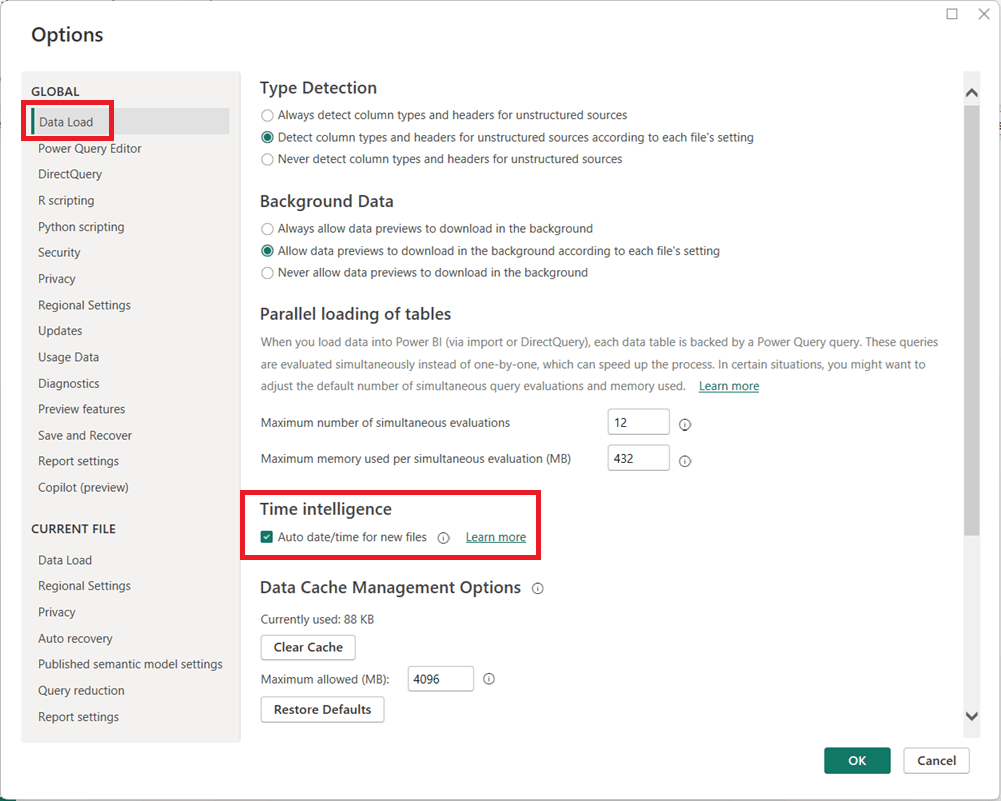
In Power BI Desktop, go to File → Options and settings → Options.
Under Global, select Data Load.
Uncheck Auto date/time for new files.
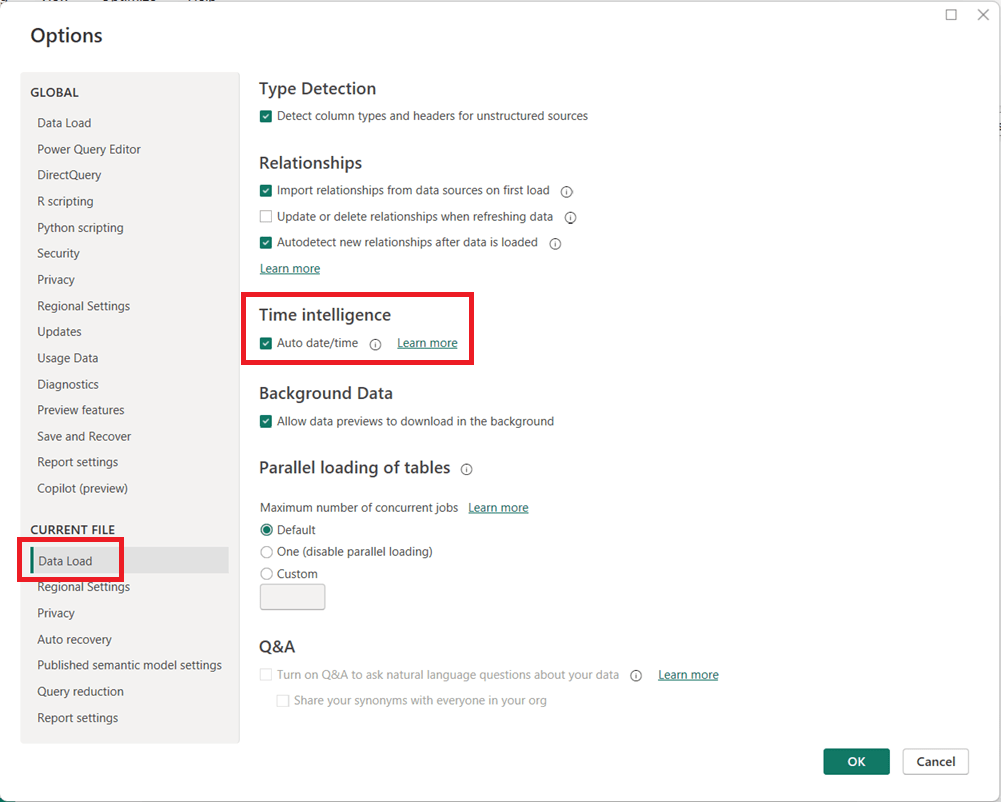
(Optional but recommended) Under Current File, select Data Load and uncheck Auto date/time to disable it for the current report.
Click OK and refresh your model if necessary.
When Should You Leave It On?
Auto date/time can still be useful for:
Quick prototypes or ad-hoc analysis
Simple models with only one or two date fields
Users new to Power BI who are not yet working with custom DAX time intelligence
Final Thoughts
For enterprise, reusable, or performance-sensitive Power BI models, turning off Auto date/time and using a dedicated Date table is usually the better approach. It leads to cleaner models, more reliable calculations, and greater long-term flexibility as your reports grow in complexity.
One of the more confusing Power BI errors—especially for intermediate users—is:
“A circular dependency was detected”
This error typically appears when working with DAX measures, calculated columns, calculated tables, relationships, or Power Query transformations. While the message is short, the underlying causes can vary, and resolving it requires understanding how Power BI evaluates dependencies.
This article explains what the error means, common scenarios that cause it, and how to resolve each case.
What Does “Circular Dependency” Mean?
A circular dependency occurs when Power BI cannot determine the correct calculation order because:
Object A depends on B
Object B depends on A (directly or indirectly)
In other words, Power BI is stuck in a loop and cannot decide which calculation should be evaluated first.
Power BI uses a dependency graph behind the scenes to determine evaluation order. When that graph forms a cycle, this error is triggered.
Example of the Error Message
Below is what the error typically looks like in Power BI Desktop:
A circular dependency was detected:
Table[Calculated Column] → Measure[Total Sales] → Table[Calculated Column]
Power BI may list:
Calculated columns
Measures
Tables
Relationships involved in the loop
⚠️ The exact wording varies depending on whether the issue is in DAX, relationships, or Power Query.
Common Scenarios That Cause Circular Dependency Errors
1. Calculated Column Referencing a Measure That Uses the Same Column
Scenario
A calculated column references a measure
That measure aggregates or filters the same table containing the calculated column
Example
-- Calculated Column
Flag =
IF ( [Total Sales] > 1000, "High", "Low" )

-- Measure
Total Sales =
SUM ( Sales[SalesAmount] )
Why This Fails
Calculated columns are evaluated row by row during data refresh
Measures are evaluated at query time
The measure depends on the column, and the column depends on the measure → loop
How to Fix
✅ Replace the measure with row-level logic
Flag =
IF ( Sales[SalesAmount] > 1000, "High", "Low" )
✅ Or convert the calculated column into a measure if aggregation is needed
2. Measures That Indirectly Reference Each Other
Scenario
Two or more measures reference each other through intermediate measures.
Example
Measure A = [Measure B] + 10
Measure B = [Measure A] * 2
Why This Fails
Power BI cannot determine which measure to evaluate first
How to Fix
✅ Redesign logic so one measure is foundational
Base calculations on columns or constants
Avoid bi-directional measure dependencies
Best Practice
Create base measures (e.g., Total Sales, Total Cost)
Build higher-level measures on top of them
3. Calculated Tables Referencing Themselves (Directly or Indirectly)
The GENERATE / ROW pattern is an advanced but powerful DAX technique used to dynamically create rows and expand tables based on calculations. It is especially useful when you need to produce derived rows, combinations, or scenario-based expansions that don’t exist physically in your data model.
This article explains what the pattern is, when to use it, how it works, and provides practical examples. It assumes you are familiar with concepts such as row context, filter context, and iterators.
What Is the GENERATE / ROW Pattern?
At its core, the pattern combines two DAX functions:
GENERATE() – Iterates over a table and returns a union of tables generated for each row.
ROW() – Creates a single-row table with named columns and expressions.
Together, they allow you to:
Loop over an outer table
Generate one or more rows per input row
Shape those rows using calculated expressions
In effect, this pattern mimics a nested loop or table expansion operation.
Why This Pattern Exists
DAX does not support procedural loops like for or while. Instead, iteration happens through table functions.
GENERATE() fills a critical gap by allowing you to:
Produce variable numbers of rows per input row
Apply row-level calculations while preserving relationships and context
Function Overview
GENERATE
GENERATE (
    table1,
    table2
)
table1: The outer table being iterated.
table2: A table expression evaluated for each row of table1.
The result is a flattened table containing all rows returned by table2 for every row in table1.
This is especially useful for timeline visuals or event-based reporting.
Performance Considerations ⚠️
The GENERATE / ROW pattern can be computationally expensive.
Best Practices
Filter the outer table as early as possible
Avoid using it on very large fact tables
Prefer calculated tables over measures when expanding rows
Test with realistic data volumes
Common Mistakes
❌ Using GENERATE When ADDCOLUMNS Is Enough
If you’re only adding columns—not rows—ADDCOLUMNS() is simpler and faster.
❌ Forgetting Table Shape Consistency
All ROW() expressions combined with UNION() must return the same column structure.
❌ Overusing It in Measures
This pattern is usually better suited for calculated tables, not measures.
Mental Model to Remember
Think of the GENERATE / ROW pattern as:
“For each row in this table, generate one or more calculated rows and stack them together.”
If that sentence describes your problem, this pattern is likely the right tool.
Final Thoughts
The GENERATE / ROW pattern is one of those DAX techniques that feels complex at first—but once understood, it unlocks entire classes of modeling and analytical solutions that are otherwise impossible.
Used thoughtfully, it can replace convoluted workarounds, reduce model complexity, and enable powerful scenario-based reporting.
A Quick Guide through some of the top data certifications for 2026
As data platforms continue to converge analytics, engineering, and AI, certifications in 2026 are less about isolated tools and more about end-to-end data value delivery. The certifications below stand out because they align with real-world enterprise needs, cloud adoption, and modern data architectures.
Each certification includes:
What it is
Why it’s important in 2026
How to achieve it
Difficulty level
1. DP-600: Microsoft Fabric Analytics Engineer Associate
What it is
DP-600 validates skills in designing, building, and deploying analytics solutions using Microsoft Fabric, including lakehouses, data warehouses, semantic models, and Power BI.
Why it’s important
Microsoft Fabric represents Microsoft’s unified analytics vision, merging data engineering, BI, and governance into a single SaaS platform. DP-600 is quickly becoming one of the most relevant certifications for analytics professionals working in Microsoft ecosystems.
It’s especially valuable because it:
Bridges data engineering and analytics
Emphasizes business-ready semantic models
Aligns directly with enterprise Power BI adoption
How to achieve it
Study Fabric concepts: OneLake, Lakehouse, Warehouse, Dataflows Gen2, semantic models
Practice impact analysis, security, deployment pipelines, and governance
This is your one-stop hub with information for preparing for the DP-600: Implementing Analytics Solutions Using Microsoft Fabric certification exam. Upon successful completion of the exam, you earn the Fabric Analytics Engineer Associate certification.
This hub provides information directly here, links to a number of external resources, tips for preparing for the exam, practice tests, and section questions to help you prepare. Bookmark this page and use it as a guide to ensure that you are fully covering all relevant topics for the exam and using as many of the resources available as possible. We hope you find it convenient and helpful.
Why do the DP-600: Implementing Analytics Solutions Using Microsoft Fabric exam to gain the Fabric Analytics Engineer Associate certification?
Most likely, you already know why you want to earn this certification, but in case you are seeking information on its benefits, here are a few: (1) there is a possibility for career advancement because Microsoft Fabric is a leading data platform used by companies of all sizes, all over the world, and is likely to become even more popular (2) greater job opportunities due to the edge provided by the certification (3) higher earnings potential, (4) you will expand your knowledge about the Fabric platform by going beyond what you would normally do on the job and (5) it will provide immediate credibility about your knowledge, and (6) it may, and it should, provide you with greater confidence about your knowledge and skills.
Important DP-600 resources:
In the section below this one, titled “DP-600: Skills measured as of October 31, 2025“, you will find the “skills measured” topics from the official study guide with links to exam preparation content for each topic. Bookmark this page and use that section as a structured topic-by-topic guide for your prep.
This page provides information for preparing for, practicing for, and registering for the exam. The skills measured content in the guide is also what is used to form the “Skills Measured as of …” outline below.
About the exam:
Cost: US $165
Number of questions: approximately 60
Time to do exam: 120 minutes (2 hours)
To Do’s:
Schedule time to learn, study, perform labs, and do practice exams and questions
Schedule the exam based on when you think you will be ready; scheduling the exam gives you a target and drives you to keep working on it
Use the various resources above and below to learn
Take the free Microsoft Learn practice test, any other available practice tests, and do the practice questions in each section and the two practice tests available in this hub.
Link to the free, comprehensive, self-paced course: Microsoft Learn course for a Microsoft Fabric Analytics Engineer. It contains 4 Learning Paths, each with multiple Modules, and each module has multiple Units. It will take some time to do it, but we recommend that you complete this entire course, including the exercises/labs. To help you work through your preparation in a structured manner, we will point you to the relevant sections in the training material corresponding to each of the sections in the skills measured section below.
Here you can learn in a structured manner by going through the topics of the exam one-by-one to ensure full coverage; click on each hyperlinked topic below to go to more information about it:
Good luck to you passing the DP-600: Implementing Analytics Solutions Using Microsoft Fabric certification exam and earning the Fabric Analytics Engineer Associate certification!
This post is a part of the DP-600: Implementing Analytics Solutions Using Microsoft Fabric Exam Prep Hub; and this topic falls under these sections:
Implement and manage semantic models (25-30%)
    --> Optimize enterprise-scale semantic models
        --> Implement performance improvements in queries and report visuals
Performance optimization is a critical skill for the Fabric Analytics Engineer. In enterprise-scale semantic models, poor query design, inefficient DAX, or overly complex visuals can significantly degrade report responsiveness and user experience. This exam section focuses on identifying performance bottlenecks and applying best practices to improve query execution, model efficiency, and report rendering.
1. Understand Where Performance Issues Occur
Performance problems typically fall into three layers:
a. Data & Storage Layer
Storage mode (Import, DirectQuery, Direct Lake, Composite)
Data source latency
Table size and cardinality
Partitioning and refresh strategies
b. Semantic Model & Query Layer
DAX calculation complexity
Relationships and filter propagation
Aggregation design
Use of calculation groups and measures
c. Report & Visual Layer
Number and type of visuals
Cross-filtering behavior
Visual-level queries
Use of slicers and filters
DP-600 questions often test your ability to identify the correct layer where optimization is needed.
2. Optimize Queries and Semantic Model Performance
a. Choose the Appropriate Storage Mode
Use Import for small-to-medium datasets requiring fast interactivity
Use Direct Lake for large OneLake Delta tables with high concurrency
Use Composite models to balance performance and real-time access
Avoid unnecessary DirectQuery when Import or Direct Lake is feasible
b. Reduce Data Volume
Remove unused columns and tables
Reduce column cardinality (e.g., avoid high-cardinality text columns)
Prefer surrogate keys over natural keys
Disable Auto Date/Time when not needed
c. Optimize Relationships
Use single-direction relationships by default
Avoid unnecessary bidirectional filters
Ensure relationships follow a star schema
Avoid many-to-many relationships unless required
d. Use Aggregations
Create aggregation tables to pre-summarize large fact tables
Enable query hits against aggregation tables before scanning detailed data
Especially valuable in composite models
3. Improve DAX Query Performance
a. Write Efficient DAX
Prefer measures over calculated columns
Use variables (VAR) to avoid repeated calculations
Minimize row context where possible
Avoid excessive iterators (SUMX, FILTER) over large tables
b. Use Filter Context Efficiently
Prefer CALCULATE with simple filters
Avoid complex nested FILTER expressions
Use KEEPFILTERS and REMOVEFILTERS intentionally
c. Avoid Expensive Patterns
Avoid EARLIER in favor of variables
Avoid dynamic table generation inside visuals
Minimize use of ALL when ALLSELECTED or scoped filters suffice
4. Optimize Report Visual Performance
a. Reduce Visual Complexity
Limit the number of visuals per page
Avoid visuals that generate multiple queries (e.g., complex custom visuals)
Use summary visuals instead of detailed tables where possible
b. Control Interactions
Disable unnecessary visual interactions
Avoid excessive cross-highlighting
Use report-level filters instead of visual-level filters when possible
c. Optimize Slicers
Avoid slicers on high-cardinality columns
Use dropdown slicers instead of list slicers
Limit the number of slicers on a page
d. Prefer Measures Over Visual Calculations
Avoid implicit measures created by dragging numeric columns
Define explicit measures in the semantic model
Reuse measures across visuals to improve cache efficiency
5. Use Performance Analysis Tools
a. Performance Analyzer
Identify slow visuals
Measure DAX query duration
Distinguish between query time and visual rendering time
b. Query Diagnostics (Power BI Desktop)
Analyze backend query behavior
Identify expensive DirectQuery or Direct Lake operations
c. DAX Studio (Advanced)
Analyze query plans
Measure storage engine vs formula engine time
Identify inefficient DAX patterns
(You won’t be tested on tool UI details, but knowing when and why to use them is exam-relevant.)
6. Common DP-600 Exam Scenarios
You may be asked to:
Identify why a report is slow and choose the best optimization
Identify the bottleneck layer (model, query, or visual)
Select the most appropriate storage mode for performance
Choose the least disruptive, most effective optimization
Improve a slow DAX measure
Reduce visual rendering time without changing the data source
Optimize performance for enterprise-scale models
Apply enterprise-scale best practices, not just quick fixes
Key Exam Takeaways
Always optimize the model first, visuals second
Star schema + clean relationships = better performance
Efficient DAX matters more than clever DAX
Fewer visuals and interactions = faster reports
Aggregations and Direct Lake are key enterprise-scale tools
A composite model in Power BI and Microsoft Fabric combines data from multiple data sources and multiple storage modes in a single semantic model. Rather than importing all data into the model’s in-memory cache, composite models let you mix different query/storage patterns such as:
Import
DirectQuery
Direct Lake
Live connections
Composite models enable flexible design and optimized performance across diverse scenarios.
Why Composite Models Matter
Semantic models often need to support:
Large datasets that cannot be imported fully
Real-time or near-real-time requirements
Federation across disparate sources
Mix of highly dynamic and relatively static data
Composite models let you combine the benefits of in-memory performance with direct source access.
Core Concepts
Storage Modes in Composite Models
Storage Mode
Description
Typical Use
Import
Data is cached in the semantic model memory
Fast performance for static or moderately sized data
DirectQuery
Queries are pushed to the source at runtime
Real-time or large relational sources
Direct Lake
Queries Delta tables in OneLake
Large OneLake data with faster interactive access
Live Connection
Delegates all query processing to an external model
Shared enterprise semantic models
A composite model may include tables using different modes — for example, imported dimension tables and DirectQuery/Direct Lake fact tables.
Key Features of Composite Models
1. Table-Level Storage Modes
Every table in a composite model may use a different storage mode:
Dimensions may be imported
Fact tables may use DirectQuery or Direct Lake
Bridge or helper tables may be imported
This flexibility enables performance and freshness trade-offs.
2. Relationships Across Storage Modes
Relationships can span tables even if they use different storage modes, enabling:
Filtering between imported and DirectQuery tables
Cross-mode joins (handled intelligently by the engine)
Underlying engines push queries to the appropriate source (SQL, OneLake, Semantic layer), depending on where the data resides.
3. Aggregations and Hierarchies
You can define:
Aggregated tables (pre-summarized import tables)
Detail tables (DirectQuery or Direct Lake)
Power BI automatically uses aggregations when a visual’s query can be satisfied with summary data, enhancing performance.
4. Calculation Groups and Measures
Composite models work with complex semantic logic:
Calculation groups (standardized transformations)
DAX measures that span imported and DirectQuery tables
These models require careful modeling to ensure that context transitions behave predictably.
When to Use Composite Models
Composite models are ideal when:
A. Data Is Too Large to Import
Large fact tables (> hundreds of millions of rows)
Delta/OneLake data too big for full in-memory import
Use Direct Lake for these, while importing dimensions
B. Real-Time Data Is Required
Operational reporting
Systems with high update frequency
Use DirectQuery to relational sources
C. Multiple Data Sources Must Be Combined
Relational databases
OneLake & Delta
Cloud services (e.g., Synapse, SQL DB, Spark)
On-prem gateways
Composite models let you combine these seamlessly.
D. Different Performance vs Freshness Needs
Import for static master data
DirectQuery or Direct Lake for dynamic fact data
Composite vs Pure Models
Aspect
Import Only
Composite
Performance
Very fast
Depends on source/query pattern
Freshness
Scheduled refresh
Real-time/near-real-time possible
Source diversity
Limited
Multiple heterogeneous sources
Model complexity
Simpler
Higher
Query Execution and Optimization
Query Folding
DirectQuery and Power Query transformations rely on query folding to push logic back to the source
Query folding is essential for performance in composite models
Storage Mode Selection
Good modeling practices for composite models include:
Import small dimension tables
Direct Lake for large storage in OneLake
DirectQuery for real-time relational sources
Use aggregations to optimize performance
Modeling Considerations
1. Relationship Direction
Prefer single-direction relationships
Use bidirectional filtering only when required (careful with ambiguity)
2. Data Type Consistency
Ensure fields used in joins have matching data types
In composite models, mismatches can cause query fallbacks
3. Cardinality
High cardinality DirectQuery columns can slow queries
Use star schema patterns
4. Security
Row-level security crosses modes but must be carefully tested
Security logic must consider where filters are applied
Common Exam Scenarios
Exam questions may ask you to:
Choose between Import, DirectQuery, Direct Lake and composite
Assess performance vs freshness requirements
Determine query folding feasibility
Identify correct relationship patterns across modes
Example prompt:
“Your model combines a large OneLake dataset and a small dimension table. Users need current data daily but also fast filtering. Which storage and modeling approach is best?”
Correct exam choices often point to composite models using Direct Lake + imported dimensions.
Best Practices
Define a clear star schema even in composite models
Import dimension tables where reasonable
Use aggregations to improve performance for heavy visuals
Limit direct many-to-many relationships
Use calculation groups to apply analytics consistently
Test query performance across storage modes
Exam-Ready Summary/Tips
Composite models enable flexible and scalable semantic models by mixing storage modes:
Import – best performance for static or moderate data
DirectQuery – real-time access to source systems
Direct Lake – scalable querying of OneLake Delta data
Live Connection – federated or shared datasets
Design composite models to balance performance, freshness, and data volume, using strong schema design and query optimization.
For DP-600, always evaluate:
Data volume
Freshness requirements
Performance expectations
Source location (OneLake vs relational)
Composite models are frequently the correct answer when these requirements conflict.
Practice Questions:
Here are 10 questions to test and help solidify your learning and knowledge. As you review these and other questions in your preparation, make sure to …
Identifying and understand why an option is correct (or incorrect) — not just which one
Look for and understand the usage scenario of keywords in exam questions to guide you
Expect scenario-based questions rather than direct definitions
1. What is the primary purpose of using a composite model in Microsoft Fabric?
A. To enable row-level security across workspaces B. To combine multiple storage modes and data sources in one semantic model C. To replace DirectQuery with Import mode D. To enforce star schema design automatically
✅ Correct Answer: B
Explanation: Composite models allow you to mix Import, DirectQuery, Direct Lake, and Live connections within a single semantic model, enabling flexible performance and data-freshness tradeoffs.
2. You are designing a semantic model with a very large fact table stored in OneLake and small dimension tables. Which storage mode combination is most appropriate?
A. Import all tables B. DirectQuery for all tables C. Direct Lake for the fact table and Import for dimension tables D. Live connection for the fact table and Import for dimensions
✅ Correct Answer: C
Explanation: Direct Lake is optimized for querying large Delta tables in OneLake, while importing small dimension tables improves performance for filtering and joins.
3. Which storage mode allows querying OneLake Delta tables without importing data into memory?
A. Import B. DirectQuery C. Direct Lake D. Live Connection
✅ Correct Answer: C
Explanation: Direct Lake queries Delta tables directly in OneLake, combining scalability with better interactive performance than traditional DirectQuery.
4. What happens when a DAX query in a composite model references both imported and DirectQuery tables?
A. The query fails B. The data must be fully imported C. The engine generates a hybrid query plan D. All tables are treated as DirectQuery
✅ Correct Answer: C
Explanation: Power BI’s engine generates a hybrid query plan, pushing operations to the source where possible and combining results with in-memory data.
5. Which scenario most strongly justifies using a composite model instead of Import mode only?
A. All data fits in memory and refreshes nightly B. The dataset is static and small C. Users require near-real-time data from a large relational source D. The model contains only calculated tables
✅ Correct Answer: C
Explanation: Composite models are ideal when real-time or near-real-time access is needed, especially for large datasets that are impractical to import.
6. In a composite model, which table type is typically best suited for Import mode?
A. High-volume transactional fact tables B. Streaming event tables C. Dimension tables with low cardinality D. Tables requiring second-by-second freshness
✅ Correct Answer: C
Explanation: Importing dimension tables improves query performance and reduces load on source systems due to their relatively small size and low volatility.
7. How do aggregation tables improve performance in composite models?
A. By replacing DirectQuery with Import B. By pre-summarizing data to satisfy queries without scanning detail tables C. By eliminating the need for relationships D. By enabling bidirectional filtering automatically
✅ Correct Answer: B
Explanation: Aggregations allow Power BI to answer queries using pre-summarized Import tables, avoiding expensive queries against large DirectQuery or Direct Lake fact tables.
8. Which modeling pattern is strongly recommended when designing composite models?
A. Snowflake schema B. Flat tables C. Star schema D. Many-to-many relationships
✅ Correct Answer: C
Explanation: A star schema simplifies relationships, improves performance, and reduces ambiguity—especially important in composite and cross-storage-mode models.
9. What is a potential risk of excessive bidirectional relationships in composite models?
A. Reduced data freshness B. Increased memory consumption C. Ambiguous filter paths and unpredictable query behavior D. Loss of row-level security
✅ Correct Answer: C
Explanation: Bidirectional relationships can introduce ambiguity, cause unexpected filtering, and negatively affect query performance—risks that are amplified in composite models.
10. Which feature allows a composite model to reuse an enterprise semantic model while extending it with additional data?
A. Direct Lake B. Import mode C. Live connection with local tables D. Calculation groups
✅ Correct Answer: C
Explanation: A live connection with local tables enables extending a shared enterprise semantic model by adding new tables and measures, forming a composite model.
Information and resources for the data professionals' community




 The Data Community