This post is a part of the DP-900: Microsoft Azure Data Fundamentals Exam Prep Hub.
This topic falls under these sections:
Describe an analytics workload (25–30%)
   --> Describe data visualization in Microsoft Power BI
      --> Describe features of data models in Power BI

Note that there are 10 practice questions (with answers and explanations) for each section to help you solidify your knowledge of the material. Also, there are 2 practice tests with 60 questions each available on the hub below the exam topics section.
A data model is the foundation of any effective report in Microsoft Power BI. It defines how data is structured, related, and calculated, enabling efficient analysis and meaningful visualizations.
For the DP-900 exam, you should understand how data models work, their key components, and best practices.
What Is a Data Model in Power BI?
A data model is a logical representation of data that includes:
- Tables
- Relationships
- Calculations
It allows Power BI to:
- Combine data from multiple sources
- Enable filtering and aggregation
- Support interactive reporting
Key Features of Power BI Data Models
1. Tables
Data models consist of one or more tables, which can come from:
- Databases
- Files (Excel, CSV)
- Cloud sources
✔ Tables contain rows (records) and columns (fields)
2. Relationships
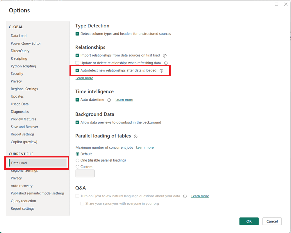
Relationships define how tables are connected.
Types of Relationships
- One-to-many (1:*) → Most common
- Many-to-one (*:1)
- Many-to-many (:)
Key Concepts
- Primary key → Unique identifier in one table
- Foreign key → Reference in another table
✔ Relationships enable filtering across tables
3. Schema Design (Star Schema)
Power BI models commonly follow a star schema:
- Fact tables → Contain measurable data (e.g., sales)
- Dimension tables → Contain descriptive data (e.g., customer, product)
✔ This structure improves performance and usability
4. Measures and Calculated Columns
Power BI uses DAX (Data Analysis Expressions) for calculations.
Measures
- Calculated at query time
- Used in aggregations (e.g., SUM, AVERAGE)
Calculated Columns
- Computed during data load
- Stored in the model
✔ Measures are preferred for performance
5. Data Types
Each column has a defined data type:
- Text
- Number
- Date/Time
- Boolean
✔ Correct data types ensure accurate calculations and visuals
6. Hierarchies
Hierarchies allow users to drill down into data.
Example
- Year → Quarter → Month → Day
✔ Used for interactive reporting and exploration
7. Filtering and Cross-Filtering
Relationships enable:
- Filter propagation between tables
- Cross-filtering in visuals
✔ Example:
Selecting a product filters related sales data
8. Data Granularity
Granularity refers to the level of detail in data.
- Fine-grained → detailed (e.g., individual transactions)
- Coarse-grained → summarized (e.g., monthly totals)
✔ Consistent granularity is important for accurate analysis
9. Model Optimization
Well-designed models:
- Use fewer tables when possible
- Avoid unnecessary columns
- Use measures instead of calculated columns
- Follow star schema design
✔ Improves performance and usability
10. Relationships Direction (Filter Direction)
Relationships can filter:
- Single direction (default, recommended)
- Both directions (used cautiously)
✔ Incorrect settings can lead to ambiguous results
Typical Data Modeling Workflow in Power BI
- Load data into Power BI
- Clean and transform data (Power Query)
- Define relationships
- Create measures and calculations
- Build reports and visuals
Why This Matters for DP-900
On the exam, you may be asked to:
- Identify components of a data model
- Understand relationships and keys
- Differentiate between measures and calculated columns
- Recognize star schema design
- Understand filtering behavior
Summary — Exam-Relevant Takeaways
✔ A data model includes:
- Tables
- Relationships
- Calculations
✔ Key features:
- Relationships (1:*, :)
- Star schema (fact + dimension tables)
- Measures vs calculated columns
- Hierarchies and filtering
✔ Best practices:
- Use star schema
- Prefer measures over calculated columns
- Maintain consistent granularity
✔ Exam tips:
👉 Fact table = metrics (numbers)
👉 Dimension table = descriptive attributes
👉 Measure = dynamic calculation
👉 Calculated column = stored value
Go to the Practice Exam Questions for this topic.
Go to the DP-900 Exam Prep Hub main page.