Category: Business Intelligence

Quality Assurance (QA) for Data Projects or Data Applications

This post discusses Quality Assurance (QA) activities for data projects.

What is Quality Assurance (QA)?  Simply put, Quality Assurance, also called QA, Testing or Validation, is about testing an application or solution to ensure that all the stated/promised/expected requirements are met. It is a critically important activity for all software application development or implementations. Data applications are no different. They need to be tested to ensure they work as intended.

QA stands between development and deployment. And QA makes the difference between a delivered product and a high quality delivered product.

There are a number of things to keep in mind when you plan your Quality Assurance activities for data solutions. I present some of them in this post as suggestions, considerations, or prompting questions. The things mentioned here will not apply to all data applications but can be used as a guide or a check.

People / Teams

The number of people and teams involved in a project will vary depending on the size, scope and complexity of the project.

The technical team building the application needs to perform an initial level of validation of the solution.

If there is a Quality Assurance team that performs the validation tasks, then that team will need to perform the “official” validation.

The business analysts and end-users of the application also need to validate. Where possible, work with as many end users as efficiently possible. The more real users you have testing the application, the better the chances of finding issues early.

Where it makes sense, Test IDs that simulate various types of users or groups should be used to help test various usage and security scenarios. This is particularly useful in automated testing.

On large projects where there is a lot to be tested, it is best to break up the testing across multiple people or teams. This will help to prevent testing fatigue and sloppy testing and result in higher quality testing.

Plan ahead to ensure that access for all the relevant users is set up in the testing environments.

Communication

With all the teams and people involved, it is important to have a plan for how they will communicate. Things to consider and have a plan for include:

  • How will teams communicate within? Email, Microsoft Teams, SharePoint, Shared Files, are some options.
  • How will the various teams involved communicate with each other? In other words, how will cross-team communication be handled? As above, Email, Microsoft Teams, SharePoint, Shared Files, are some options.
  • How will issues and status be communicated? Weekly meetings, Status emails or documents, Shared files available on shared spaces are options.
  • How will changes and resolutions be tracked? Files, SDLC applications, Change Management applications are options.
  • How will teams and individuals be notified when they need to perform a task? Manual communication or automated notifications from tools are options.

Data

The most important thing to ensure in data projects is that the data is high quality, particularly the “base” data set. If the base data is incorrect, everything built on top of it will be bad. Of course, the correctness of intermediate and user-facing data is also just as important, but the validation of the base data is critical to achieving the correct data all over.

  • Ensure that table counts, field counts and row counts of key data are correct.
  • Does the data warehouse data match the source data?
  • Test detailed, low level records with small samples of data
  • Test to ensure that the data and the values conform to what is expected. For example, ensuring that there is no data older than 3 years old, or ensuring that there are no account values outside a certain range. The Data Governance Team may become involved in these activities across all projects.

Next in line is the “intermediate” data such as derived metrics, aggregates, specialized subsets, and more. These will also need to be verified.

  • Are the calculated values correct?
  • Are the aggregates correct? Test aggregate data with small, medium and large sets of data
  • Verify metric calculations

Then the user-facing data or data prepared for self-service usage needs to be validated.

  • Does the data on the dashboard match the data in the database?
  • Are the KPIs correctly reflecting the status?

Test the full flow of the data. The validity of the data should be verified at each stage of the data flow – from the source, to the staging, to the final tables in the data warehouse, to aggregates or subsets, to the dashboard.

Take snapshots of key datasets or reports so you can compare results post data migration.

Some additional data prep might be needed in some cases.

  • These include making sure that you have sourced adequate data for testing. For example, if you need to test an annual trend, then it might be best to have at least a year’s worth of data, preferably two.
  • You may need to scramble or redact some data for testing. Often Test data is taken from the Production environment and then scrambled and/or redacted in order to not expose sensitive information.
  • You may need to temporarily load in data for testing. For various reasons, you may need to load some Production data into the QA environment just to test the solution or a particular feature and then remove the data after the testing is complete. While this can be time consuming, sometimes it’s necessary, and it’s good to be aware of the need early and make plans accordingly.

Aesthetics & Representation of Data

Presentation matters. Although the most critical thing is data correctness, how the data is presented is also very important. Good presentation helps with understanding, usability, and adoption. A few things to consider include:

  • Does the application, such as dashboard, look good?  Does it look right? 
  • Are the components laid out properly so that there is no overcrowding?
  • Are the logos, colors and fonts in line with company expectations?
  • Are proper chart options used to display the various types of data and metrics?
  • Is the information provided in a way that users can digest?

Usage

The data application or solution should be user friendly, preferably intuitive or at least have good documentation. The data must be useful to the intended audience, in that, it should help them to understand the information and make good decisions or take sensible actions based on it.

The application should present data in a manner that is effective – easy to access, and easy to understand.

The presentation should satisfy the analytic workflows of the various users. Users should be able to logically step through the application to find information at the appropriate level of detail that they need based on their role.

A few things that affect usability include:

  • Prompts – ensure that all the proper prompts or selections are available to users to slice and filter the data as necessary. And of course, verify that they work.
  • Drill downs and drill throughs – validate that users can drill-down and across data to find the information they need in a simple, logical manner.
  • Easy interrogation of the data – if the application is ad-hoc in nature, validate that users can navigate it or at least verify that the documentation is comprehensive enough for users to follow.

Security

Securing the application and its data so that only authorized users have access to it is critical.

Application security comprises of “authentication”– access to the application, and “authorization” – what a user is authorized to do when he or she accesses the application.

Authorization (what a user is authorized to do within the application) can be broken into “object security” – what objects or features a user has access to, and “data security” – what data elements a user has access to within the various objects or features.

For example, a user has access to an application (authenticated / can log in), and within the application the user has access to (authorized to see and use) 3 of 10 reports (object-level security). The user is not authorized to see the other 7 reports (object-level security) and, therefore, will not have access to them. Now, within the 3 reports that the user has access to, he or she can only see data related to 1 of 5 departments (data-level security).

All object-level and data-level security needs to be validated. This includes negative testing. Not only test to make sure that users have the access they need, but testing should also ensure that users do not have access that they should not have.

  • Data for testing should be scrambled or redacted as appropriate to protect it.
  • Some extremely sensitive data may need to be filtered out entirely.
  • Can all the appropriate users access the application?
  • Are non-authorized users blocked from accessing the application?
  • Can user see the data they should be able to see to perform their jobs?

Performance

Performance of the data solution is important to user efficiency and user adoption. If users cannot get the results they need in a timely manner, they will look elsewhere to get what they need. Even if they have no choice, a poorly performing application will result in wasted time and dollars.

A few things to consider for ensuring quality around performance:

  • Application usage – is the performance acceptable? Do the results get returned in an acceptable time?
  • Data Integration – is the load performance acceptable?
  • Data processing – can the application perform all the processing it needs to do in a reasonable amount of time?
  • Stress Testing – how is performance with many users? How is it with a lot data?
  • How is performance with various selections or with no selections at all?
  • Is ad-hoc usage setup to be flexible but avoid rogue analyses that may cripple the system?
  • Is real-time analysis needed and is the application quick enough?

These items need to be validated and any issues need to be reported to the appropriate teams for performance tuning before the application is released for general usage.

Methodology

Each organization, and even each team within an organization, will have a preferred methodology for application development and change management, including how they perform QA activities.

Some things to consider include:

  • Get QA resources involved in projects early so that they gain an early understanding of the requirements and the solutions to assess and plan how best to test.
  • When appropriate, do not wait until all testing is complete before notifying development teams of issue discovered. By notifying them early, this could make the difference between your project being on-time or late.
  • Create a test plan and test scripts – even if they are high-level.
  • Where possible, execute tasks in an agile, iterative manner.
  • Each environment will have unique rules and guidelines that need to be validated. For example, your application may have a special naming convention, color & font guidelines, special metadata items, and more. You need to validate that these rules and guidelines are followed.
  • Use a checklist to ensure that you validate with consistency from deliverable to deliverable
  • When the solution being developed is replacing an existing system or dataset, use the new and old solutions in parallel to validate the new against the old.
  • Document test results. All testing participants should document what has been tested and the results. This may be as simple as a checkmark or a “Done” status, but may also include things like data entered, screenshots, results, errors, and more.
  • Update the appropriate tracking tools (such as your SDLC or Change Management tools) to document changes and validation. These tools will vary from company to company, but it is best to have a trail of the development, testing, and release to production.
  • For each company and application, there will a specific, unique set of things that will need to be done. It is best if you have a standard test plan or test checklist to help you confirm that you have tested all important aspects and scenarios of the application.

This is not an all-encompassing coverage of Quality Assurance for data solutions, but I hope the article gives you enough information to get started or tips for improving what you currently have in place. You can share your questions, thoughts and input via comments to this post. Thanks for reading!

BI Application getting ORA-00257 Error

One day this week, we got the following error showing up on our BI dashboards.
“ORA-00257: Archiver error. Connect AS SYSDBA only until resolved.”
This is an Oracle database error (which you may guess based on the “ORA”), and not an error directly from BI application.

If you get this error, it means that the database redo logs are filled up, and cannot be archived due to lack of space on the designated archive area or some other issue. In our case, the “some other issue” was caused by some issues with “commvault”, a software application used for data backup and recovery, among other things.

When this happens, if a user tries to connect to the database, such as the BI Application user in our case, the database will not allow the new connection. The only exception is SYSDBA users will be allowed to connect.

If you are not the database administrator (DBA), you will most likely work with your DBA (as we do) to get this error resolved.
After the issue that caused the problem is resolved and the redo logs are cleared, then the database, and therefore the BI application, will allow new connections as normal.

Thanks for reading and I hope you found this helpful.

Error downloading data to Excel in OBIEE 12c

If you get the error …

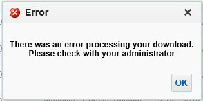
“There was an error processing your download. Please check with your administrator.”

… when Exporting / Downloading data from an analysis in OBIEE, then this post might be helpful.

In OBIEE, you have a few options for exporting / downloading data from an analysis / report as shown below. You can export / download to PDF, Excel 2007+, PowerPoint 2007+, Web Archive (.mht), or in CSV, Tab Delimited, or XML data formats.

OBIEE_Export_Analysis_Data

If you are trying to download data from an analysis and get this error …

OBIEE_Export_to_Excel_Failed

“There was an error processing your download. Please check with your administrator.”
then try the following fix. Note, you might find that you are able to download to CSV, but get the error when you try to download to Excel.

Edit the config.xml file
Located at the directory specified below (for OBIEE 12c):
ORACLE_HOME/user_projects/domains/bi/config/fmwconfig/biconfig/OBIJH

FYI, this is the location of the config.xml file in OBIEE 11g
[MW_HOME]/instances/instance1/config/OracleBIJavaHostComponent/coreapplication_obijh1

Locate the section and the parameter within that section. It may look like below, but there could be more or less parameters within the section than shown here.

<XMLP>
<InputStreamLimitInKB>8192</InputStreamLimitInKB>
<ReadRequestBeforeProcessing>true</ReadRequestBeforeProcessing>
</XMLP>

Change the value of the InputStreamLimitInKB parameter to 0 as shown below…

<XMLP>
<InputStreamLimitInKB>0</InputStreamLimitInKB>
<ReadRequestBeforeProcessing>true</ReadRequestBeforeProcessing>
</XMLP>

Restart the OBIEE services and try your export again.

If it succeeds, then we know for sure that altering this parameter fixes it.
Setting the above parameter value to zero (0) means that there is no limit. So, you may now go back and modify the value to a number that is suitable for your environment, such as, 8192, 15384, 65536, etc.

Error on reports after upgrading to OBIEE 12.2.1.1.0 – “nQSError 35029: Unable to evaluate text 0.0 as either true or false”

After upgrading or migrating to OBIEE 12.2.1.1.0, you may encounter this error: “nQSError 35029: Unable to evaluate text 0.0 as either true or false”.
This is a known bug and there is a patch for it.

The Bug # is: 24005980
And the Patch # and description is: 24005980 RPD CONSISTENCY ERRORS AFTER UPGRADE FROM 12.2.1.0.0 TO 12.2.1.1.0.

Applying this patch resolved the issue for us.

Good luck with your resolution.

InfatoODI – Informatica to ODI conversion tool

We are currently in the process of upgrading Oracle Business Intelligence Applications (OBIA) from version 7.9.6 to OBIA 11g.  Oracle has replaced Informatica as the data integration tool in the platform with it’s own tool, Oracle Data Integrator (ODI). This was a selfish, profit-driven move on Oracle’s part with no consideration for the impact on customers, but it is what it is.

Because of this, as a part of the upgrade to the new OBIA release, we need to convert all our hundreds of Informatica mappings to ODI.  As you can imagine, this is a lot of work.  We are getting help from a company that has developed a specialized conversion tool called InfatoODI, which converts Informatica mappings to ODI interfaces.

We are performing the conversions specifically for an OBIA application, but the tool can be used as a straight conversion tool for Informatica-to-ODI for any type of application.

We are in the beginning stages of the project, but early indications are that the tool will save us time, but I am not sure how significant as yet. I will post updates as we progress through the conversions with my experience and opinion of the tool.

OBIEE 11g vs OBIEE 12c – What’s new in OBIEE 12c

In this post I highlight a few of the new features of OBIEE 12c, and in some cases show how they differ from OBIEE 11g.

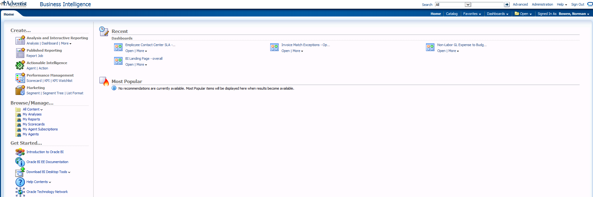
The OBIEE Home Page looks a bit different, and includes a new “Data Exploration & Discovery” option and functionality.

OBIEE 11g
Whats_new_OBIEE12c_OBIEE_11g_HomePage

OBIEE 12c
Whats_new_OBIEE12c_OBIEE_12c_HomePage

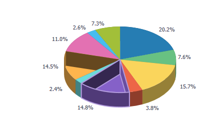
OBIEE 12c has a new visualization feature:  Mouse-over highlights the selected area with animation.

For example, the below image shows what it looks like when you mouse-over the “14.8% purple” slice.

Note: In reports where the selection drills on the entire stacked column (such as in a vertical stacked graph), the drilling will operate the same as before – that is – if the drill was done on the selected area only in 11g, then that will continue to occur; If the report was drilling on the entire stack/column when clicked in 11g, that will continue to occur also (even though the animation only happens on the area that was clicked).

Whats_new_OBIEE12c_new_visualization_feature

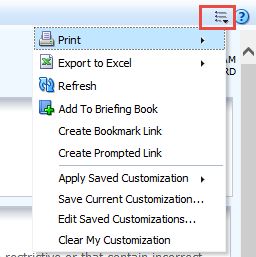
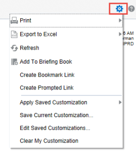
The Dashboard “Page Options” icon has changed from the “3 lines with the down arrow” to a “gear” icon.

OBIEE 11g
Whats_new_OBIEE12c_Dashboard_Page_Options_11g

OBIEE 12c
Whats_new_OBIEE12c_Dashboard_Page_Options_12c

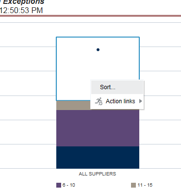
OBIEE 12c now provides the ability to Sort in graphs by right-clicking and using the pop-up menu. So, you will now see the Sort option along with the Action Links when you right-click on a graph.
Whats_new_OBIEE12c_Sort_in_Graphs

For report developers:

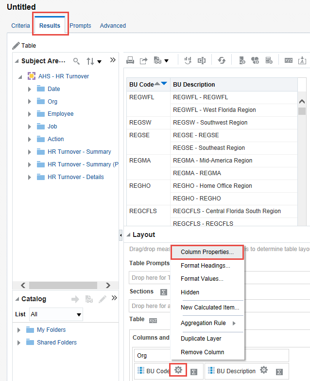
In OBIEE 12c: It is now possible to modify Column Properties from the Results tab – more efficient.

Whats_new_OBIEE12c_modify_column_properties

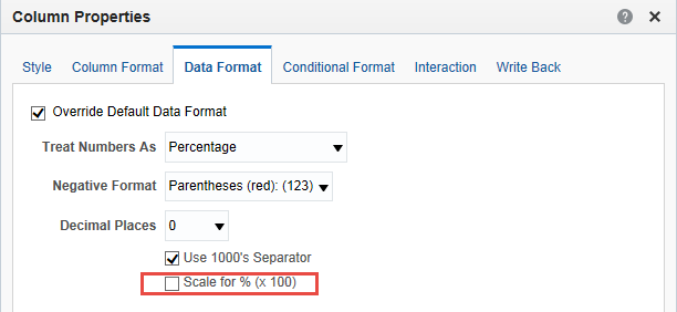
In OBIEE 12c: There is a new “Scale for % (x 100)” option in the Column Properties – Data Format tab.

Whats_new_OBIEE12c_new_scale_in_column_properties

In OBIEE 12c: You can create a new Calculated Column in the Results tab by clicking the “ruler” icon.

Whats_new_OBIEE12c_new_calculated_column

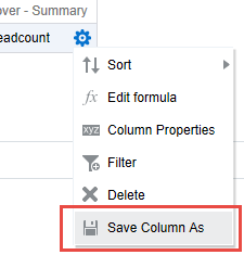
After adding the column, use the new “Save Column As” option to save the column. This is great feature that will allow for re-using calculated columns instead of having to re-enter the formula each time.

Whats_new_OBIEE12c_Save_Column_As

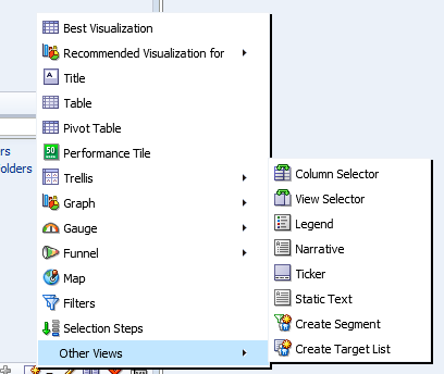
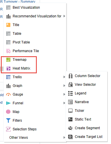
OBIEE 12c introduces 2 new visualization options – Tree Map and Heat Index

OBIEE 11g
Whats_new_OBIEE12c_Vizualization_options_11g

OBIEE 12c
Whats_new_OBIEE12c_Vizualization_options_12c

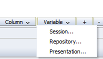
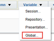
OBIEE 12c introduces a new Global Variable type, that can be a value or an expression.

OBIEE 11g  Whats_new_OBIEE12c_Variable_Types_11g                OBIEE 12c Whats_new_OBIEE12c_Variable_Types_12c

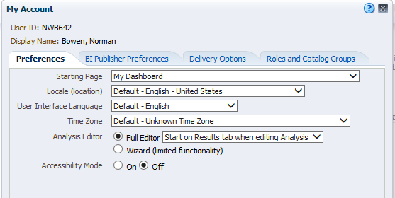
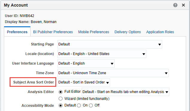
In OBIEE 12c, there is a new “Subject Area Sort Order” option available in Account properties.

OBIEE 11g
Whats_new_OBIEE12c_Account_Properties_11g

OBIEE 12c
Whats_new_OBIEE12c_Account_Properties_12c

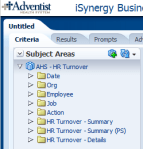
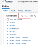
OBIEE 12c provides the ability to search a subject area by keyword entered, and to sort folders and columns in a subject area.

OBIEE11g  Whats_new_OBIEE12c_Subject_Areas_11g                OBIEE 12c Whats_new_OBIEE12c_Subject_Areas_12c

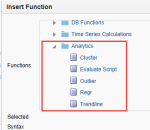
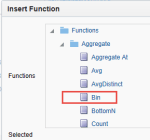
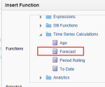
In OBIEE 12c, there are a few new analytic functions.  A new Analytics folder contains new functions Cluster, Evaluate Script, Outlier, Regr, and Trendline. The Aggregate folder contains a new function, Bin. And the Time Series Calculations folder contains a new function, Forecast.

Whats_new_OBIEE12c_New_Analytic_Functions_12c_1          Whats_new_OBIEE12c_New_Analytic_Functions_12c_2          Whats_new_OBIEE12c_New_Analytic_Functions_12c_3

Creating a Business Intelligence (BI) & Analytics Strategy and Roadmap

This post provides some of my thoughts on how to go about creating a Business Intelligence (BI) & Analytics Strategy and Roadmap for your client or company.  Please comment with your suggestions from your experience for improving this information.


When creating or updating the BI & Analytics Strategy and Roadmap for a company, one of the first things to understand is:

Who are all the critical stakeholders that need to be involved?

Understanding who needs and uses the BI & Analytics systems is critical for starting the process of understanding and documenting the “who needs what, why, and when”.

These are some of the roles that are typically important stakeholders:

  • High-level business executives that are paying for the projects
  • Business directors involved in the usage of the systems
  • IT directors involved in the developing and support of the systems
  • Business Subject Matter Experts (SME’s) & Business Analysts
  • BI/Analytics/Data/System Architects
  • BI/Analytics/Data/System Developers and Administrators


Then, you need to ask all these stakeholders, especially those from the business:

What are the drivers for BI & Analytics? And what is the level of importance for each of these drivers?

This will help you to understand and document what business needs are creating the need for new or modified BI & Analytics solutions. You should then go deeper to understand … what are the business objectives and goals that are driving these business needs.  This will help you to understand and document the bigger picture so that a more comprehensive strategy and roadmap can be created.

The questions and discussions surrounding the above will require deep and broad business involvement. Getting the perspective of a wide range of users from all business areas that are using the BI & Analytics Systems is critical.  The business should be involved throughout the process of creating the strategy and roadmap, and all decisions should tie back to support for business objectives and goals. And the trail leading to all these decisions must be documented.

Some examples of business drivers include:

  • Gain more insight into who our best customers are and how best to acquire them.
  • Understand how weather affects our sales/revenue.
  • Determine how we can sell more to our existing customers.
  • Understand what causes employee turnover.
  • Gain insight into how we can improve staffing schedules.


And examples of business objectives and goals may include things like:

  • Increase corporate revenues by 10%
  • Grow our base of recurring customers
  • Stabilize corporate revenues over all seasons
  • Create an environment where employees love to work
  • Reduce payroll costs without a reduction in staff, for example, reduce turnover.


Then, turn to understanding and documenting the current scenario (if not already known). Identify what systems (including data sources) are in place, who are using them (and why and how), what capabilities do they offer, what are the must-haves, and what are the pain points and positive highlights.

Also, you will need to determine the current workload (and future workload if it can be determined) of the primary team members involved in developing, testing, and implementing BI & Analytics solutions.

This will help you understand a few things:

  • Some of the highest priority needs of the users
  • Gaps in capabilities and data between what is needed and what is currently in place (including an understanding of what is liked and disliked about the current systems)
  • Current user base knowledge and engagement
  • IT knowledge and skills
  • Resource availability – when are people available to work on new initiatives


What are the options and limitations?

  • Can existing systems be customized to meet the requirements?
  • Can they be upgraded to a new version that has the needed functionality?
  • Do we need to consider adding a new platform or replacing one or more of the existing systems with a new platform?
  • Can we migrate from/integrate one system to/with another system that we already have up and running?
  • Are any of our current systems losing vendor support or require an upgrade for other reasons? Has the pricing changed for any of our software applications?
  • What options does our budget permit us to explore?
  • What options do our knowledge and skills permit us to explore?


Once you have identified these items …

  • Identify and engage stakeholders, and document these roles and the people
  • Identify and document business drivers, objectives and goals
  • Understand and document the current landscape – needs (including must-haves), technology, gaps, users, IT staff, resource availability, and more
  • Identify and document options – based on current landscape, technology, budget, staff resources, etc.

… you can develop a “living” Strategy and Roadmap for BI & Analytics. And when I say “living”, I mean it will not be a static document, but will be fine-tuned over time as new information emerge and as changes arise in business needs, technology, and staff resources.


Your Strategy and Roadmap for BI & Analytics should include, but is not limited to:

  • BI & Analytics that will be used to satisfy business drivers, objectives and goals
  • Data acquisition and storage plan for meeting the analytics needs
  • Technology platforms that will be used to process and store data, and deliver the analytics
  • Information about any new technologies that needs to be acquired or implemented, and schedules
  • Roles and Responsibilities for all stakeholders involved in BI & Analytics projects
  • Planned staffing allocations and schedules
  • Planned staffing changes and schedules
  • User training (business users) and Delivery team training (technical implementers & developers for example)
  • List dependencies for each item or set of items

When Export to Excel (csv) in OBIEE 12c, rows are limited to 65000 (65K)

After upgrading to OBIEE 12c, you may have noticed that your downloads to Excel CSV files are now getting cut off at 65000 rows.  If you are experiencing this issue, this post may help.

In OBIEE 11g, there was a parameter (instanceconfig.xml parameter) called “DefaultRowsDisplayedInDownload” that controlled the number of rows downloadable to a CSV file.   So, if you had that set to a number higher than 65K, then you would have been able to download more than 65K rows in the past.

However, the parameter that now controls the number of rows downloadable to CSV in OBIEE 12c is “DefaultRowsDisplayedInDownloadCSV“.  You will need to set this parameter in the instanceconfig.xml file based on your needs.

This parameter DefaultRowsDisplayedInDownloadCSV is found within the <Table> section which may look something like this:

<Table>
< DefaultRowsDisplayedInDelivery>1000000</DefaultRowsDisplayedInDelivery>
< DefaultRowsDisplayedInDownload>1000000</DefaultRowsDisplayedInDownload>
< MaxCells>10000000</MaxCells>
< MaxVisiblePages>50</MaxVisiblePages>
< MaxVisibleRows>1000000</MaxVisibleRows>
< MaxVisibleSections>100000</MaxVisibleSections>
< DefaultRowsDisplayed>100</DefaultRowsDisplayed>
<DefaultRowsDisplayedInDownloadCSV>200000</DefaultRowsDisplayedInDownloadCSV>
< /Table>

As always, back up your files before making changes.  Then, change the parameter as needed, and restart OBIEE services.

Your career in 2018 (referencing 2017 Gartner Magic Quadrant for Business Intelligence and Analytics)

How will you grow your career in 2018?

Each year Gartner publishes Magic Quadrants for several technologies, including one for Business Intelligence and Analytics. Let’s take a look at this year’s.

The “2017 Gartner Magic Quadrant for Business Intelligence and Analytics” document was published earlier in the year, but as we are at the end of the year, it is a good time to take stock of the industry and your career in this field.

Below is an image of the results published by Gartner for 2017.  As you can see, from their perspective, Tableau and Microsoft lead the way, with Qlik also in the leader quadrant.

Source: Gartner

Since the same 3 players were also in the leader quadrant in 2016 and 2015 (along with others), we know they are solid.

So, based on this, if you are primarily an Oracle BI (OBI), IBM Cognos, or SAP Business Objects (BO) person (for example), you may consider learning or at least getting exposure to one or more of the 3 platforms in the Leaders quadrant.  There is still plenty of work out there for OBI, Cognos, BO and other platforms, but having additional technical/platform skills in leading platforms never hurts.

And this is just a broad suggestion, because you may find that developing skills in Salesforce (for example) is a better strategic move for you based on your situation.  The bottom-line is, assess your career/skills/goals/etc., and plan on learning something new in 2018.  Don’t stop learning!

Happy New Year to you, and best wishes for 2018!


QlikView Sheet Objects Quick Overview

This post provides a quick overview for each of the QlikView Sheet Objects.
Sheet Objects are the various objects that a developer or analyst places on a QlikView document’s sheet to provide the rich functionality of dashboards.

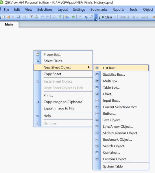
By right-clicking on an open area in a sheet, the below menu will appear.  Select “New Sheet Object” to see the available Sheet Object options – which are – List Box, Statistics Box, Multi Box, Table Box, Chart, Input Box, Current Selections Box, Button, Text Object, Line/Arrow Object, Slider/Calendar Object, Bookmark Object, Search Object, Container, Custom Object, and System Table.
Qlik_SheetObject_ListBox

The sheet objects can also be created from the Design Toolbar selections.
Qlik_SheetObject_DesignMenu

Some of our example images are taken from the Movies Database application that comes with QlikView.

List Box
The “List Box” is one of the most heavily used QlikView sheet objects.  It lists all the distinct values of a particular field. For example, you may have a List Box that displays all the products available within your data set.  The List Box is often used as a menu, where a user selects a value to analyze the data based on that value.
Qlik_SheetObject_ListBox_example2
The above example displays 3 List Boxes – the Director list box, the Actor list box, and the Title list box. When a user selects one or more values from one or more list boxes 9or any other object), the data in all other objects cascade to show only records relevant to that combination of selections.

Statistics Box
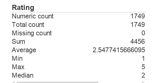
The “Statistics Box” is used to show aggregated representations of the data.  There are several statistical aggregation functions that are available, such as Sum, Average, Min, Max, Std Dev, Null Count, and several more.
Qlik_SheetObject_StatisticsBox_example
The above example shows “Statistics” for the Rating field – the number of ratings, the average rating, the min and max ratings, and the average and median ratings.

Multi Box
A Multi Box allows you to display several fields in a single object, with the values for each field available via a drop down. This object can be described as a set of List Boxes compacted together. The example screenshot below shows a Multi Box with the 3 fields, Director/Actor/Title, and by clicking any of the fields, you will get a drop down of all the values for that field – similar to a List Box for that field.
Qlik_SheetObject_MultiBox_example

Clicking on Director will display the list of all Directors, as shown below. Similarly, you can Actor or Title to get those respective drop down lists.
Qlik_SheetObject_MultiBox_dropdown_example

Table Box
The Table Box, as the name implies, displays a table of records for the selected data fields.
Qlik_SheetObject_TableBox_example

Chart
The Chart object is used for creating charts of various types. Some of the chart types available include bar, line, combo, radar, scatter, grid, pie, block, funnel, gauge, and mekko charts, and pivot and straight tables.
Qlik_SheetObject_Chart
The above shows one of the properties dialog tabs for the chart object – which shows some of the various chart types you can create.

Input Box
The Input Box object allows for users to enter a value. (which sets a variable that can be used for further processing)
Qlik_SheetObject_InputBox

Current Selections Box
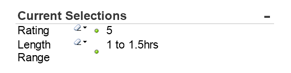
The Current Selections Box displays all the selections that the user has selected. The Current Selections box is usually placed at the top of a sheet (dashboard page) in a position that allows users to easily see the selections that have been made.
Users are able to clear selections by clicking on the eraser beside the selection in the Current Selections Box, and the data on the sheet will change accordingly.
Qlik_SheetObject_CurrentSelectionsBox
In the example above, the user has selected Rating 5 and Length Range 1 to 1.5 hrs.

Button
The Button object creates a button that can be configured to execute various types of actions. When clicked the configured action will be executed.
Qlik_SheetObject_Button

Text Object
The Text Object is used for adding simple text to the document/sheet. It can be used to display informational messages, directions, descriptions or titles and labels, or any kind of information that needs to be shared with viewers/users of the document.
Qlik_SheetObject_TextObject

Line/Arrow Object
This object is used to create a line with or without arrows, and vertical or horizontal or diagonal. This object can be used for many purposes such showing relationships and flows.
Qlik_SheetObject_LineArrow

Slider/Calendar Object
The Slider/Calendar object is used to create either a slider with multiple values that the user can slide across to select, or a calendar that the user can use to find and select a date.
Qlik_SheetObject_Slider                 Qlik_SheetObject_Calendar
In the above slider, the user has selected Rating 4.  In the calendar object, clicking the grid icon opens a calendar that allows selection.

Bookmark Object
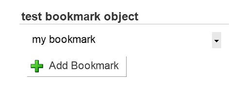
The Bookmark object is used to save the selection state of the current sheet. If a bookmark is created after a specific Actor has been selected, when you select that bookmark, the selection and corresponding data in the sheet will be displayed based on that saved selection state of the bookmark.
Multiple bookmarks can be saved for each sheet. Each having a different set of saved selections.
Qlik_SheetObject_Bookmark

Search Object
The Search Object allows users to search for values in entire data set or within a specific set of fields.
Qlik_SheetObject_Search

Container
The Container is a sheet space saving object that can contain multiple other objects, such as multiple chart objects. This allows you to display multiple views of the data within the same sheet “real estate” and change the view by clicking on the appropriate tab to get to each chart.
Qlik_SheetObject_Container
In the above example, the container contains 3 objects (3 charts), and therefore displays 3 tabs across the top, one for each chart. There are different possible orientations for the tabs – they can be to the left, right, top (as in this example), or bottom.

Custom Object
The custom object is a sheet object specifically intended to carry custom defined OCX replacement controls.
The Custom Object: Object Menu can be accessed from the Object menu, when the custom object is the active object.
Replacement controls are windowless OCX controls programmed by Qlik, yourself or third party vendors, which comply with the specifications for QlikView replacement OCX controls. The OCX control will be drawn in a rectangle on the sheet outlined by the underlying custom object. Communication between the OCX control and the QlikView document is maintained via the internal macro interpreter.

System Table
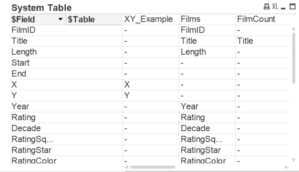
The System Table object creates a pivot table that shows the data structure of the qlikview document.
Qlik_SheetObject_SystemTable

In future posts, we will be covering each object in depth.