Microsoft Fabric is a central platform for data and analytics, and one of its powerful features that supports it being an all-in-one platform is Shortcuts. Shortcuts provide a simple way to unify data across multiple locations without duplicating or moving it. This is a big deal because it saves a LOT of time and effort that is usually involved in moving data around.
What Are Shortcuts?
Shortcuts are references (or “pointers”) to data that resides in another storage location. Instead of copying the data into Fabric, a shortcut lets you access and query it as if it were stored locally.
This is especially valuable in today’s data landscape, where data often spans OneLake, Azure Data Lake Storage (ADLS), Amazon S3, or other environments.
Types of Shortcuts
There are 2 types of shortcuts: table shortcuts and file shortcuts
Table Shortcuts
Point to existing tables in other Fabric workspaces or external sources.
Allow you to query and analyze the table without physically moving it.
File Shortcuts
Point to files (e.g., Parquet, CSV, Delta Lake) stored in OneLake or other supported storage systems.
Useful for scenarios where files are your system of record, but you want to use them in Fabric experiences like Power BI, Data Engineering, or Data Science.
Benefits of Shortcuts
Shortcuts is a really useful feature, and here are some of its benefits:
No Data Duplication: Saves storage costs and avoids data sprawl.
Single Source of Truth: Data stays in its original location while being usable across Fabric.
Speed and Efficiency: Query and analyze external data in place, without lengthy ETL processes.
Flexibility: Works across different storage platforms and Fabric workspaces.
How and Where Shortcuts Can Be Created
In OneLake: You can create shortcuts directly in OneLake to link to data from ADLS Gen2, Amazon S3, or other OneLake workspaces.
In Fabric Experiences: Whether working in Data Engineering, Data Science, Real-Time Analytics, or Power BI, shortcuts can be created in lakehouses or KQL (Kusto Query Language) databases, and you can use them directly as data in OneLake. Any Fabric service will be able to use them without copying data from the data source.
In Workspaces: Shortcuts make it possible to connect across lakehouses stored in different workspaces, breaking down silos within an organization. The shortcuts can be generated from a lakehouse, warehouse, or KQL database.
Note that warehouses do not support the creation of shortcuts. However, you can query data stored within other warehouses and lakehouses.
How Shortcuts Can Be Used
Cross-Workspace Data Access: Analysts can query data in another team’s workspace without requesting a copy.
Data Virtualization: Data scientists can work with files stored in ADLS without having to move them into Fabric.
BI and Reporting: Power BI models can use shortcuts to reference external files or tables, enabling consistent reporting without duplication.
ETL Simplification: Instead of moving raw files into Fabric, engineers can create shortcuts and build transformations directly on the source.
Common Scenarios
A finance team wants to build Power BI reports on data stored by the operations team without moving the data.
A data scientist needs access to parquet files in Amazon S3 but prefers to analyze them within Fabric.
A company with multiple Fabric workspaces wants to centralize access to shared reference data (like customer or product master data) without replication.
In summary: Microsoft Fabric Shortcuts simplify data access across locations and workspaces. Whether table-based or file-based, they allow organizations to unify data without duplication, streamline analytics, and improve collaboration.
When building measures and calculated columns in Power BI, we often face situations where we need to evaluate multiple possible outcomes and return different results based on conditions. While IF statements can handle this, they can become cumbersome, confusing, and hard to read when there are many branches.
The SWITCHfunction in DAX is a cleaner, more efficient alternative for handling multiple condition checks. Let’s take a look.
Explanation: – The Customer[Category] column is evaluated once. – If it equals 1, "Bronze" is returned; if 2, "Silver"; if 3, "Gold". – Otherwise, "Unknown" is returned.
Example 2 – Multiple Match Checks
If we wanted to calculate a commission rate based on a sales tier:
Explanation: – The Sales[SalesTier] column is evaluated once. – If it equals "Low", 0.02 is returned; if "Medium", 0.05; if "High", 0.08. – Otherwise, 0 is returned.
The SWITCH TRUE Pattern
This is a really cool and handy usage of the function. Sometimes, we don’t have a single value to compare against. Instead, we want to evaluate different logical conditions. In these cases, we can use the SWITCH TRUE pattern, which works like multiple IF statements but is much cleaner.
Here, TRUE() acts as the <expression>. Each <condition> is a Boolean expression that returns TRUE or FALSE. The function returns the corresponding result of the first condition that evaluates to TRUE.
Example 3 – SWITCH TRUE for Ranges
Suppose we want to grade students based on their score:
Explanation: – Each Scores[Score] comparison statement is evaluated in order from top to bottom, and returns the first match. – If Scores[Score] >= 90, “A” is returned; if Scores[Score] >= 80, “B”; if Scores[Score] >= 70, “C”, if Scores[Score] >= 60, “D” – Otherwise, “F” is returned.
Note: Other more complex conditions, such as ones using OR and AND logic or including complex calculations, can be used.
Why SWITCH is such a great, clean, easy to use function:
No nested IFs.
Each condition is independent.
Easy to add or modify conditions.
When to Use SWITCH Instead of IF
While IF can achieve the same results, SWITCH has several advantages:
Readability – SWITCH structures conditions in a clear, top-to-bottom list.
Maintainability – Easier to add, remove, or change cases without dealing with messy nested parentheses.
Performance – In some cases, SWITCH can be more efficient because the expression (in the basic form) is evaluated once, not multiple times as with nested IF statements.
Logical Branching – The SWITCH TRUE pattern handles complex conditions without deep nesting.
When working with data in Power BI, it’s common to need to combine, compare, or filter tables based on their rows. DAX provides three powerful table / set functions for this: UNION, INTERSECT, and EXCEPT.
These functions are especially useful in advanced calculations, comparative analysis, and custom table creation in reports. If you have used these functions in SQL, the concepts here will be familiar.
Sample Dataset
We’ll use the following two tables throughout our examples:
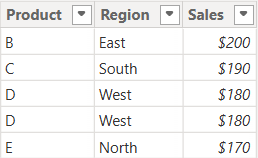
Table: Sales_2024
The above table (Sales_2024) was created using the following DAX code utilizing the DATATABLE function (or you could enter the data directly using the Enter Data feature in Power BI):
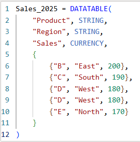
Table: Sales_2025
The above table (Sales_2025) was created using the following DAX code utilizing the DATATABLE function (or you could enter the data directly using the Enter Data feature in Power BI):
Now that we have our two test tables, we can now use them to explore the 3 table / set functions – Union, Intersect, and Except.
1. UNION – Combine Rows from Multiple Tables
The UNION function returns all rows from both tables, including duplicates. It requires the same number of columns and compatible data types in corresponding columns in the the tables being UNION’ed. The column names do not have to match, but the number of columns and datatypes need to match.
DAX Syntax:
UNION(<Table1>, <Table2>)
For our example, here is the syntax and resulting dataset:
UnionTable = UNION(Sales_2024, Sales_2025)
As you can see, the UNION returns all rows from both tables, including duplicates.
If you were to reverse the order of the tables (in the function call), the result remains the same (as shown below):
To remove duplicates, you can wrap the UNION inside a DISTINCT() function call, as shown below:
2. INTERSECT – Returns Rows Present in Both Tables
The INTERSECT function returns only the rows that appear in both tables (based on exact matches across all columns).
DAX Syntax:
INTERSECT(<Table1>, <Table2>)
For our example, here is the syntax and resulting dataset:
In this case, it returns only the rows in Sales_2025 that are also found in Sales_2024. Since the record with “D – West – $180” exists twice in Sales_2025, and also exists in Sales_2024, then both records are returned. So, while it might not be relevant for all datasets, order does matter when using INTERSECT.
3. EXCEPT – Returns Rows in One Table but Not the Other
The EXCEPT function returns rows from the first table that do not exist in the second.
DAX Syntax:
EXCEPT(<Table1>, <Table2>)
For our example, here is the syntax and resulting dataset:
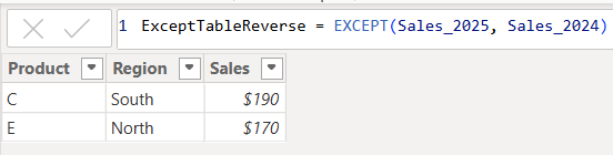
ExceptTable = EXCEPT(Sales_2024, Sales_2025)
Only the rows in Sales_2024 that are not in Sales_2025 are returned.
If you were to reverse the order of the tables, you would get the following result:
Only the rows in Sales_2025 that are not in Sales_2024 are returned. Therefore, as you have seen, since it pulls data from the first table that does not exist in the second, order does matter when using EXCEPT.
Comparison table summarizing the 3 functions:
Function
UNION
INTERSECT
EXCEPT
Purpose & Output
Returns all rows from both tables
Returns rows that appear in both tables (i.e., rows that match across all columns in both tables)
Returns rows from the first table that do not exist in the second
Match Criteria
Column position (number of columns) and datatypes
Column position (number of columns) and datatypes and values
Column position (number of columns) and datatypes must match and values must not match
Order Sensitivity
order does not matter
order matters if you want duplicates returned when they exist in the first table
order matters
Duplicate Handling
Keeps duplicates. They can be removed by using DISTINCT()
Returns duplicates only if they exist in the first table
Returns duplicates only if they exist in the first table
Additional Notes for your consideration:
Column Names: Only the column names from the first table are kept; the second table’s columns must match in count and data type.
Performance: On large datasets, these functions can be expensive, so you should consider filtering the data before using them.
Case Sensitivity: String comparisons are generally case-insensitive in DAX.
Real-World Use Cases:
UNION – Combining a historical dataset and a current dataset for analysis.
INTERSECT – Finding products sold in both years.
EXCEPT – Identifying products discontinued or newly introduced.
Data cleaning is an essential step in the data preprocessing pipeline when preparing data for analytics or data science. It involves identifying and correcting or removing errors, inconsistencies, and inaccuracies in the dataset to improve its quality and reliability. It is essential that data is cleaned before being used in analyses, reporting, development or integration. Here are some common data cleaning methods:
Handling missing values:
Delete rows or columns with a high percentage of missing values if they don’t contribute significantly to the analysis.
Impute missing values by replacing them with a statistical measure such as mean, median, mode, or using more advanced techniques like regression imputation or k-nearest neighbors imputation.
Handling categorical variables:
Encode categorical variables into numerical representations using techniques like one-hot encoding, label encoding, or target encoding.
Removing duplicates:
Identify and remove duplicate records based on one or more key variables.
Be cautious when removing duplicates, as sometimes duplicated entries may be valid and intentional.
Handling outliers:
Identify outliers using statistical methods like z-scores, box plots, or domain knowledge.
Decide whether to remove outliers or transform them based on the nature of the data and the analysis goals.
Correcting inconsistent data:
Standardize data formats: Convert data into a consistent format (e.g., converting dates to a specific format).
Resolve inconsistencies: Identify and correct inconsistent values (e.g., correcting misspelled words, merging similar categories).
Dealing with irrelevant or redundant features:
Remove irrelevant features that do not contribute to the analysis or prediction task.
Identify and handle redundant features that provide similar information to avoid multicollinearity issues.
Data normalization or scaling:
Normalize numerical features to a common scale (e.g., min-max scaling or z-score normalization) to prevent certain features from dominating the analysis due to their larger magnitudes.
Data integrity issues:
Finally, you need to address data integrity issues.
Check for data integrity problems such as inconsistent data types, incorrect data ranges, or violations of business rules.
Resolve integrity issues by correcting or removing problematic data.
It’s important to note that the specific data cleaning methods that need to be applied to a dataset will vary depending on the nature of the dataset, the analysis goals, and domain knowledge. It’s recommended to thoroughly understand the data and consult with domain experts when preparing to perform data cleaning tasks.
In this post, I will quickly show how to perform 3 key transformations in Power BI – Transpose, Pivot, and Unpivot – and what impact they have on the data they are applied to. These transformations are often needed to manipulate the original data to get it into the shape needed to create the Power BI model and reports. We will use a simple example so that you can see clearly the effect of each transformation.
This is the original dataset – Student Grades:
Transpose
Transpose the data by going to the Transform ribbon and clicking “Transpose”.
This is what the data looks like after the Transpose transformation is applied. The rows are converted into columns, and the columns are converted into rows. Default headers / column names are applied.
Pivot Column
Starting with the original dataset, we will now Pivot the dataset. Go to Transform ribbon, click on “Pivot Column”.
The Pivot Column dialog opens. As noted, it will use the values in the Names column to create new columns, and will use the Score column as the Values Column.
This is what the data looks like after Pivot is applied as described above. Pivot Column converts the selected Name column values into column headers.
Unpivot Columns
Starting with the original dataset, we will now Unpivot the dataset. First select all 4 name columns by using “Ctrl + Click”.
Then, go to Transform ribbon, click on “Unpivot Columns”. This is what the data looks like after the Unpivot Columns transformation is applied. Unpivot Columns converts the selected columns (the name columns in this case) into a column of values (Attribute) and the column values are stored in the Value column.
It is common to have the need to perform time-driven analysis on your data. For example, you may need to compare this month’s sales with the sales from the same period a year ago or you may need to calculate the number of days between two dates. Power BI provides a set of Time Intelligence functions that make it easy to perform these types of calculations. But to take advantage of the Time Intelligence functions in Power BI, you must have a date table in your Power BI model and to have that you will need to “mark” a table as a date table.
To mark a table as a date table, it must meet the following criteria:
It must have a column of data type “Date” or “Date/time”. This will be referred to as the “date column”.
The date column must contain unique date values. For example, you cannot have the value “3/1/2022” (or any other date value) listed twice (or more than once) in the table.
The date column must not contain BLANKs or NULLs. Only unique date values should be in the table’s date column.
The date column must not have any missing dates or gaps in dates. For example, you cannot have 1/1/2022 and then 1/3/2022 and not have 1/2/2022 in the date values.
The date column must span full years. Keep in mind that a year isn’t necessarily a calendar year (January-December), but should cover the entire 12 months, such as all dates between July 1, 2022 – June 30, 2023, inclusive. If you have less than one year’s dates in your table, then the range can be less than a year, but there cannot be any gaps. Also,
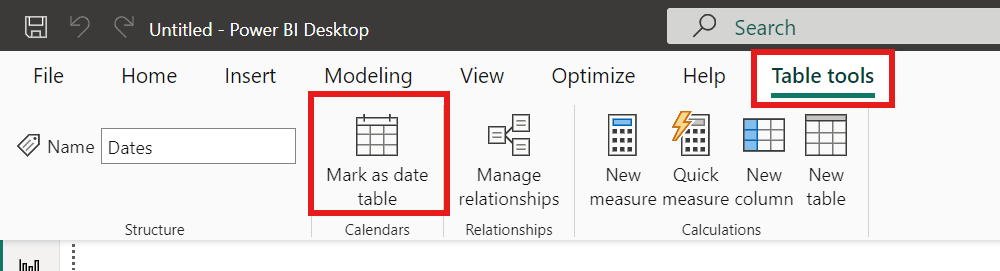
Once these rules are met, you can then mark the table as the date table. To do this, you can either right-click on the table in the Data pane and select “Mark as date table” (as shown below):
Or with the table selected in the Data pane, from the Table Tools tab, click on the “Mark as date table” icon. This icon will be grayed out if there are no date columns in the table.
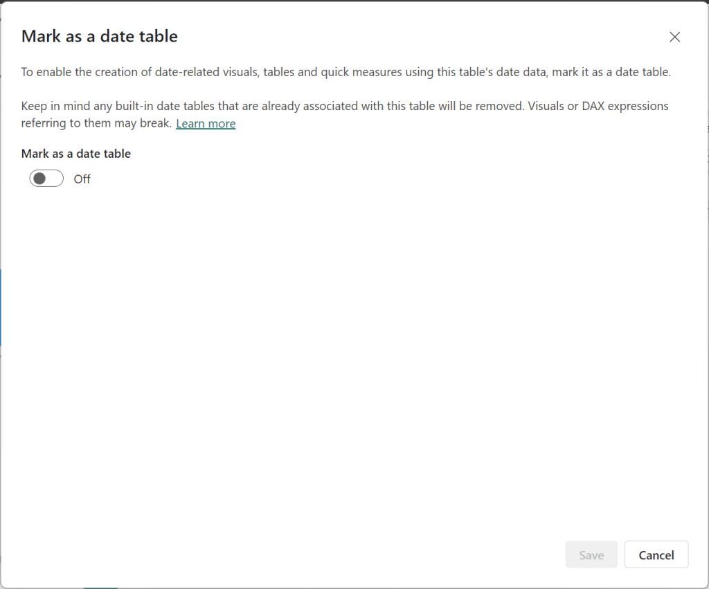
The “Mark as date table” dialog opens (which includes a warning), from which you can turn on the “Mark as date table” flag.
Turn on the flag, and then select / set the date column from the dropdown.
Power BI will then validate your data to make sure all the criteria is met for the chosen column. If you get an error, make the necessary changes and try again.
The employee life cycle, the journey of a person from “a potential candidate who applies for a job at a company at some point” to “becoming an employee of the company” to “eventually leaving the company”, consists of 6 stages. In this article I will describe the stages of the employee life cycle and will also describe a few metrics that can be used to evaluate how the organization is doing at each stage. These metrics will allow HR teams (and others) to understand how things are going at each stage so that they can make data-driven decisions to improve outcomes. As I described in more detail in another article, “What is HR / People / Workforce Analytics?”, examples of the “outcomes” that companies seek to improve, include but are not limited to: successful hiring, reduced costs, high employee engagement, reduced absences, high employee productivity, low turnover or high retention (especially of top talent), accurate staff forecasting, and attributable business impact.
While the metrics covered here are relevant in almost all companies, these are just examples of some of the possible metrics. There are many other metrics that a company could track, and other metrics may be more relevant in your organization, and you would therefore use those metrics to guide the management of the stages. The main idea here is to identify the metrics for each stage that are important to your organization and use them to help manage your life cycle using data and not just intuition.
Another thing to keep in mind is, you must have the relevant data to generate the metrics you are interested in tracking. Once you determine the metrics that are important to you, then you need to make sure the data needed to generate those metrics is available in some form, otherwise a plan must be devised to start generating, capturing, and storing the necessary data.
The Stages
The Employee Life Cycle has 6 stages. They are (1) Attracting/Recruitment, (2) Hiring, (3) Onboarding, (4) Development, (5) Engagement/Retention, and (6) Separation.
The Employee Life Cycle with its 6 stages
Each stage is important and, with the right data, can provide insight into how effective your organization is at making the best of its most important and valuable resource (its employees). Let’s take a look at each stage in more detail.
Stage 1: Attracting / Recruitment
The Attracting/Recruitment stage of The Employee Life Cycle
In this stage, organizations engage in indirect and direct efforts to attract and recruit candidates. Organizations will make efforts to build their brand as a great company and employer which will attract potential candidates with a desire to work there. They will also perform direct recruiting efforts such as job postings, job fairs, recruiting events, college outreach, and more. Companies generally desire to have a robust pool of potential candidates and a solid number of applicants for their open positions. It is important to know if you are attracting the right candidates, recruiting in the right places and with the best mediums, and using effective methods.
Below are a few metrics that can be used to analyze how things are going at this stage. You will use metrics relevant to tracking and meeting your company’s recruitment goals.
Attracting / Recruitment Metrics
Metric
Description and commentary
Average recruiting cost per hire
What the organization spends on average in recruitment to fill a position. If this number is too high, a company will need to find ways to lower the cost by implementing new recruiting methods or eliminating some methods.
Average length of hiring cycle
Measured from the date HR is asked to fill a position to the date the new hire starts the job. So, this metric spans more than just the recruitment stage. If this length of time is too long or has started trending in the wrong direction, the recruiting team can examine to determine where the delays are coming from and take necessary action if it turns out to be a result of the attracting/recruiting efforts.
On-time talent delivery factor
Average number of days that newly hired employees’ start dates differs from the need-by date listed on the requisition requesting the hire. If this metric shows that on-time delivery is low, then the team needs to examine things like … Are we attracting the wrong applicants or in other words, are we attracting quality candidates? Are our job postings effective? Are we recruiting with the right frequency and using the right mediums/methods?
Recruitment source ratio
This metric is calculated by: Internal hires/External hires This will shed light on if the company is “recruiting” internally, and also if they are developing internal people properly and encouraging internal mobility. A high Recruitment Source Ratio is a good sign that employees want to stay with the company and have opportunities for growth and mobility, which will help the company’s brand as an “employer of choice”.
Offer Acceptance Rate
What percentage of candidates accept job offers presented by the company. This is calculated by: Offers accepted/Offers made x 100. The aim is to get this number as close to 100% as possible. While this metric is most relevant in the Hiring stage, it is also important for team members that monitor the Recruitment stage to pay attention to this metric to determine if any changes need to be made in Recruiting before the person moves to the Hiring stage. For example, if this metric is too low, it might be relevant to investigate if Recruiting is setting the wrong expectations which don’t materialize for the candidate in the Hiring stage.
Internal Hire rate
The percentage of hires that are internal hires. This metric provides similar insights as the Recruitment Source Ratio metric and will let you know if your company is attracting qualified internal candidates for open positions and supporting internal mobility.
Number of applicants per job listing
The number of applicants applying to each job. This will shed light on your company’s recruiting power. It will also show which jobs may need unique recruiting approaches.
% of diverse applicants
The percentage of applicants that are diverse. This metric will help you to track if your recruiting efforts are supportive of your diversity goals.
Stage 2: Hiring
The Hiring stage of The Employee Life Cycle
This is where an organization interviews, selects, extends offers to, and hires candidates to join their staff. This is an important stage because hiring the “right” people is critical to the success of any company. But it’s also important to make sure that applicants not selected are also handled properly by the process.
Below are a few metrics that can be used to analyze how things are going at this stage. You will use metrics relevant to tracking and meeting your company’s hiring goals.
Hiring Metrics
Metric
Description and commentary
Headcount & Headcount demographics
The number of employees in the company; and the number of employees broken out by various demographic and organizational values. This helps a company to see if headcount is shrinking, growing, or stable, and if the headcount is within the company’s or division’s target ranges. This will also shed light on the diversity makeup of the employees across the company and across smaller org units within the company.
# of new hires
The number of new hires within some timeframe (month, quarter, year). This metric can help companies prepare for new employees. It may also lead to investigative questions like … why are we hiring so much? Or why has hiring dropped so much? This metric can also be analyzed in comparison to terminations, as in the Net Hire Ratio metric described below.
Time to hire
The time it takes from the job posting to a hire for the position. This is an indication of the strength of the company’s candidate pool and how efficient their recruiting and hiring processes are.
Offer acceptance rate
This metric was also included in the Recruitment stage. The percentage of candidates that accept job offers presented by the company. It is often calculated as: Offers accepted/Offers made x 100 The aim is to get this number as close to 100% as possible. If this number of low or trending down, the HR Teams can investigate to identify the causes and determine possible actions for improvement.
Net hire ratio
The ratio of the number of employees joining the organization to the number leaving. If this ratio is greater than 1 then more people are joining than those leaving, and it’s the opposite if this ratio is less than 1. It is calculated by: External hires/Terminations
New hire turnover contribution
This metric provides the percentage of total terminations that is attributable to the termination of short-tenure employees. If this number is high, then HR needs to examine recruiting, hiring, onboarding, and early development stages.
Performance of new hires in first year
This metric provides a measure of the performance of new hires. Implementing programs to drive high performance in new employees will reduce turnover and likely improve overall outcomes for the company.
New hire Turnover rate (3 months, 6 months, first year, 2 years)
This is a measure of the percentage of new hires that are leaving the company. And this should be tracked at various tenure marks and across relevant dimensions (such as your various orgs and jobs). This is another way to measure the quality of new hires and can be very useful to identify where you might be having a new hire turnover issue.
Cost per hire
This measures how much it is costing to hire each employee. Tracking this metric allows HR departments to easily recognize when they may need to make adjustments in the hiring process to reduce costs. This metric is also important for some ROI analyses.
Average cost of a bad hire
Measures the cost of hiring employees that did not work out. Breaking this down by department, position, and other dimensions is most useful and hits home with the importance of hiring “right”.
New hire satisfaction index
This metric measures if new hires are satisfied with their job. This metric’s data is usually derived from surveys. This metric will shed light on new hire turnover, and quality of hire metrics. This will help to identify if changes are needed in the recruiting, hiring, onboarding, or developments processes.
Manager satisfaction with new hires index
This metric measures the satisfaction of managers with new hires reporting to them. The data for this metric is usually derived from surveys. This metric can be compared to the “New hire satisfaction index” metric to see if these 2 perspectives are in sync or if they diverge. This will help to identify if changes are needed in the recruiting, hiring, onboarding, or developments processes.
Quality of hire
This is a measure of the value new hires bring to a company or in other words, a measure of whether new hires turned out to be good hires. How companies measure this will vary. Most will use tenure/turnover data, and some may also include employee performance data, and even employee and manager satisfaction data, and exit survey data.
Internal Hire rate
The percentage of hires that are internal hires. This metric will let you know if your company is attracting qualified internal candidates for open positions and supporting internal mobility.
% of new hires that are diverse
The percentage of new hires that are diverse. This metric will help you to track if you are meeting your diversity goals.
Stage 3: Onboarding
The Onboarding stage of the Employee Life Cycle
In this stage, an organization “onboards” newly hired employees. This includes setting up the new employees with access to buildings and networks, providing information about the company’s operations, culture, and more, and providing information about benefits, intranets, etc., and potentially introducing them to key leaders. The whole idea here is to transition the new employee into the company as smoothly as possible, with relevant knowledge to get started efficiently, and with the right expectations and mindset based on the company’s goals and culture. The first few weeks on the job is a very important phase and can “make or break” the success of new employees. It takes time to get new hires to be productive, and therefore, it’s very costly when an organization loses these new hires quickly.
Below are a few metrics that can be used to analyze how things are going at this stage. You will use metrics relevant to tracking and meeting your company’s onboarding goals.
Onboarding Metrics
Metric
Description and commentary
Onboarding satisfaction
The sentiment of new hires after the onboarding process is complete. This metric will usually be derived from survey data. Sometimes the satisfaction of the hiring managers is also tracked. This metric will shed light on whether changes are needed in the onboarding process.
New hire turnover (or new hire retention)
This metric provides the percentage of total terminations that is attributable to the termination of new or short-tenure employees, where the tenure term is usually tracked at various marks, such as 3 months, 6 months, and 1 year. If using the “retention” metric, then it’s the opposite, which is … the percentage of new employees that remain with the company. And this can also be tracked at various tenure marks.
Retention threshold
This metric tracks the threshold points at which employees are leaving. It may help to identify if you have a problem at specific tenure points, perhaps in specific roles or departments, which will allow a company to analyze more closely and determine what actions may help to address the situation.
Time to productivity
This is a measure of the time it takes to make an employee productive. This will vary by job and so it’s best to be able to measure and use it accordingly. This metric is useful for identifying what changes might be needed in the onboarding process to shorten this time. The metric can also be used for setting expectations for employees and managers.
Cost to productivity
This is the cost version of the “Time to productivity” metric. It is a measure of the costs involved in making an employee productive (cost of training and more). Similarly, this metric is useful for identifying what changes might be needed in the onboarding process to shorten this time and lower the costs.
Training completion rate
The percentage of employees completing their required training in the allotted time. Depending on the nature of the organization, this could be a critical metric and will shed light on what changes may be needed in the new employee training process or content.
Average onboarding costs per hire
The amount an organization spends on onboarding after filling a position with a new hire. This will help HR teams to determine if changes are needed to the process.
Stage 4: Development
The Development stage of the Employee Life Cycle
During this stage, organizations provide training and development opportunities for the employees including formal training, on the job training, documentation, opportunities to use new knowledge, mentoring, along with all other relevant pieces to help employees be as productive as possible in their jobs. The initial and ongoing development of employees is critical to the confidence, performance, and success of the employees on the job.
Below are a few metrics that can be used to analyze how things are going at this stage. You will use metrics relevant to tracking and meeting your company’s development goals.
Development Metrics
Metric
Description and commentary
Employee productivity
This is a measure of how productive employees are in their respective roles, and how productive employees are overall toward the goals and expectation of the company. This metric may shed light on, for example, if training is not effective or if additional trainings are needed, if the company’s culture is affecting performance, or if process or organizational changes are impacting employees, among other things. Anything negatively impacting productivity should be addressed with the highest priority.
Employee satisfaction with job/role
This metric identifies how satisfied employees are with their job. As you can imagine, unsatisfied employees lead to a whole set of issues, including the failure of the company to meet its goals. This is usually measured using surveys, one-on-one interactions, and potentially social media data. As with Employee Productivity, anything negatively impacting Employee Satisfaction should be addressed with the highest priority.
Employee performance
This is a measure of how employees are performing in their respective roles. This is similar to the “Employee productivity” metric. Are employees performing at or above expectations? If not, what can be done to improve the situation?
Training completion rate
A measure of the percentage of employees that are completing the required trainings. This may provide insight into questions like: Do we need to make changes to the training (content, delivery, timing)? Is there a correlation between completed training and job performance?
Training completion time
A measure of the time it takes to complete training. This metric will be a part of what makes up the “Time to productivity” metric. Monitoring this metric will provide insight into whether this metric is trending up or down, and what changes may be needed to the training programs.
Training effectiveness
A measure of how effective the new employee training is. Monitoring this metric will provide insight into what changes may be needed to the training programs.
Training expense per employee
A measure of how much training costs per employee. This metric will become a part of what makes up the “Cost to productivity” metric. This metric will be useful for identifying employee ROI. If this metric is trending up, it needs to be investigated to understand why and make adjustments as necessary.
Time to productivity
This metric is also in the Onboarding stage but for some jobs/companies, it goes beyond onboarding to get to full or acceptable productivity. This is a measure of the time it takes to make an employee productive. This will vary by job and so it’s best to be able to measure and use it accordingly. This metric is useful for identifying what changes might be needed in the onboarding and development stages to shorten the time. The metric can also be used for setting expectations for employees and managers.
Cost to productivity
This metric is also in the Onboarding stage but for some jobs/companies, it takes beyond onboarding to get to full or acceptable productivity. This is the cost version of the “Time to productivity” metric. It is a measure of the costs involved in making an employee productive (cost of training and more). Similarly, this metric is useful for identifying what changes might be needed in the onboarding and development stages to shorten the time and lower the costs.
Revenue per employee
This measures how much revenue the company generates per employee. Ideally, this metric should be trending up, but is acceptable to be going down during growth initiatives with lots of hiring. This metric will be useful for identifying employee ROI.
Stage 5: Engagement / Retention
The Engagement/Retention stage of the Employee Life Cycle
This is typically the longest stage of the employee life cycle, potentially spanning many years. In this stage, an organization will monitor the employees’ performance and provide competitive salaries, benefits, learning and development opportunities, growth opportunities, recognition, rewards such as bonuses, and take other steps to grow and retain effective employees. This stage could span years and includes many activities that need to be measured and monitored.
Below are a few metrics that can be used to analyze how things are going at this stage. You will use metrics relevant to tracking and meeting your company’s retention goals.
Engagement / Retention Metrics
Metric
Description and commentary
Retention rate
This measures the percentage of employees that stay with the company. It is the opposite of “Turnover rate”. It is often calculated as: (Starting headcount + external hires – terminations)/(Starting headcount + external hires) x 100
Key employee retention rate
This is the same as “Retention rate” but limited to those defined as key employees or high-performing employees or top-talent employees. Obviously, companies are most concerned about retaining their key talent. Any decline in the retention rate of key employees must be analyzed carefully and acted upon, if necessary, with a high priority.
Average retention period
Average amount of time employees stay in their positions (typically broken down by department and position). This metric can be analyzed alongside satisfaction and performance metrics.
This measures the percentage of employees leaving the organization. This metric is the opposite of “Retention rate”. It is often calculated as: (Terminations/Average headcount) x 100 And it is typically broken out by Voluntary and Involuntary Terminations. As with many other metrics, this will be most insightful when broken out by time, org (region, department, etc.), manager, termination reasons, and other dimensions.
Employee retention index
This metric measures how likely employees are to stay with the organization. The data for this metric typically comes from surveys. This metric sheds light on if changes are needed to the current retention efforts.
Employee satisfaction
This metric measures employee overall satisfaction. Employee satisfaction has a direct and significant impact on a company’s success. This is usually measured using surveys, one-on-one interactions, and potentially social media data. This measure should be tracked by org, and by role. And it should also be tracked with whether there have been recent major organizational or process changes.
Employee performance
This metric is also included in the Developing stage of the life cycle. This is a measure of how employees are performing in their respective roles. Are employees performing at or above expectations? If not, what can be done to improve the situation?
Talent turnover rate
This is the opposite of the “Key employee retention rate “ metric listed earlier, but measures turnover of key employees as opposed to retention of those employees. Obviously, companies are most concerned about reducing the turnover of their key talent.
Time since last promotion
The time since an employee was last promoted. This metric can provide insight into what impact promotions may have on areas such as turnover/retention, employee satisfaction, and performance.
Time since last salary increase
The time since an employee last received a salary increase. This metric may provide similar insights as the “Time since last promotion” metric. This metric can provide insight into what impact raises may have on areas such as turnover/retention, employee satisfaction, and performance.
Absence rate
This metric measures how often employees are absent from work. Like many other metrics, this will be most insightful when viewed by various dimensions, such as by org or by manager. High absence will undoubtedly impact the company’s overall performance and must be addressed when necessary.
Overtime hours
The is the amount of overtime hours worked by employees. A high amount of overtime is not necessarily bad, as it may be a result of business growth, but on the other hand, it may indicate problems with inefficient scheduling or overtime abuse. Another consideration is checking the impact overtime has on turnover and employee satisfaction.
Revenue per employee
This measures was also included in the “Development” stage of the life cycle. It measures how much revenue the company generates per employee. Ideally, this metric should be trending up, but is acceptable to be going down during growth initiatives. This metric will be useful for ROI analyses.
Time to resolution of HR cases
This measures how quickly HR cases are resolved. This can impact employee satisfaction and therefore, is important to track and monitor.
Stage 6: Separation
The Separation stage of the Employee Life Cycle
This is where the employee and the organization separate. The termination may be voluntary (the employee decided to leave the organization), or it may be involuntarily (the organization decided the employee must leave).
Below are a few metrics that can be used to analyze how things are going at this stage. You will use metrics relevant to tracking and meeting your company’s separation goals.
Metrics
Description and commentary
Turnover Rate (also called Attrition rate) Voluntary Turnover Rate or Voluntary Attrition Rate
This metric is also included in the Engagement/Retention stage. It measures the percentage of employees leaving the organization. It is often calculated as: (Terminations/Average headcount) x 100 And is typically broken out by Voluntary and Involuntary Terminations As with many other metrics, this will be most insightful when broken out by time, org (region, department, etc.), manager, termination reasons, and other dimensions.
Tenure
The length of time that an employee is with the company. Analyzing tenure by various dimensions and how it correlates with other metrics can lead to insights.
Overtime Hours
This metric is also included in the Engagement/Retention stage. It measures the amount of overtime hours worked by employees. A high amount of overtime could be a cause of employee dissatisfaction and lead to increased turnover. This should be asked in exit surveys, but also be tracked using hours worked data.
Employee performance
This metric is also included in the Development stage and the Engagement/Retention stage of the life cycle. This is a measure of how employees are performing in their respective roles. Are employees performing at or above expectations? Are we losing high performers or low performers?
Time since last promotion
This metric was also included in the Engagement/Retention stage. It is the time since an employee was last promoted. This metric can provide insight into what impact promotions may have on areas such as turnover/retention, employee satisfaction, and performance. Are employees quitting because of a lack of vertical career growth potential and going to other companies that are perceived to have such potential?
Time since last salary increase
This metric was also included in the Engagement/Retention stage. It may provide similar insights similar to the “Time since last promotion” metric. The time since an employee last received a salary increase. This metric can provide insight into what impact raises may have on areas such as turnover/retention, employee satisfaction, and performance. Are employees competitively paid? Are employees quitting to go to other jobs with higher pay?
Employee satisfaction
This metric was also included in the Engagement/Retention stage. It measures employee overall satisfaction. Employee satisfaction has a direct and significant impact on a company’s success. This is usually measured using surveys, one-on-one interactions, and potentially social media data. This measure should be tracked by org, and by role. And it should also be tracked with whether there have been recent major organizational or process changes.
Summary
We went through each stage of The Employee Life Cycle and a sampling of relevant metrics that can be used to manage each stage. Throughout the employee life cycle, the appropriate HR teams need to track and monitor the relevant metrics at each stage and use that information to continuously manage the processes toward improvement. Note that issues in one stage will sometimes affect other stages. For example, if a company develops a reputation of not investing in training for employees (Onboarding and Development stage) which leads to an inefficient and stressful work environment (Engagement/Retention), then this may also lead to higher-than-normal turnover (Separation stage) and may impact the company’s ability to attract and recruit top talent (Attracting/Recruitment stage), among other things.
Keep in mind that the above sets of metrics do not include all HR metrics. These are examples of some common metrics that are most likely relevant to a company, with their definitions and additional commentary to show how you can use metrics at each stage to better manage your HR processes and activities. There are many other HR metrics that may be more relevant to your company.
Also, remember that each metric (where it makes sense) should be analyzed across a variety of relevant dimensions. For example, just about all metrics should be analyzed over the dimension of time, because looking at turnover rates over all-of-time will not be as insightful as looking at it by month. Another example is, Employee Performance can be analyzed at the company level, but can be more insightful when analyzed by departments or by roles or both.
Thanks for reading! I hope you found this information useful.
An organization’s most important resource is its staff. Understanding how to take the best care of your staff and help them to be highly engaged and productive is key to the success of the organization. HR Analytics / People Analytics / Workforce Analytics can help with this. But what is that exactly?
Analytics is a multi-disciplinary field that involves the collection and curation of data, and the analysis of that data using a variety of methods and tools, to discover, interpret and share information and insights, to help develop better business understanding and help guide decision making, usually toward achieving an organization’s goals. HR / People / Workforce Analytics is analytics around an organization’s candidates and staff, and HR actions and operations. The term most commonly used for this area of specialization by people in the field has shifted from HR Analytics to People Analytics over the years, and is now trending toward Workforce Analytics, so I will just use Workforce Analytics for the rest of the article.
The data used for Workforce Analytics will come from many sources inside and outside the organization including, but not limited to, Human Capital ERP systems, Workforce applications, Recruiting applications, Payroll applications, scheduling applications, employee and candidate surveys, social media, Glassdoor, and more. This data can be transformed, integrated and aggregated as appropriate, and then analyzed to provide information to help with operational and strategic decision making around areas such as staffing, recruiting, retention, turnover, absence, compensation and benefits, employee engagement, job satisfaction, performance and productivity, training and development, diversity, equity and inclusion, and operational efficiency, among others.
This analysis is usually performed across time periods (months, years) to allow for period-to-period comparisons and trend analysis to determine if the various metrics being measured and analyzed are improving or not. And the analysis is also usually done across all levels of the organization, so that information is available to support decision making for the entire organization or for a single department or for a specific segment of employees (such as all the clinical employees within a healthcare organization) or potentially for an individual employee.
The end goal usually includes helping with efforts such as:
Understanding the current workforce landscape and knowing any operational tasks that need to be performed
Hiring better candidates by predicting candidate success and reducing recruiting/hiring costs
Improve employee engagement through a better understanding of employee’s true needs, and what is working and what is not, and reducing absences as a result
Increase employee productivity through a better understanding of how employees work and things that slow them down
Reducing turnover by predicting employees at a high risk of turnover and implementing proactive retention measures
Forecast future staffing needs to better prepare for it with recruiting and training & development
Determining the business impact of HR initiatives
The diagram below summarizes the Workforce Analytics components to give you an overview of this article in a quick glance.
Of course, all organizations are different, and so the goals of an organization, the type of data available and the type of analyses of interest to an organization, will vary. But the importance and value of Workforce Analytics, which helps organizations make the most of their most important resource, is critical to just about all medium to large organizations, regardless of industry and prior success.
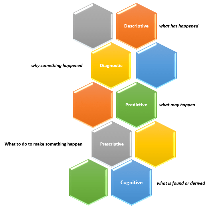
New capabilities and solutions have led to a new classification of analytics called Cognitive Analytics.
Cognitive Analytics involves bringing together technologies such as Artificial Intelligence (AI), Machine Learning (ML), and Deep Learning to apply human-like behavior to data tasks at unhuman scale, such as, searching through massive amounts of data and making sense of its contexts and be able to provide information from it, such as a likely answer or a sentiment score. This form of analytics provides new solutions that do not fit into any of the other four classifications and, in short, can be dubbed as “what is found or derived“.
There are many use cases that could benefit from this type of analytics, such as, personalization of services at scale, and improved customer service efficiency.
Thanks for reading and best wishes on your data journey!
Our team at work recently started using the Power BI platform. We are just getting going but I am already loving this tool. Our current enterprise BI platforms are Qlik and OBI (Oracle Business Intelligence), however, Power BI has has gained significant traction in business teams over the last couple years where it used for departmental reporting and analysis.
I see why the business teams love this tool and am excited about bringing it into our portfolio of tools for delivering analytic solutions across the company. These are some of the reasons I like Power BI:
First and foremost, we have not yet come across anything that we currently do in Qlik or OBI that we will not be able to do in Power BI. This was very important.
Power BI has a very intuitive and well laid out interface. You can easily switch between the visualizations, the data, and the data model. And within each of those tabs, you easily navigate using the well-placed objects and menu items. I found the interface easy to get accustomed to.
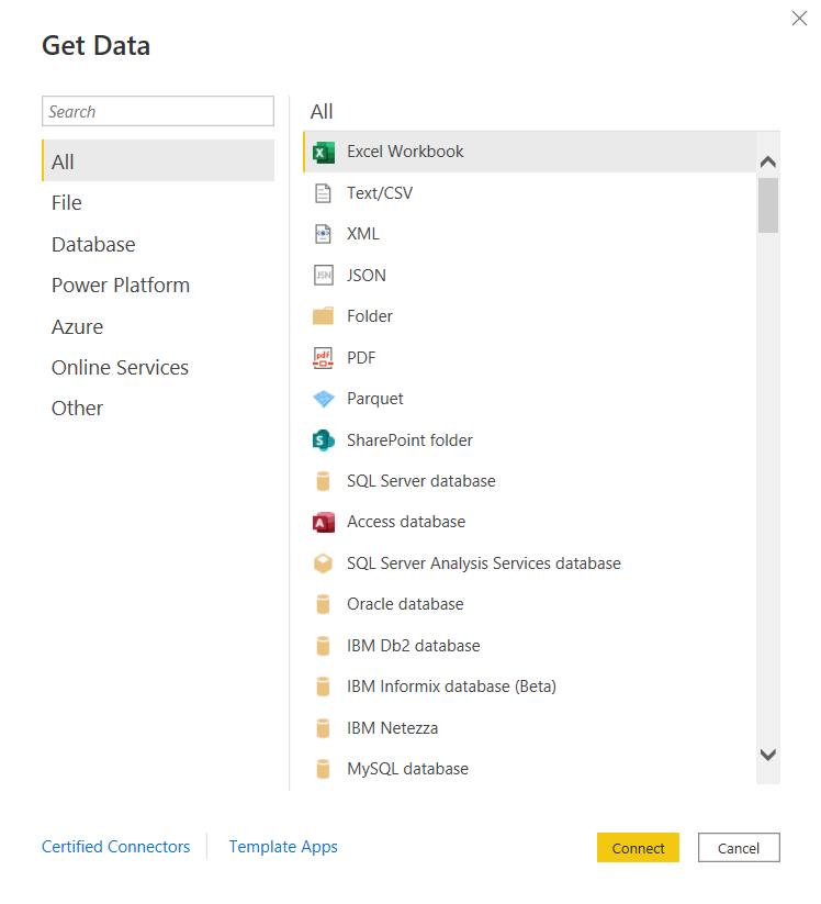
You can connect to just about any data source. The list is long. It seems the only source missing is an alien database on Mars. 🙂 I am kidding, but I did not find a native connector for Informix – the most uncommon database that we currently have as a source, but of course, ODBC and JDBC are available for those scenarios. Take a look.
and there are many more!
Some notable connectors are SQL Server Analysis Services, PostgreSQL, Amazon Redshift, Google BigQuery, Snowflake, various Azure data sources, Salesforce, Spark, GitHub, Databricks, and many more.
There are many awesome features for handling Excel data. And although we try to avoid Excel data as a source, it’s just not possible at times, and sometimes it makes sense to use those sources. However, the Power Query functionality allows users to perform ETL tasks on any data from any source.
Power BI has many built-in visualization options.
And you have the ability to “get more” from the marketplace.
Data modeling in Power BI is based on a methodology that our team is very familiar with: Dimensional Modeling, also known as, Star-Schema Modeling. And this is a proven method that works for efficient analytic solutions. In Power BI, it is also easy to create relationships between tables, change data types, and build hierarchies.
Within the data models, you can also use a versatile language called DAX (Data Analysis Expressions) to manipulate data, filter data, build measures, and more. I find that what’s possible with DAX brings Power BI into a whole other tier of flexibility compared to other tools. There is a bit of a learning curve for DAX, but you can start by focusing on a few key functions, and then expand your knowledge over time.
As you would expect in any modern BI platform, the security features in Power BI provide for object-level and data-level security. We have set up some simple security scenarios so far and it was straightforward. We will be digging more into setting up some more complex security scenarios soon and will report on that experience.
Data profiling features are built into Power BI, which may save you some time from having to jump into another query tool to profile your data.
Along with some standard analytic features, such as TopN, conditional formatting, and aggregate functions, Power BI also offers AI visuals, R and Python visuals, and advanced algorithms (such as key influencers and outliers) are available. I can foresee us using these features in the future.
Integration options with Office 365, SharePoint, and Teams.
Power BI is a great platform for one of the most significant trends in analytics – that is, users clamoring for Self-Service Analytics. With the ability to easily secure and share Power BI datasets, and users able to easily connect and use that data with an intuitive, optional code, tool that they may already have exposure to, it will be easier to implement self-service solutions. There are also some cool features for report consumers, such as personalization of visuals and mobile view.
A company called P3Adaptive delivered an awesome training for us, but there are tons of free resources available for learning. A good place to start is the Power BI lessons on Microsoft Learn – Power BI. And then, sign up for Dashboard in a Day (DIAD), a free one-day instructor-led training. You can find and register for DIAD classes here: Microsoft Events – DIAD
There are reasons why the Power BI platform has been at the top of the “Gartner Magic Quadrant for Business Intelligence and Analytics Platforms” for the last 3 years. It has a lot going for it and the company seems to be aggressive about continuous improvement.
I look forward to the Power BI journey and the ongoing quest to make our data as valuable as possible for our company.
Information and resources for the data professionals' community


 and there are many more!