Tag: Power BI

Power BI refresh error: Column ‘X’ in table ‘Y’ contains blank values and this is not allowed for columns on the one-side of a many-to-one relationship or for columns that are used as the primary key of a table

I was getting this error message when I attempted to refresh a Power BI application:

"Column 'Date' in table 'Date Dim' contains blank values and this is not allowed for columns on the one-side of a many-to-one relationship or for columns that are used as the primary key of a table"

However, despite what the message indicated, I double-checked and confirmed that I did not have any blank values in the ‘Date Dim’ table.

It turns out that you may also get this error (although incorrectly worded in my opinion) if the blanks are in the joining table. In my case, I had blanks in a ‘Snapshot Date’ column in the fact table that was joined to the ‘Date Dim’ table. Once these blanks were filled, the refresh ran without error.

One thing to look out for in these cases (since this is what happened in my case), if your source is Excel, undo all filters to make sure that you do not have any rows being filtered out when checking for blanks values across your columns, because this could potentially inadvertently hide the rows with the blank values and cause you to miss them.

I hope you found this helpful.

Choosing the Right Chart to display your data in Power BI or any other analytics tool

Data visualization is at the heart of analytics. Choosing the right chart or visual can make the difference between insights that are clear and actionable, and insights that remain hidden. There are many visualization types available for showcasing your data, and choosing the right ones for your use cases is important. Below, we’ll walk through some common scenarios and share information on the charts best suited for them, and will also touch on some Power BI–specific visuals you should know about.

1. Showing Trends Over Time

When to use: To track how a measure changes over days, months, or years.

Best charts:

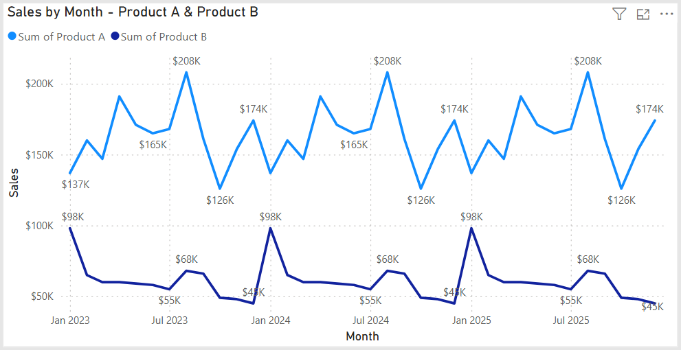
  • Line Chart: The classic choice for time series data. Best when you want to show continuous change. In Power BI, the line chart visual can also be used for forecasting trends.
  • Area Chart: Like a line chart but emphasizes volume under the curve—great for cumulative values or when you want to highlight magnitude.
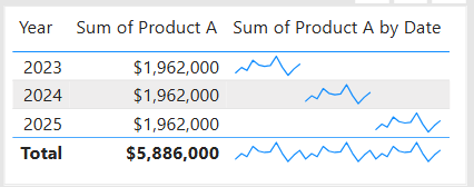
  • Sparklines (Power BI): Miniature line charts embedded in tables or matrices. Ideal for giving quick context without taking up space.

2. Comparing Categories

When to use: To compare values across distinct groups (e.g., sales by region, revenue by product).

Best charts:

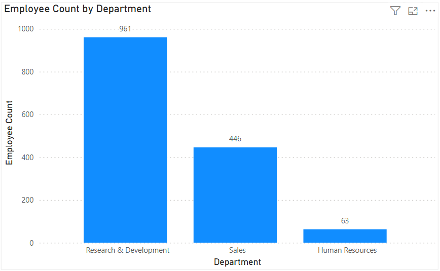
  • Column Chart: Vertical bars for category comparisons. Good when categories are on the horizontal axis.
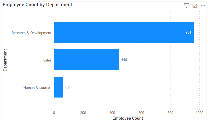
  • Bar Chart: Horizontal bars—useful when category names are long or when ranking items. Is usually a better choice than the column chart when there are many values.
  • Stacked Column/Bar Chart: Show category totals and subcategories in one view. Works for proportional breakdowns, but can get hard to compare across categories.

3. Understanding Relationships

When to use: To see whether two measures are related (e.g., advertising spend vs. sales revenue).

Best charts:

  • Scatter Chart: Plots data points across two axes. Useful for correlation analysis. Add a third variable with bubble size or color to generate more insights. This chart can also be useful for identifying anomalies/outliers in the data.
  • Line & Scatter Combination: Power BI lets you overlay a line for trend direction while keeping the scatter points.
  • Line & Bar/Column Chart Combination: Power BI offers some of these combination charts also to allow you to relate your comparison measures to your trend measures.

4. Highlighting Key Metrics

Sometimes you don’t need a chart—you just want a single number to stand out. These types of visuals are great for high-level executive dashboards, or for the summary page of dashboards in general.

Best visuals in Power BI:

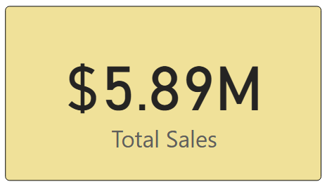
  • Card Visual: Displays one value clearly, like Total Sales.
  • KPI Visual: Adds target context and status indicator (e.g., actual vs. goal).
  • Gauge Visual: Circular representation of progress toward a goal—best for showing percentages or progress to target. For example, Performance Rating score shown on the scale of the goal.

5. Distribution Analysis

When to use: To see how data is spread across categories or ranges.

Best charts:

  • Column/Bar Chart with bins: Useful for creating histograms in Power BI.
  • Box-and-Whisker Chart (custom visual): Shows median, quartiles, and outliers.
  • Pie/Donut Charts: While often overused, they can be effective for showing composition when categories are few (ideally 3–5). For example, show the number and percentage of employees in each department.

6. Spotting Problem Areas

When to use: To identify anomalies or areas needing attention across a large dataset.

Best charts:

  • Heatmap: A table where color intensity represents value magnitude. Excellent for finding hot spots or gaps. This can be implemented in Power BI by using a Matrix visual with conditional formatting in Power BI.
  • Treemap: Breaks data into rectangles sized by value—helpful for hierarchical comparisons and for easily identifying the major components of the whole.

7. Detail-Level Exploration

When to use: To dive into raw data while keeping formatting and hierarchy.

Best visuals:

  • Table: Shows granular row-level data. Best for detail reporting.
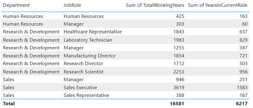
  • Matrix: Adds pivot-table–like functionality with rows, columns, and drill-down. Often combined with conditional formatting and sparklines for added insight.

8. Part-to-Whole Analysis

When to use: To see how individual parts contribute to a total.

Best charts:

  • Stacked Charts: Show both totals and category breakdowns.
  • 100% Stacked Charts: Normalize totals so comparisons are by percentage share.
  • Treemap: Visualizes hierarchical data contributions in space-efficient blocks.

Quick Reference: Which Chart to Use?

ScenarioBest Visuals
Tracking trends, forecasting trendsLine, Area, Sparklines
Comparing categoriesColumn, Bar, Stacked
Showing relationshipsScatter, Line + Scatter, Line + Column/Bar
Highlighting metricsCard, KPI, Gauge
Analyzing distributionsHistogram (columns with bins), Box & Whisker, Pie/Donut (for few categories)
Identifying problem areasHeatmap (Matrix with colors), Treemap, Scatter
Exploring detail dataTable, Matrix
Showing part-to-wholeStacked Column/Bar, 100% Stacked, Treemap, Pie/Donut

The below graphic shows the visualization types available in Power BI. You can also import additional visuals by clicking the “3-dots” (get more visuals) at the bottom of the visualization icons.

Summary

Power BI, and other BI/analytics tools, offers a rich set of visuals, each designed to represent data in a way that suits a specific set of analytical needs. The key is to match the chart type with the story you want the data to tell. Whether you’re showing a simple KPI, uncovering trends, or surfacing problem areas, choosing the right chart ensures your insights are clear, actionable, and impactful. In addition, based on your scenario, it can also be beneficial to get feedback from the user population on what other visuals they might find useful or what other ways they would they like to see the data.

Thanks for reading! And good luck on your data journey!

Understanding Microsoft Fabric Shortcuts

Microsoft Fabric is a central platform for data and analytics, and one of its powerful features that supports it being an all-in-one platform is Shortcuts. Shortcuts provide a simple way to unify data across multiple locations without duplicating or moving it. This is a big deal because it saves a LOT of time and effort that is usually involved in moving data around.

What Are Shortcuts?

Shortcuts are references (or “pointers”) to data that resides in another storage location. Instead of copying the data into Fabric, a shortcut lets you access and query it as if it were stored locally.

This is especially valuable in today’s data landscape, where data often spans OneLake, Azure Data Lake Storage (ADLS), Amazon S3, or other environments.

Types of Shortcuts

There are 2 types of shortcuts: table shortcuts and file shortcuts

  1. Table Shortcuts
    • Point to existing tables in other Fabric workspaces or external sources.
    • Allow you to query and analyze the table without physically moving it.
  2. File Shortcuts
    • Point to files (e.g., Parquet, CSV, Delta Lake) stored in OneLake or other supported storage systems.
    • Useful for scenarios where files are your system of record, but you want to use them in Fabric experiences like Power BI, Data Engineering, or Data Science.

Benefits of Shortcuts

Shortcuts is a really useful feature, and here are some of its benefits:

  • No Data Duplication: Saves storage costs and avoids data sprawl.
  • Single Source of Truth: Data stays in its original location while being usable across Fabric.
  • Speed and Efficiency: Query and analyze external data in place, without lengthy ETL processes.
  • Flexibility: Works across different storage platforms and Fabric workspaces.

How and Where Shortcuts Can Be Created

  • In OneLake: You can create shortcuts directly in OneLake to link to data from ADLS Gen2, Amazon S3, or other OneLake workspaces.
  • In Fabric Experiences: Whether working in Data Engineering, Data Science, Real-Time Analytics, or Power BI, shortcuts can be created in lakehouses or KQL (Kusto Query Language) databases, and you can use them directly as data in OneLake. Any Fabric service will be able to use them without copying data from the data source.
  • In Workspaces: Shortcuts make it possible to connect across lakehouses stored in different workspaces, breaking down silos within an organization. The shortcuts can be generated from a lakehouse, warehouse, or KQL database.
  • Note that warehouses do not support the creation of shortcuts. However, you can query data stored within other warehouses and lakehouses.

How Shortcuts Can Be Used

  • Cross-Workspace Data Access: Analysts can query data in another team’s workspace without requesting a copy.
  • Data Virtualization: Data scientists can work with files stored in ADLS without having to move them into Fabric.
  • BI and Reporting: Power BI models can use shortcuts to reference external files or tables, enabling consistent reporting without duplication.
  • ETL Simplification: Instead of moving raw files into Fabric, engineers can create shortcuts and build transformations directly on the source.

Common Scenarios

  • A finance team wants to build Power BI reports on data stored by the operations team without moving the data.
  • A data scientist needs access to parquet files in Amazon S3 but prefers to analyze them within Fabric.
  • A company with multiple Fabric workspaces wants to centralize access to shared reference data (like customer or product master data) without replication.

In summary: Microsoft Fabric Shortcuts simplify data access across locations and workspaces. Whether table-based or file-based, they allow organizations to unify data without duplication, streamline analytics, and improve collaboration.

Here is a link to the Microsoft Learn OneLake documentation about Shortcuts. From there you will be able to explore all the Shortcut topics shown in the image below:

Thanks for reading! I hope you found this information useful.

Creating a DATE value in Power BI DAX, Power Query M, and Excel

You may at times need to create a date value in Power BI either using DAX or M, or in Excel. This is a quick post that describes how to create a date value in Power BI DAX, Power Query M language, and in Excel. Working with dates is an every-day thing for anyone that works with data.

In Power BI DAX, the syntax is:

DATE(<year>, <month>, <day>) //the parameters must be valid numbers

DATE(2025, 8, 23) //returns August 23, 2025

In Power Query M, the syntax is:

#date(<year>, <month>, <day>) //the parameters must be valid numbers

#date(2022, 3, 6) //returns March 6, 2022

In Excel, the syntax is:

DATE(<year>, <month>, <day>) //the parameters must be valid numbers

DATE(1989, 12, 3) //produces 12/3/1989 (officially returns a number that represents the date in Excel date-time code)

Thanks for reading. Hope you found this useful.

Microsoft Fabric OneLake Catalog – description and links to resources

What is OneLake Catalog?

Microsoft Fabric OneLake Catalog is the next generation, enhanced version of the OneLake Data Hub. It provides a complete solution in a central location for team members (data engineers, data scientists, analysts, business team members, and other stakeholders) to browse, manage, and govern all their data from a single, intuitive location. It provides an intuitive and efficient user interface and truly simplifies and transforms the way we can manage, explore, and utilize content in Fabric. Usage is contextual and it has unified all Fabric item types (including Power BI items) and expanded support to all Fabric item types, integrating experiences, and providing detailed views of data subitems. It is a great tool.

Why use OneLake Catalog?

This tool will make your work within Fabric easier, and it will reduce duplication of items due to improved discoverability, and it will enhance our ability to govern data objects within the platform. So, check out the resources below to learn more.

Here is a link to a detailed Microsoft blog post introducing the OneLake Catalog:

And here is a link to a Microsoft Learn OneLake Catalog overview:

And finally, this is a link to a great, short (less than 5 min) video that gives an overview of the OneLake Catalog:

Thanks for reading! Good luck on your data journey!

Using MAXX in Power BI to find the Latest Event Date across several event date columns in each row

We were working with some HR data which included multiple date fields such as Hire Date, Transfer Date, Promotion Date, and Termination Date. We needed to determine the most recent event date before termination. We ended up using the MAXX function to do this.

Sample dataset to demonstrate the scenario:

Using the following dataset to demonstrate the example:

EmployeeHire DateTransfer DatePromotion DateTermination Date
Alice2020-01-152021-05-102022-03-202023-06-15
Bob2019-11-012020-07-152021-10-05(blank)
Carol2021-03-25(blank)2021-09-142022-02-28

The goal is to calculate the most recent event and event date (i.e., the latest event and its date) between Hire Date, Transfer Date, and Promotion Date for each row. Termination Date was excluded from the comparison because the goal was to find the latest event before Termination (if that had occurred).

Using MAXX for Row-by-Row Evaluation

MAXX is an iterator function in DAX, meaning it evaluates an expression for each row of a table, then returns the maximum value. Iterator functions such as MAXX and SUMX work row-by-row over a table, in contrast to aggregate functions like MAX and SUM which operate over an entire column at once.

  • Aggregate example (MAX): Finds the highest value in a column across all rows.
  • Iterator example (MAXX): Evaluates an expression for each row in a virtual table, then finds the highest value.

This makes MAXX ideal for scenarios like this where the various dates are in multiple columns of the same row, and we need to find the max of these dates on each row.

DAX Code Example: This is an example of the code that was used to derive the latest event date.

Latest Event Date =
MAXX(
{
[Hire Date],
[Transfer Date],
[Promotion Date]
},
[Value]
)

Code Explanation:

  1. Create a virtual table with one column and three rows—one for each date we want to consider.
  2. MAXX iterates through this virtual table, evaluates [Value] (the date), and returns the latest / maximum (max) date for each iteration.

Expected Output based on the sample dataset:

EmployeeHire DateTransfer DatePromotion DateTermination DateLatest Event Date
Alice2020-01-152021-05-102022-03-202023-06-152022-03-20
Bob2019-11-012020-07-152021-10-05(blank)2021-10-05
Carol2021-03-25(blank)2021-09-142022-02-282021-09-14

This is much cleaner than using nested IF checks to determine the latest date / latest event for each record. Of course, the MAXX function can be used in other scenarios where you want to find the max value across multiple columns on each row.

Thanks for reading and I hope you found this useful!

Mastering the SWITCH Function in Power BI DAX – includes usage and code examples

When building measures and calculated columns in Power BI, we often face situations where we need to evaluate multiple possible outcomes and return different results based on conditions. While IF statements can handle this, they can become cumbersome, confusing, and hard to read when there are many branches.

The SWITCH function in DAX is a cleaner, more efficient alternative for handling multiple condition checks. Let’s take a look.

SWITCH Function Signature

The basic DAX syntax of the SWITCH function is:

SWITCH(<expression>,
       <value1>, <result1>,
       <value2>, <result2>,
       ...,
       [<else>])
  • <expression> – The value or expression you want to evaluate once.
  • <valueN> – A possible value that the expression could equal.
  • <resultN> – The result to return if the expression equals the corresponding <valueN>.
  • [<else>] – (Optional) The default result if none of the value-result pairs match.

Note: the <expression> is evaluated once and compared against multiple <value> options in sequence until a match is found.

Example 1 – Basic SWITCH Usage

Suppose we have a Customer[Category] column containing numeric codes:

  • 1 = “Bronze”
  • 2 = “Silver”
  • 3 = “Gold”

We can translate these codes into readable labels using SWITCH as in the following DAX code example:

Customer Category Label =
SWITCH(Customer[Category],
       1, "Bronze",
       2, "Silver",
       3, "Gold",
       "Unknown"
      )

Explanation:
– The Customer[Category] column is evaluated once.
– If it equals 1, "Bronze" is returned; if 2, "Silver"; if 3, "Gold".
– Otherwise, "Unknown" is returned.

Example 2 – Multiple Match Checks

If we wanted to calculate a commission rate based on a sales tier:

Commission Rate =
SWITCH(Sales[SalesTier],
       "Low", 0.02,
       "Medium", 0.05,
       "High", 0.08,
       0
)

Explanation:
– The Sales[SalesTier] column is evaluated once.
– If it equals "Low", 0.02 is returned; if "Medium", 0.05; if "High", 0.08.
– Otherwise, 0 is returned.

The SWITCH TRUE Pattern

This is a really cool and handy usage of the function. Sometimes, we don’t have a single value to compare against. Instead, we want to evaluate different logical conditions. In these cases, we can use the SWITCH TRUE pattern, which works like multiple IF statements but is much cleaner.

DAX Syntax:

SWITCH( TRUE(),
<condition1>, <result1>,
<condition2>, <result2>,
...,
[<else>])

Here, TRUE() acts as the <expression>. Each <condition> is a Boolean expression that returns TRUE or FALSE. The function returns the corresponding result of the first condition that evaluates to TRUE.

Example 3 – SWITCH TRUE for Ranges

Suppose we want to grade students based on their score:

Grade =
SWITCH(TRUE(),
Scores[Score] >= 90, "A",
Scores[Score] >= 80, "B",
Scores[Score] >= 70, "C",
Scores[Score] >= 60, "D",
"F"
)

Explanation:
– Each Scores[Score] comparison statement is evaluated in order from top to bottom, and returns the first match.
– If Scores[Score] >= 90, “A” is returned; if Scores[Score] >= 80, “B”; if Scores[Score] >= 70, “C”, if Scores[Score] >= 60, “D”
– Otherwise, “F” is returned.

Note: Other more complex conditions, such as ones using OR and AND logic or including complex calculations, can be used.

Why SWITCH is such a great, clean, easy to use function:

  • No nested IFs.
  • Each condition is independent.
  • Easy to add or modify conditions.

When to Use SWITCH Instead of IF

While IF can achieve the same results, SWITCH has several advantages:

  1. ReadabilitySWITCH structures conditions in a clear, top-to-bottom list.
  2. Maintainability – Easier to add, remove, or change cases without dealing with messy nested parentheses.
  3. Performance – In some cases, SWITCH can be more efficient because the expression (in the basic form) is evaluated once, not multiple times as with nested IF statements.
  4. Logical Branching – The SWITCH TRUE pattern handles complex conditions without deep nesting.

Example 4 – IF vs. SWITCH

Let’s take a look at a comparison example:

IF Version:
Category Label =
IF(Customer[Category] = 1, "Bronze",
IF(Customer[Category] = 2, "Silver",
IF(Customer[Category] = 3, "Gold", "Unknown")
)
)

SWITCH Version:
Category Label =
SWITCH(Customer[Category],
1, "Bronze",
2, "Silver",
3, "Gold",
"Unknown"
)

Result: As you can see, the SWITCH version is shorter, easier to read, less error-prone, and easier to maintain.

Key Takeaways

  • Use basic SWITCH when comparing one expression to multiple possible values.
  • Use SWITCH TRUE when checking multiple conditions or ranges.
  • SWITCH often results in cleaner, more maintainable DAX than deeply nested IF statements.
  • Always include a default (else) value to handle unexpected cases.

Thanks for reading and I hope you found this useful.

Calculated Columns vs. Measures in Power BI: Understanding the Differences

When working in Power BI, two common ways to add custom calculations to your data model are calculated columns and measures. While they both use DAX (Data Analysis Expressions), their purposes, storage, and performance implications differ significantly. Understanding these differences can help you design more efficient and maintainable Power BI reports.

1. What They Are

Calculated Column
A calculated column is a new column added to a table in your data model. It is calculated row-by-row based on the existing data and stored in the model like any other column.

Measure
A measure is a calculation that is evaluated on the fly, usually aggregated at the visual level. Measures don’t exist as stored data in your table—they are computed dynamically based on filter context.

To create a Calculated Column or a Measure, either from the Home menu …

… or from the Table Tools menu …

… select “New Column” (to create a Calculated Column) or “New Measure” (to create a new measure). Then enter the relevant DAX for the column or measure as shown in the next section below.

2. DAX Syntax Examples

Imagine a Sales table with columns: Product, Quantity, and Unit Price.

Calculated Column Example
Creating a calculated column:
Total Price = Sales[Quantity] * Sales[Unit Price]

This new column will appear in the table and will be stored for every row in the Sales table.

Measure Example
Creating a measure:
Total Sales = SUMX(Sales, Sales[Quantity] * Sales[Unit Price])

This measure calculates the total across all rows in the current filter context—without physically storing a column for every row.

3. When They Are Computed

FeatureCalculated ColumnMeasure
When computedDuring data model processing (data refresh).At query time (when a visual or query is run).
Where storedIn-memory within the data model (VertiPaq storage).Not stored—calculated on demand.
Performance impactIncreases model size (RAM & disk space).Consumes CPU at query time, minimal storage overhead.

4. Storage and Performance Implications

  • Calculated Columns
    • RAM & Disk Space: Stored in VertiPaq compression format. Large columns increase your .pbix file size and memory footprint.
    • CPU: Low impact at query time since results are precomputed, but refresh time increases.
    • Good for: Fields you need for filtering, sorting, or joining tables.
  • Measures
    • RAM & Disk Space: No significant impact on storage since they’re not persisted.
    • CPU: Can be CPU-intensive if the calculation is complex and used across large datasets.
    • Good for: Aggregations, KPIs, and calculations that change based on slicers or filters.

5. When to Use Each

When to Use a Calculated Column

  • You need a field for row-level filtering or grouping in visuals.
  • You need a column to create relationships between tables.
  • The calculation is row-specific and independent of report filters.

Example:

Sales Category = IF(Sales[Quantity] > 100, "High Volume", "Low Volume")

When to Use a Measure

  • You want calculations that respond dynamically to slicers and filters.
  • You want to avoid inflating your data model with unnecessary stored columns.
  • The calculation is aggregate-based.

Example:

Average Order Value = DIVIDE([Total Sales], DISTINCTCOUNT(Sales[Order ID]))

6. When They Cannot Be Used

SituationCalculated ColumnMeasure
Relationship creation✅ Can be used❌ Cannot be used
Row-level filtering in slicers✅ Can be used❌ Cannot be used
Dynamic response to slicers❌ Cannot recalculate✅ Fully dynamic
Reduce model size❌ Adds storage✅ No storage impact

7. Summary Table

FeatureCalculated ColumnMeasure
Stored in modelYesNo
Calculated atData refreshQuery time
Memory impactHigher (stored per row)Minimal
Disk size impactHigherMinimal
Dynamic filtersNoYes
Best forFiltering, relationships, sortingAggregations, KPIs, dynamic calcs

8. Best Practices

  • Default to measures when possible—they’re lighter and more flexible.
  • Use calculated columns sparingly, only when the calculation must exist at the row level in the data model.
  • If a calculated column is only used in visuals, try converting it to a measure to save memory.
  • Be mindful of CPU impact for very complex measures—optimize DAX to avoid performance bottlenecks.

I hope this was helpful in clarifying the differences between Calculated Columns and Measures, and will help you to determine which you need in various scenarios for your Power BI solutions.

Thanks for reading!

Understanding UNION, INTERSECT, and EXCEPT in Power BI DAX

When working with data in Power BI, it’s common to need to combine, compare, or filter tables based on their rows. DAX provides three powerful table / set functions for this: UNION, INTERSECT, and EXCEPT.

These functions are especially useful in advanced calculations, comparative analysis, and custom table creation in reports. If you have used these functions in SQL, the concepts here will be familiar.

Sample Dataset

We’ll use the following two tables throughout our examples:

Table: Sales_2024

The above table (Sales_2024) was created using the following DAX code utilizing the DATATABLE function (or you could enter the data directly using the Enter Data feature in Power BI):

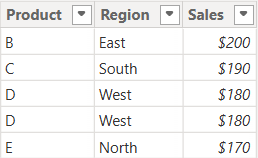
Table: Sales_2025

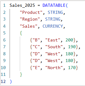
The above table (Sales_2025) was created using the following DAX code utilizing the DATATABLE function (or you could enter the data directly using the Enter Data feature in Power BI):

Now that we have our two test tables, we can now use them to explore the 3 table / set functions – Union, Intersect, and Except.

1. UNION – Combine Rows from Multiple Tables

The UNION function returns all rows from both tables, including duplicates. It requires the same number of columns and compatible data types in corresponding columns in the the tables being UNION’ed. The column names do not have to match, but the number of columns and datatypes need to match.

DAX Syntax:

UNION(<Table1>, <Table2>)

For our example, here is the syntax and resulting dataset:

UnionTable = UNION(Sales_2024, Sales_2025)

As you can see, the UNION returns all rows from both tables, including duplicates.

If you were to reverse the order of the tables (in the function call), the result remains the same (as shown below):

To remove duplicates, you can wrap the UNION inside a DISTINCT() function call, as shown below:

2. INTERSECT – Returns Rows Present in Both Tables

The INTERSECT function returns only the rows that appear in both tables (based on exact matches across all columns).

DAX Syntax:

INTERSECT(<Table1>, <Table2>)

For our example, here is the syntax and resulting dataset:

IntersectTable = INTERSECT(Sales_2024, Sales_2025)

Only the rows in Sales_2024 that are also found in Sales_2025 are returned.

If you were to reverse the order of the tables, you would get the following result:

IntersectTableReverse = INTERSECT(Sales_2025, Sales_2024)

In this case, it returns only the rows in Sales_2025 that are also found in Sales_2024. Since the record with “D – West – $180” exists twice in Sales_2025, and also exists in Sales_2024, then both records are returned. So, while it might not be relevant for all datasets, order does matter when using INTERSECT.

3. EXCEPT – Returns Rows in One Table but Not the Other

The EXCEPT function returns rows from the first table that do not exist in the second.

DAX Syntax:

EXCEPT(<Table1>, <Table2>)

For our example, here is the syntax and resulting dataset:

ExceptTable = EXCEPT(Sales_2024, Sales_2025)

Only the rows in Sales_2024 that are not in Sales_2025 are returned.

If you were to reverse the order of the tables, you would get the following result:

ExceptTableReverse = EXCEPT(Sales_2025, Sales_2024)

Only the rows in Sales_2025 that are not in Sales_2024 are returned. Therefore, as you have seen, since it pulls data from the first table that does not exist in the second, order does matter when using EXCEPT.

Comparison table summarizing the 3 functions:

FunctionUNIONINTERSECTEXCEPT
Purpose & OutputReturns all rows from both tablesReturns rows that appear in both tables (i.e., rows that match across all columns in both tables)Returns rows from the first table that do not exist in the second
Match CriteriaColumn position (number of columns) and datatypesColumn position (number of columns) and datatypes and valuesColumn position (number of columns) and datatypes must match and values must not match
Order Sensitivityorder does not matterorder matters if you want duplicates returned when they exist in the first tableorder matters
Duplicate HandlingKeeps duplicates. They can be removed by using DISTINCT()Returns duplicates only if they exist in the first tableReturns duplicates only if they exist in the first table

Additional Notes for your consideration:

  • Column Names: Only the column names from the first table are kept; the second table’s columns must match in count and data type.
  • Performance: On large datasets, these functions can be expensive, so you should consider filtering the data before using them.
  • Case Sensitivity: String comparisons are generally case-insensitive in DAX.
  • Real-World Use Cases:
    • UNION – Combining a historical dataset and a current dataset for analysis.
    • INTERSECT – Finding products sold in both years.
    • EXCEPT – Identifying products discontinued or newly introduced.

Thanks for reading!

How to enter data using DAX DATATABLE function in Power BI

I previously posted an article about how to manually enter data into Power BI using the Enter Data feature. That article can be found here: https://thedatacommunity.org/2024/08/03/how-to-enter-data-manually-and-update-it-in-power-bi/. This post shares how to use DAX to create a table with data in Power BI, an alternative way of creating data manually, which can be useful in many scenarios.

In Power BI Desktop, from the Table tools menu, click New Table:

Enter the code for the new table and data as shown in the example below:

The example code below shows the syntax for the DATATABLE function. You need to specify the table name (the name in the example below is “Games Table created using DAX”), and column names and their corresponding datatypes, and then provide the data as a list of values within braces to represent each row of data. STRING values are enclosed in quotes as usual.

Then click the checkmark to run the code/create the table with data.

When you review the table in the Table View, it will look like this, just like other tables look:

This table and data can then be used as any other table and data loaded into Power BI.

Thanks for reading. I hope you found this useful.