Below is a glossary that includes 100 common “Data Visualization” terms and phrases in alphabetical order. Enjoy!
| Term | Definition & Example |
| Accessibility | Designing for all users. Example: Colorblind-friendly palette. |
| Aggregation | Summarizing data. Example: Sum of sales. |
| Alignment | Proper positioning of elements. Example: Grid layout. |
| Annotation | Explanatory text on a visual. Example: Highlighting a spike. |
| Area Chart | Line chart with filled area. Example: Cumulative sales. |
| Axis | Reference line for measurement. Example: X and Y axes. |
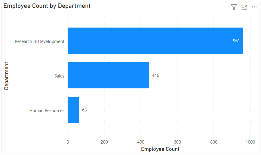
| Bar Chart | Uses bars to compare categories. Example: Sales by product. |
| Baseline | Reference starting point. Example: Zero line. |
| Best Practice | Recommended visualization approach. Example: Avoid 3D charts. |
| Binning | Grouping continuous values. Example: Age ranges. |
| Box Plot | Displays data distribution and outliers. Example: Salary ranges. |
| Bubble Chart | Scatter plot with size dimension. Example: Profit by region and size. |
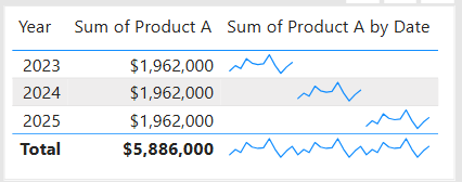
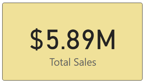
| Card | Displays a single value. Example: Total customers. |
| Categorical Scale | Discrete category scale. Example: Product names. |
| Chart | Visual representation of data values. Example: Bar chart of revenue by region. |
| Chart Junk | Unnecessary visual elements. Example: Excessive shadows. |
| Choropleth Map | Map colored by value. Example: Sales by state. |
| Cognitive Load | Mental effort required to interpret. Example: Overly complex charts. |
| Color Encoding | Using color to represent data. Example: Red for losses. |
| Color Palette | Selected set of colors. Example: Brand colors. |
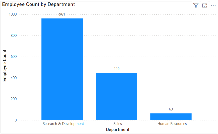
| Column Chart | Vertical bar chart. Example: Revenue by year. |
| Comparative Analysis | Comparing values. Example: Year-over-year sales. |
| Conditional Formatting | Formatting based on values. Example: Red for negative. |
| Context | Supporting information for visuals. Example: Benchmarks. |
| Continuous Scale | Numeric scale without breaks. Example: Temperature. |
| Correlation | Relationship between variables. Example: Scatter plot trend. |
| Dashboard | Collection of visualizations on one screen. Example: Executive KPI dashboard. |
| Dashboard Layout | Arrangement of visuals. Example: Top-down flow. |
| Data Density | Amount of data per visual area. Example: Dense scatter plot. |
| Data Ink Ratio | Proportion of ink used for data. Example: Minimal chart clutter. |
| Data Refresh | Updating visualized data. Example: Daily refresh. |
| Data Story | Structured insight narrative. Example: Executive presentation. |
| Data Visualization | Graphical representation of data. Example: Sales trends shown in a line chart. |
| Data-to-Ink Ratio | Proportion of ink showing data. Example: Minimalist charts. |
| Density Plot | Smoothed distribution visualization. Example: Probability density. |
| Distribution | Spread of data values. Example: Histogram shape. |
| Diverging Chart | Shows deviation from a baseline. Example: Profit vs target. |
| Diverging Palette | Colors diverging from midpoint. Example: Profit/loss. |
| Donut Chart | Pie chart with a center hole. Example: Expense breakdown. |
| Drill Down | Navigating to more detail. Example: Year → month → day. |
| Drill Through | Navigating to a detailed report. Example: Customer detail page. |
| Dual Axis Chart | Two measures on different axes. Example: Sales and margin. |
| Emphasis | Drawing attention to key data. Example: Bold colors. |
| Explanatory Visualization | Used to communicate findings. Example: Board presentation. |
| Exploratory Visualization | Used to discover insights. Example: Ad-hoc analysis. |
| Faceting | Splitting data into subplots. Example: One chart per category. |
| Filtering | Limiting displayed data. Example: Filter by year. |
| Footnote | Additional explanation text. Example: Data source note. |
| Forecast | Predicted future values. Example: Next quarter sales. |
| Funnel Chart | Shows process stages. Example: Sales pipeline. |
| Gauge | Displays progress toward a target. Example: KPI completion. |
| Geospatial Visualization | Data mapped to geography. Example: Customer density map. |
| Granularity | Level of data detail. Example: Daily vs monthly. |
| Graph | Diagram showing relationships between variables. Example: Scatter plot of height vs weight. |
| Grouping | Combining similar values. Example: Products by category. |
| Heatmap | Uses color to show intensity. Example: Sales by day and hour. |
| Hierarchy | Parent-child relationships. Example: Country → State → City. |
| Highlighting | Emphasizing specific data. Example: Selected bar. |
| Histogram | Distribution of numerical data. Example: Customer age distribution. |
| Insight | Meaningful takeaway from data. Example: Sales decline identified. |
| Interactivity | User-driven exploration. Example: Click to filter. |
| KPI Visual | Highlights key performance metrics. Example: Total revenue card. |
| Label | Text identifying data points. Example: Value labels on bars. |
| Legend | Explains colors or symbols. Example: Product categories. |
| Legend Placement | Position of legend. Example: Right side. |
| Line Chart | Shows trends over time. Example: Daily website traffic. |
| Matrix | Table with grouped dimensions. Example: Sales by region and year. |
| Outlier | Value far from others. Example: Extremely high sales. |
| Pan | Move across a visual. Example: Map navigation. |
| Pie Chart | Displays parts of a whole. Example: Market share. |
| Proportion | Part-to-whole relationship. Example: Market share. |
| Ranking | Displaying relative position. Example: Top 10 customers. |
| Real-Time Visualization | Live data display. Example: Streaming metrics. |
| Reference Line | Benchmark line on chart. Example: Target line. |
| Report | Structured set of visuals and text. Example: Monthly performance report. |
| Responsive Design | Adjusts to screen size. Example: Mobile dashboards. |
| Scatter Plot | Shows relationship between two variables. Example: Ad spend vs revenue. |
| Sequential Palette | Gradual color progression. Example: Low to high values. |
| Shape Encoding | Using shapes to distinguish categories. Example: Circles vs triangles. |
| Size Encoding | Using size to represent values. Example: Bubble size. |
| Slicer | Interactive filter control. Example: Dropdown region selector. |
| Small Multiples | Series of similar charts. Example: Sales by region panels. |
| Sorting | Ordering data values. Example: Top-selling products. |
| Storytelling | Communicating insights visually. Example: Narrative dashboard. To learn more, check out this article on Data Storytelling. |
| Subtitle | Supporting chart description. Example: Fiscal year context. |
| Symbol Map | Map using symbols. Example: Store locations. |
| Table | Data displayed in rows and columns. Example: Transaction list. |
| Title | Descriptive chart heading. Example: “Monthly Sales Trend.” |
| Tooltip | Hover text showing details. Example: Exact value on hover. |
| Treemap | Hierarchical data using rectangles. Example: Revenue by category. |
| Trendline | Shows overall direction. Example: Sales trend. |
| Visual Clutter | Overcrowded visuals. Example: Too many labels. |
| Visual Consistency | Uniform styling across visuals. Example: Same fonts/colors. |
| Visual Encoding | Mapping data to visuals. Example: Color = category. |
| Visual Hierarchy | Ordering elements by importance. Example: Large KPI at top. |
| Waterfall Chart | Shows cumulative effect of changes. Example: Profit bridge analysis. |
| White Space | Empty space improving readability. Example: Padding between charts. |
| X-Axis | Horizontal axis. Example: Time dimension. |
| Y-Axis | Vertical axis. Example: Sales amount. |
| Zoom | Focus on specific area. Example: Map zoom. |