Tag: Data Analysis

Power BI Drilldown vs. Drill-through: Understanding the Differences, Use Cases, and Setup

Power BI provides multiple ways to explore data interactively. Two of the most commonly confused features are drilldown and drill-through. While both allow users to move from high-level insights to more detailed data, they serve different purposes and behave differently.

This article explains what drilldown and drill-through are, when to use each, how to configure them, and how they compare.


What Is Drilldown in Power BI?

Drilldown allows users to navigate within the same visual to explore data at progressively lower levels of detail using a predefined hierarchy.

Key Characteristics

  • Happens inside a single visual
  • Uses hierarchies (date, geography, product, etc.)
  • Does not navigate to another page
  • Best for progressive exploration

Example

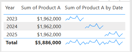
A column chart showing:

  • Year → Quarter → Month → Day
    A user clicks on 2024 to drill down into quarters, then into months.

Here is a short YouTube video on how to drilldown in a table visual.


When to Use Drilldown

Use drilldown when:

  • You want users to explore trends step by step
  • The data naturally follows a hierarchical structure
  • Context should remain within the same chart
  • You want a quick, visual breakdown

Typical use cases:

  • Time-based analysis (Year → Month → Day)
  • Sales by Category → Subcategory → Product
  • Geographic analysis (Country → State → City)

How to Set Up Drilldown

Step-by-Step

  1. Select a visual (bar chart, column chart, etc.)
  2. Drag multiple fields into the Axis (or equivalent) in hierarchical order
  3. Enable drill mode by clicking the Drill Down icon (↓) on the visual
  4. Interact with the visual:
    • Click a data point to drill
    • Use Drill Up to return to higher levels

Notes

  • Power BI auto-creates date hierarchies unless disabled
  • Drilldown works only when multiple hierarchy levels exist

Here is a YouTube video on how to set up hierarchies and drilldown in Power BI.


What Is Drill-through in Power BI?

Drill-through allows users to navigate from one report page to another page that shows detailed, filtered information based on a selected value.

Key Characteristics

  • Navigates to a different report page
  • Passes filters automatically
  • Designed for detailed analysis
  • Often uses dedicated detail pages

Example

From a summary sales page:

  • Right-click Product = Laptop
  • Drill through to a “Product Details” page
  • Page shows sales, margin, customers, and trends for Laptop only

When to Use Drill-through

Use drill-through when:

  • You need a separate, detailed view
  • The analysis requires multiple visuals
  • You want to preserve context via filters
  • Detail pages would clutter a summary page

Typical use cases:

  • Customer detail pages
  • Product performance analysis
  • Region- or department-specific deep dives
  • Incident or transaction-level reviews

How to Set Up Drill-through

Step-by-Step

  1. Create a new report page
  2. Add the desired detail visuals
  3. Drag one or more fields into the Drill-through filters pane
  4. (Optional) Add a Back button using:
    • Insert → Buttons → Back
  5. Test by right-clicking a data point on another page and selecting Drill through

Notes

  • Multiple fields can be passed
  • Works across visuals and tables
  • Requires right-click interaction (unless buttons are used)

Here is a short YouTube video on how to set up drill-through in Power BI

And here is a detailed YouTube video on creating a drill-through page in Power BI.


Drilldown vs. Drill-through: Key Differences

FeatureDrilldownDrill-through
NavigationSame visualDifferent page
Uses hierarchiesYesNo (uses filters)
Page changeNoYes
Level of detailIncrementalComprehensive
Typical useTrend explorationDetailed analysis
User interactionClickRight-click or button

Similarities Between Drilldown and Drill-through

Despite their differences, both features:

  • Enhance interactive data exploration
  • Preserve user context
  • Reduce report clutter
  • Improve self-service analytics
  • Work with Power BI visuals and filters

Common Pitfalls and Best Practices

Best Practices

  • Use drilldown for simple, hierarchical exploration
  • Use drill-through for rich, detailed analysis
  • Clearly label drill-through pages
  • Add Back buttons for usability
  • Avoid overloading a single visual with too many drill levels

Common Mistakes

  • Using drilldown when a detail page is needed
  • Forgetting to configure drill-through filters
  • Hiding drill-through functionality from users
  • Mixing drilldown and drill-through without clear design intent

Summary

  • Drilldown = explore deeper within the same visual
  • Drill-through = navigate to a dedicated detail page
  • Drilldown is best for hierarchies and trends
  • Drill-through is best for focused, detailed analysis

Understanding when and how to use each feature is essential for building intuitive, powerful Power BI reports—and it’s a common topic tested in Power BI certification exams.

Thanks for reading and good luck on your data journey!

Glossary – 100 “Data Analysis” Terms

Below is a glossary that includes 100 common “Data Analysis” terms and phrases in alphabetical order. Enjoy!

TermDefinition & Example
A/B TestComparing two variations to measure impact. Example: Two webpage layouts.
Actionable InsightAn insight that leads to a clear decision. Example: Improve onboarding experience.
Ad Hoc AnalysisOne-off analysis for a specific question. Example: Investigating a sudden sales dip.
AggregationSummarizing data using functions like sum or average. Example: Total revenue by region.
Analytical MaturityOrganization’s capability to use data effectively. Example: Moving from descriptive to predictive analytics.
Bar ChartA chart comparing categories. Example: Sales by region.
BaselineA reference point for comparison. Example: Last year’s sales used as baseline.
BenchmarkA standard used to compare performance. Example: Industry average churn rate.
BiasSystematic error in data or analysis. Example: Surveying only active users.
Business QuestionA decision-focused question data aims to answer. Example: Which products drive profit?
CausationA relationship where one variable causes another. Example: Price cuts causing sales growth.
Confidence IntervalRange likely containing a true value. Example: 95% CI for average sales.
CorrelationA statistical relationship between variables. Example: Sales and marketing spend.
Cumulative TotalA running total over time. Example: Year-to-date revenue.
DashboardA visual collection of key metrics. Example: Executive sales dashboard.
DataRaw facts or measurements collected for analysis. Example: Sales transactions, sensor readings, survey responses.
Data AnomalyUnexpected or unusual data pattern. Example: Sudden spike in user signups.
Data CleaningCorrecting or removing inaccurate data. Example: Fixing misspelled country names.
Data ConsistencyUniform representation across datasets. Example: Same currency used everywhere.
Data GovernancePolicies ensuring data quality, security, and usage. Example: Defined data ownership roles.
Data ImputationReplacing missing values with estimated ones. Example: Filling null ages with the median.
Data LineageTracking data origin and transformations. Example: Tracing metrics back to source systems.
Data LiteracyAbility to read, understand, and use data. Example: Interpreting charts correctly.
Data ModelThe structure defining how data tables relate. Example: Star schema.
Data PipelineAutomated flow of data from source to destination. Example: Daily ingestion job.
Data ProfilingAnalyzing data characteristics. Example: Checking null percentages.
Data QualityThe accuracy, completeness, and reliability of data. Example: Valid dates and consistent formats.
Data RefreshUpdating data with the latest values. Example: Nightly refresh.
Data Refresh FrequencyHow often data is updated. Example: Hourly vs. daily refresh.
Data SkewnessDegree of asymmetry in data distribution. Example: Income data skewed to the right.
Data SourceThe origin of data. Example: SQL database, API.
Data StorytellingCommunicating insights using narrative and visuals. Example: Executive-ready presentation.
Data TransformationModifying data to improve usability or consistency. Example: Converting text dates to date data types.
Data ValidationEnsuring data meets rules and expectations. Example: No negative quantities.
Data WranglingTransforming raw data into a usable format. Example: Reshaping columns for analysis.
DatasetA structured collection of related data. Example: A table of customer orders with dates, amounts, and regions.
Derived MetricA metric calculated from other metrics. Example: Profit margin = Profit / Revenue.
Descriptive AnalyticsAnalysis that explains what happened. Example: Last quarter’s sales summary.
Diagnostic AnalyticsAnalysis that explains why something happened. Example: Revenue drop due to fewer customers.
DiceFiltering data by multiple dimensions. Example: Sales for 2025 in the West region.
DimensionA descriptive attribute used to slice data. Example: Date, region, product.
Dimension TableA table containing descriptive attributes. Example: Product details.
DimensionalityNumber of features or variables in data. Example: High-dimensional customer data.
DistributionHow values are spread across a range. Example: Income distribution.
Drill DownNavigating from summary to detail. Example: Yearly sales → monthly sales.
Drill ThroughJumping to a detailed view for a specific value. Example: Clicking a region to see store data.
ELTExtract, Load, Transform approach. Example: Transforming data inside a warehouse.
ETLExtract, Transform, Load process. Example: Loading CRM data into a warehouse.
Exploratory Data Analysis (EDA)Initial investigation to understand data. Example: Visualizing distributions.
Fact TableA table containing quantitative data. Example: Sales transactions.
FeatureAn individual measurable property used in analysis. Example: Customer age used in churn analysis.
Feature EngineeringCreating new features from existing data. Example: Calculating customer tenure from signup date.
FilteringLimiting data to a subset of interest. Example: Only orders from 2025.
GranularityThe level of detail in the data. Example: Daily sales vs. monthly sales.
GroupingOrganizing data into categories before aggregation. Example: Sales grouped by product category.
HistogramA chart showing data distribution. Example: Frequency of order sizes.
HypothesisA testable assumption. Example: Discounts increase sales.
Incremental LoadLoading only new or changed data. Example: Yesterday’s transactions.
InsightA meaningful finding that informs action. Example: High churn among new users.
KPI (Key Performance Indicator)A critical metric tied to business objectives. Example: Monthly churn rate.
KurtosisMeasure of how heavy the tails of a distribution are. Example: Detecting extreme outliers.
LatencyDelay between data generation and availability. Example: Real-time vs. daily data.
Line ChartA chart showing trends over time. Example: Monthly revenue trend.
MeanThe arithmetic average. Example: Average order value.
MeasureA calculated numeric value, often aggregated. Example: SUM(Sales).
MedianThe middle value in ordered data. Example: Median household income.
MetricA quantifiable measure used to track performance. Example: Total sales, average order value.
Missing ValuesData points that are absent or null. Example: Blank customer age values.
ModeThe most frequent value. Example: Most common product category.
Multivariate AnalysisAnalyzing multiple variables simultaneously. Example: Studying price, demand, and seasonality.
NormalizationScaling data to a common range. Example: Normalizing values between 0 and 1.
ObservationA single record or row in a dataset. Example: One customer’s purchase history.
OutlierA data point significantly different from others. Example: An unusually large transaction amount.
PercentileValue below which a percentage of data falls. Example: 90th percentile response time.
PopulationThe full set of interest. Example: All customers.
Predictive AnalyticsAnalysis that forecasts future outcomes. Example: Predicting next month’s demand.
Prescriptive AnalyticsAnalysis that suggests actions. Example: Recommending price changes.
QuartileValues dividing data into four parts. Example: Q1, Q2, Q3.
ReportA structured presentation of analysis results. Example: Monthly performance report.
ReproducibilityAbility to recreate analysis results consistently. Example: Using versioned datasets.
Rolling AverageAn average calculated over a moving window. Example: 7-day rolling average of sales.
Root Cause AnalysisIdentifying the underlying cause of an issue. Example: Revenue loss due to inventory shortages.
SampleA subset of a population. Example: Survey respondents.
Sampling BiasBias introduced by non-random samples. Example: Feedback collected only from power users.
Scatter PlotA chart showing relationships between two variables. Example: Ad spend vs. revenue.
SeasonalityRepeating patterns tied to time cycles. Example: Holiday sales spikes.
Semi-Structured DataData with flexible structure. Example: JSON files.
Sensitivity AnalysisEvaluating how outcomes change with inputs. Example: Impact of price changes on profit.
SliceFiltering data by a single dimension. Example: Sales for 2025 only.
SnapshotData captured at a specific point in time. Example: End-of-month balances.
Snowflake SchemaA normalized version of a star schema. Example: Product broken into sub-tables.
Standard DeviationAverage distance from the mean. Example: Consistency of sales performance.
StandardizationRescaling data to have mean 0 and standard deviation 1. Example: Preparing data for regression analysis.
Star SchemaA data model with facts surrounded by dimensions. Example: Sales fact with product and date dimensions.
Structured DataData with a fixed schema. Example: Relational tables.
Time SeriesData indexed by time. Example: Daily stock prices.
TrendA general direction in data over time. Example: Increasing monthly revenue.
Unstructured DataData without a predefined schema. Example: Emails, images.
VariableA characteristic or attribute that can take different values. Example: Age, revenue, product category.
VarianceMeasure of data spread. Example: Variance in delivery times.

Please share your suggestions for any terms that should be added.

Choosing the Right Chart to display your data in Power BI or any other analytics tool

Data visualization is at the heart of analytics. Choosing the right chart or visual can make the difference between insights that are clear and actionable, and insights that remain hidden. There are many visualization types available for showcasing your data, and choosing the right ones for your use cases is important. Below, we’ll walk through some common scenarios and share information on the charts best suited for them, and will also touch on some Power BI–specific visuals you should know about.

1. Showing Trends Over Time

When to use: To track how a measure changes over days, months, or years.

Best charts:

  • Line Chart: The classic choice for time series data. Best when you want to show continuous change. In Power BI, the line chart visual can also be used for forecasting trends.
  • Area Chart: Like a line chart but emphasizes volume under the curve—great for cumulative values or when you want to highlight magnitude.
  • Sparklines (Power BI): Miniature line charts embedded in tables or matrices. Ideal for giving quick context without taking up space.

2. Comparing Categories

When to use: To compare values across distinct groups (e.g., sales by region, revenue by product).

Best charts:

  • Column Chart: Vertical bars for category comparisons. Good when categories are on the horizontal axis.
  • Bar Chart: Horizontal bars—useful when category names are long or when ranking items. Is usually a better choice than the column chart when there are many values.
  • Stacked Column/Bar Chart: Show category totals and subcategories in one view. Works for proportional breakdowns, but can get hard to compare across categories.

3. Understanding Relationships

When to use: To see whether two measures are related (e.g., advertising spend vs. sales revenue).

Best charts:

  • Scatter Chart: Plots data points across two axes. Useful for correlation analysis. Add a third variable with bubble size or color to generate more insights. This chart can also be useful for identifying anomalies/outliers in the data.
  • Line & Scatter Combination: Power BI lets you overlay a line for trend direction while keeping the scatter points.
  • Line & Bar/Column Chart Combination: Power BI offers some of these combination charts also to allow you to relate your comparison measures to your trend measures.

4. Highlighting Key Metrics

Sometimes you don’t need a chart—you just want a single number to stand out. These types of visuals are great for high-level executive dashboards, or for the summary page of dashboards in general.

Best visuals in Power BI:

  • Card Visual: Displays one value clearly, like Total Sales.
  • KPI Visual: Adds target context and status indicator (e.g., actual vs. goal).
  • Gauge Visual: Circular representation of progress toward a goal—best for showing percentages or progress to target. For example, Performance Rating score shown on the scale of the goal.

5. Distribution Analysis

When to use: To see how data is spread across categories or ranges.

Best charts:

  • Column/Bar Chart with bins: Useful for creating histograms in Power BI.
  • Box-and-Whisker Chart (custom visual): Shows median, quartiles, and outliers.
  • Pie/Donut Charts: While often overused, they can be effective for showing composition when categories are few (ideally 3–5). For example, show the number and percentage of employees in each department.

6. Spotting Problem Areas

When to use: To identify anomalies or areas needing attention across a large dataset.

Best charts:

  • Heatmap: A table where color intensity represents value magnitude. Excellent for finding hot spots or gaps. This can be implemented in Power BI by using a Matrix visual with conditional formatting in Power BI.
  • Treemap: Breaks data into rectangles sized by value—helpful for hierarchical comparisons and for easily identifying the major components of the whole.

7. Detail-Level Exploration

When to use: To dive into raw data while keeping formatting and hierarchy.

Best visuals:

  • Table: Shows granular row-level data. Best for detail reporting.
  • Matrix: Adds pivot-table–like functionality with rows, columns, and drill-down. Often combined with conditional formatting and sparklines for added insight.

8. Part-to-Whole Analysis

When to use: To see how individual parts contribute to a total.

Best charts:

  • Stacked Charts: Show both totals and category breakdowns.
  • 100% Stacked Charts: Normalize totals so comparisons are by percentage share.
  • Treemap: Visualizes hierarchical data contributions in space-efficient blocks.

Quick Reference: Which Chart to Use?

ScenarioBest Visuals
Tracking trends, forecasting trendsLine, Area, Sparklines
Comparing categoriesColumn, Bar, Stacked
Showing relationshipsScatter, Line + Scatter, Line + Column/Bar
Highlighting metricsCard, KPI, Gauge
Analyzing distributionsHistogram (columns with bins), Box & Whisker, Pie/Donut (for few categories)
Identifying problem areasHeatmap (Matrix with colors), Treemap, Scatter
Exploring detail dataTable, Matrix
Showing part-to-wholeStacked Column/Bar, 100% Stacked, Treemap, Pie/Donut

The below graphic shows the visualization types available in Power BI. You can also import additional visuals by clicking the “3-dots” (get more visuals) at the bottom of the visualization icons.

Summary

Power BI, and other BI/analytics tools, offers a rich set of visuals, each designed to represent data in a way that suits a specific set of analytical needs. The key is to match the chart type with the story you want the data to tell. Whether you’re showing a simple KPI, uncovering trends, or surfacing problem areas, choosing the right chart ensures your insights are clear, actionable, and impactful. In addition, based on your scenario, it can also be beneficial to get feedback from the user population on what other visuals they might find useful or what other ways they would they like to see the data.

Thanks for reading! And good luck on your data journey!