In Microsoft Fabric, storage mode determines how a semantic model accesses and processes data. It affects performance, freshness, compute behavior, and model capabilities. Choosing the right storage mode is critical when designing semantic models for analytics and reporting.
A semantic model (Power BI dataset) can use different storage modes for its tables — and when multiple modes coexist, the model is called a composite model. DEV Community
Common Storage Modes
There are three primary storage modes you should know for the exam:
1. Import Mode
Stores data inside the semantic model in memory (VertiPaq) after a refresh. DEV Community
Offers fast query performance since data is cached locally.
Requires scheduled or manual refresh to update data from the source.
Supports the full range of modeling features (e.g., calculated tables, complex DAX).
When to use Import Mode:
Data fits in memory and doesn’t need real-time freshness.
You need complex calculations or modeling features requiring data in memory.
You want high performance for interactive analytics.
Pros:
Very fast interactive queries
Full DAX and modeling capabilities
Cons:
Must schedule refreshes
Data freshness depends on refresh cadence
2. DirectQuery Mode
Semantic model does not store data locally — queries are sent to the underlying source (SQL, warehouse, etc.) at query time. DEV Community
Ensures real-time or near-real-time data because no import refresh is needed.
When to use DirectQuery:
Source data changes frequently and must always show the latest results.
Data volumes are too large to import fully.
Pros:
Real-time access to source data
No refresh cycles required
Cons:
Performance depends heavily on source system
Some modeling features may be limited compared with Import
3. Direct Lake Mode
A newer, Fabric-specific storage mode designed to combine performance and freshness:
Reads Delta tables directly from OneLake and loads necessary column data into memory. Microsoft Learn
Avoids full data copy, eliminating the long import refresh cycle.
Uses the VertiPaq engine for fast aggregations and interactions (similar to import).
Offers low-latency synch with source changes without heavy refresh workloads.
Supports real-time insights while minimizing data movement. Microsoft Learn
When to use Direct Lake:
Working with extremely large datasets that would be costly or impractical to import entirely.
Needing relatively fresh data without long refresh cycles typical of Import mode.
Integrating tightly with delta-based assets such as Fabric lakehouses and warehouses. Microsoft Learn
Pros:
Fast querying with fresher data than import
No heavy refresh cycles
Leverages OneLake integration and existing delta tables
Cons:
Some modeling features (like calculated tables) are limited or not supported in Direct Lake tables (those tables must be switched to Import if needed). Microsoft Fabric Community
May fall back to DirectQuery in certain conditions (e.g., tables requiring SQL endpoint security). Microsoft Learn
Composite Models
A semantic model may include a mix of storage modes — for example, some tables in Direct Lake and others in Import. This is called a composite model. DEV Community
Typical use cases for composite models:
Import frequently used dimension tables (to support calculated tables)
Use Direct Lake for large fact tables stored in OneLake
Balance performance with modeling flexibility
Choosing the Right Storage Mode — Key Factors
When deciding on a storage mode for your semantic model, consider:
1. Data Freshness Requirements
Real-time data? → DirectQuery or Direct Lake
Static or periodic data? → Import
2. Dataset Size
Large volumes (multi-TB) without capacity for full import? → Direct Lake
High interactive performance with good freshness? → Direct Lake
Ultimate speed with full caching? → Import
5. Source Capabilities
Some sources may not support DirectQuery efficiently — understand source performance.
Practical Examples
Import Mode: Small/medium enterprise data warehouse reporting that runs daily refreshes.
DirectQuery: Regulatory reporting where every query must reflect the latest operational data in a SQL system.
Direct Lake: Analytics on massive delta datasets stored in OneLake, where import is impractical but freshness and performance are both essential. Microsoft Learn
Exam Tips
Know what each mode does (Import vs DirectQuery vs Direct Lake).
Understand trade offs between performance, freshness, and modeling capability.
Recognize Direct Lake as a Fabric-optimized hybrid mode ideal for delta lake data.
Be prepared to choose the mode based on scenario requirements like latency, size, and features.
Here are 10 questions to test and help solidify your learning and knowledge. As you review these and other questions in your preparation, make sure to …
Identifying and understand why an option is correct (or incorrect) — not just which one
Look for and understand the usage scenario of keywords in exam questions to guide you
Expect scenario-based questions rather than direct definitions
1. Which storage mode stores data fully in memory within the semantic model?
A. DirectQuery B. Direct Lake C. Import D. Composite
Correct Answer: C. Import
Explanation: Import mode loads data into the VertiPaq in-memory engine inside the semantic model, providing the fastest query performance but requiring refreshes.
2. Which storage mode provides real-time access to data by querying the source system at query time?
A. Import B. DirectQuery C. Direct Lake D. Cached
Correct Answer: B. DirectQuery
Explanation: DirectQuery does not store data locally. Each query is sent directly to the source system, ensuring real-time or near-real-time results.
3. What is a key advantage of Direct Lake compared to Import mode?
A. Supports more DAX functions B. Requires no OneLake integration C. Avoids full data refresh while maintaining high performance D. Works only with SQL Server
Correct Answer: C. Avoids full data refresh while maintaining high performance
Explanation: Direct Lake reads Delta tables directly from OneLake, avoiding large import refreshes while still using the VertiPaq engine for fast analytics.
4. Which scenario is best suited for Import mode?
A. A dataset requiring real-time updates every second B. A small to medium dataset with complex DAX calculations C. A multi-terabyte lakehouse fact table D. Streaming event data
Correct Answer: B. A small to medium dataset with complex DAX calculations
Explanation: Import mode supports the full range of modeling features and offers excellent performance for datasets that fit comfortably in memory.
5. Which storage mode is specifically optimized for Delta tables stored in OneLake?
A. Import B. DirectQuery C. Direct Lake D. Hybrid
Correct Answer: C. Direct Lake
Explanation: Direct Lake is a Fabric-optimized storage mode designed to work directly with Delta tables in OneLake.
6. A semantic model includes some tables in Import mode and others in Direct Lake mode. What is this called?
A. Hybrid model B. Incremental model C. Composite model D. Federated model
Correct Answer: C. Composite model
Explanation: A composite model uses multiple storage modes within the same semantic model, allowing flexibility between performance and freshness.
7. Which limitation applies to Direct Lake tables?
A. They cannot be refreshed B. They do not support relationships C. Calculated tables are not supported directly D. They cannot be queried using DAX
Correct Answer: C. Calculated tables are not supported directly
Explanation: Calculated tables require Import mode. Direct Lake tables must be switched to Import if calculated tables are needed.
8. What primarily determines query performance when using DirectQuery mode?
A. The VertiPaq engine B. The refresh schedule C. The source system’s performance D. OneLake caching
Correct Answer: C. The source system’s performance
Explanation: In DirectQuery mode, queries are executed against the source system, so performance depends on source optimization and capacity.
9. Which storage mode minimizes data duplication while still offering high query performance?
A. Import B. DirectQuery C. Direct Lake D. Cached Import
Correct Answer: C. Direct Lake
Explanation: Direct Lake avoids copying data into the model while still leveraging in-memory query acceleration, minimizing duplication and refresh overhead.
10. You need near real-time analytics on a very large dataset stored in OneLake without long refresh times. Which storage mode should you choose?
A. Import B. DirectQuery C. Direct Lake D. Snapshot
Correct Answer: C. Direct Lake
Explanation: Direct Lake is ideal for large OneLake datasets where full import refreshes are impractical but fast, fresh analytics are required.
In Microsoft Fabric, the Visual Query Editor (VQE) provides a low-code, graphical experience for querying data across lakehouses, warehouses, and semantic models. It allows analytics engineers to explore, shape, and summarize data without writing SQL or KQL, while still generating optimized queries behind the scenes.
For the DP-600 exam, you should understand what the Visual Query Editor is, where it’s used, and how to perform common data analysis tasks such as selecting columns, filtering rows, and aggregating data.
What Is the Visual Query Editor?
The Visual Query Editor is a graphical query-building interface available in multiple Fabric experiences, including:
Lakehouse SQL analytics endpoint
Warehouse
Power BI (Direct Lake and DirectQuery scenarios)
Data exploration within Fabric items
Instead of writing queries manually, you interact with:
Tables and columns
Drag-and-drop operations
Menus for filters, grouping, and aggregations
Fabric then translates these actions into optimized SQL or engine-specific queries.
Selecting Data
Selecting data in the Visual Query Editor focuses on choosing the right columns and datasets for analysis.
Key Capabilities
Select or deselect columns from one or more tables
Rename columns for readability
Reorder columns for analysis or reporting
Combine columns from related tables (via existing relationships)
Exam Tips
Selecting fewer columns improves performance and reduces data transfer.
Column renaming in VQE affects the query result, not the underlying table schema.
The Visual Query Editor respects relationships defined in semantic models and warehouses.
Filtering Data
Filtering allows you to limit rows based on conditions, ensuring only relevant data is included.
Common Filter Types
Equality filters (e.g., Status = "Active")
Range filters (e.g., dates, numeric thresholds)
Text filters (contains, starts with, ends with)
Null / non-null filters
Relative date filters (last 7 days, current month)
Where Filtering Is Applied
At the query level, not permanently in the data source
Before aggregation (important for correct results)
Exam Tips
Filters applied in the Visual Query Editor are executed at the data source when possible (query folding).
Filtering early improves performance and reduces memory usage.
Be aware of how filters interact with aggregations.
Aggregating Data
Aggregation summarizes data by grouping rows and applying calculations.
Common Aggregations
Sum
Count / Count Distinct
Average
Min / Max
Grouping Data
Select one or more columns as group-by fields
Apply aggregations to numeric or date columns
Results return one row per group
Examples
Total sales by product category
Count of orders per customer
Average response time by day
Exam Tips
Aggregations in the Visual Query Editor are conceptually similar to GROUP BY in SQL.
Aggregated queries reduce dataset size and improve performance.
Understand the difference between row-level data and aggregated results.
Behind the Scenes: Generated Queries
Although the Visual Query Editor is low-code, Fabric generates:
SQL queries for warehouses and lakehouse SQL endpoints
Optimized engine-specific queries for semantic models
This ensures:
Efficient execution
Compatibility with Direct Lake and DirectQuery
Consistent results across Fabric experiences
Exam Tip
You are not required to read or write the generated SQL, but you should understand that the Visual Query Editor does not bypass query optimization.
When to Use the Visual Query Editor
Use the Visual Query Editor when:
Quickly exploring unfamiliar datasets
Building queries without writing code
Creating reusable query logic for reports
Teaching or collaborating with less SQL-focused users
Avoid it when:
Complex transformations are required (use SQL, Spark, or Dataflows)
Highly customized logic is needed beyond supported operations
Key Exam Takeaways
For the DP-600 exam, remember:
The Visual Query Editor is a graphical query-building tool in Microsoft Fabric.
It supports selecting columns, filtering rows, and aggregating data.
Operations are translated into optimized queries executed at the data source.
Filtering occurs before aggregation, affecting results and performance.
It is commonly used with lakehouses, warehouses, and semantic models.
Practice Questions:
Here are 10 questions to test and help solidify your learning and knowledge. As you review these and other questions in your preparation, make sure to …
Identifying and understand why an option is correct (or incorrect) — not just which one
Look for and understand the usage scenario of keywords in exam questions to guide you
Expect scenario-based questions rather than direct definitions
Know the purpose and scope of the Visual Query Editor
Know how to selecting, filtering, and aggregating data
Understand execution order and performance implications
Know when to use (and not use) the Visual Query Editor
Question 1
What is the primary purpose of the Visual Query Editor in Microsoft Fabric?
A. To permanently modify table schemas B. To build queries visually without writing SQL C. To replace semantic models D. To manage workspace permissions
Correct Answer:B
Explanation: The Visual Query Editor provides a low-code, graphical interface for building queries. It does not modify schemas, replace models, or manage security.
Question 2
When you deselect a column in the Visual Query Editor, what happens?
A. The column is deleted from the source table B. The column is hidden permanently for all users C. The column is excluded only from the query results D. The column data type is changed
Correct Answer:C
Explanation: Column selection affects only the query output, not the underlying data or schema.
Question 3
Why is it considered a best practice to select only required columns in a query?
A. It enforces data security B. It reduces query complexity and improves performance C. It enables Direct Lake mode D. It prevents duplicate rows
Correct Answer:B
Explanation: Selecting fewer columns reduces data movement and memory usage, leading to better performance.
Question 4
Which type of filter is commonly used to restrict data to a recent time period?
A. Equality filter B. Text filter C. Relative date filter D. Aggregate filter
Correct Answer:C
Explanation: Relative date filters (e.g., “Last 30 days”) dynamically adjust based on the current date and are commonly used in analytics.
Question 5
At what stage of query execution are filters applied in the Visual Query Editor?
A. After aggregation B. After the query result is returned C. Before aggregation D. Only in the Power BI report layer
Correct Answer:C
Explanation: Filters are applied before aggregation, ensuring accurate summary results and better performance.
Question 6
Which aggregation requires grouping to produce meaningful results?
A. SUM B. COUNT C. GROUP BY D. MIN
Correct Answer:C
Explanation: Grouping defines how rows are summarized. Aggregations like SUM or COUNT rely on GROUP BY logic to produce per-group results.
Question 7
You want to see total sales by product category. Which Visual Query Editor actions are required?
A. Filter Product Category and sort by Sales B. Group by Product Category and apply SUM to Sales C. Count Product Category and filter Sales D. Rename Product Category and aggregate rows
Correct Answer:B
Explanation: This scenario requires grouping on Product Category and applying a SUM aggregation to the Sales column.
Question 8
What happens behind the scenes when you build a query using the Visual Query Editor?
A. Fabric stores a cached dataset only B. Fabric generates optimized SQL or engine-specific queries C. Fabric converts the query into DAX D. Fabric disables query folding
Correct Answer:B
Explanation: The Visual Query Editor translates visual actions into optimized queries (such as SQL) that execute at the data source.
Question 9
Which Fabric items commonly support querying through the Visual Query Editor?
A. Pipelines and notebooks only B. Dashboards only C. Lakehouses, warehouses, and semantic models D. Eventhouses only
Correct Answer:C
Explanation: The Visual Query Editor is widely used across lakehouses, warehouses, and semantic models in Fabric.
Question 10
When should you avoid using the Visual Query Editor?
A. When exploring new datasets B. When building quick aggregations C. When complex transformation logic is required D. When filtering data
Correct Answer:C
Explanation: For advanced or complex transformations, SQL, Spark, or Dataflows are more appropriate than the Visual Query Editor.
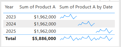
Data visualization is at the heart of analytics. Choosing the right chart or visual can make the difference between insights that are clear and actionable, and insights that remain hidden. There are many visualization types available for showcasing your data, and choosing the right ones for your use cases is important. Below, we’ll walk through some common scenarios and share information on the charts best suited for them, and will also touch on some Power BI–specific visuals you should know about.
1. Showing Trends Over Time
When to use: To track how a measure changes over days, months, or years.
Best charts:
Line Chart: The classic choice for time series data. Best when you want to show continuous change. In Power BI, the line chart visual can also be used for forecasting trends.
Area Chart: Like a line chart but emphasizes volume under the curve—great for cumulative values or when you want to highlight magnitude.
Sparklines (Power BI): Miniature line charts embedded in tables or matrices. Ideal for giving quick context without taking up space.
2. Comparing Categories
When to use: To compare values across distinct groups (e.g., sales by region, revenue by product).
Best charts:
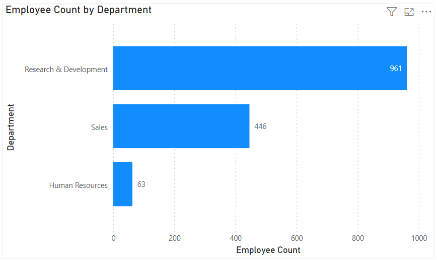
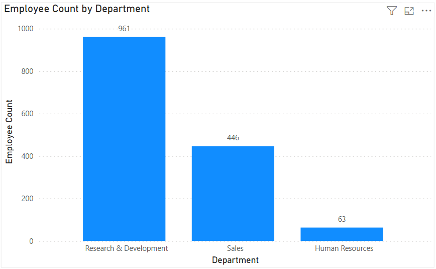
Column Chart: Vertical bars for category comparisons. Good when categories are on the horizontal axis.
Bar Chart: Horizontal bars—useful when category names are long or when ranking items. Is usually a better choice than the column chart when there are many values.
Stacked Column/Bar Chart: Show category totals and subcategories in one view. Works for proportional breakdowns, but can get hard to compare across categories.
3. Understanding Relationships
When to use: To see whether two measures are related (e.g., advertising spend vs. sales revenue).
Best charts:
Scatter Chart: Plots data points across two axes. Useful for correlation analysis. Add a third variable with bubble size or color to generate more insights. This chart can also be useful for identifying anomalies/outliers in the data.
Line & Scatter Combination: Power BI lets you overlay a line for trend direction while keeping the scatter points.
Line & Bar/Column Chart Combination: Power BI offers some of these combination charts also to allow you to relate your comparison measures to your trend measures.
4. Highlighting Key Metrics
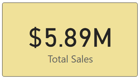
Sometimes you don’t need a chart—you just want a single number to stand out. These types of visuals are great for high-level executive dashboards, or for the summary page of dashboards in general.
Best visuals in Power BI:
Card Visual: Displays one value clearly, like Total Sales.
KPI Visual: Adds target context and status indicator (e.g., actual vs. goal).
Gauge Visual: Circular representation of progress toward a goal—best for showing percentages or progress to target. For example, Performance Rating score shown on the scale of the goal.
5. Distribution Analysis
When to use: To see how data is spread across categories or ranges.
Best charts:
Column/Bar Chart with bins: Useful for creating histograms in Power BI.
Box-and-Whisker Chart (custom visual): Shows median, quartiles, and outliers.
Pie/Donut Charts: While often overused, they can be effective for showing composition when categories are few (ideally 3–5). For example, show the number and percentage of employees in each department.
6. Spotting Problem Areas
When to use: To identify anomalies or areas needing attention across a large dataset.
Best charts:
Heatmap: A table where color intensity represents value magnitude. Excellent for finding hot spots or gaps. This can be implemented in Power BI by using a Matrix visual with conditional formatting in Power BI.
Treemap: Breaks data into rectangles sized by value—helpful for hierarchical comparisons and for easily identifying the major components of the whole.
7. Detail-Level Exploration
When to use: To dive into raw data while keeping formatting and hierarchy.
Best visuals:
Table: Shows granular row-level data. Best for detail reporting.
Matrix: Adds pivot-table–like functionality with rows, columns, and drill-down. Often combined with conditional formatting and sparklines for added insight.
8. Part-to-Whole Analysis
When to use: To see how individual parts contribute to a total.
Best charts:
Stacked Charts: Show both totals and category breakdowns.
100% Stacked Charts: Normalize totals so comparisons are by percentage share.
Treemap: Visualizes hierarchical data contributions in space-efficient blocks.
Quick Reference: Which Chart to Use?
Scenario
Best Visuals
Tracking trends, forecasting trends
Line, Area, Sparklines
Comparing categories
Column, Bar, Stacked
Showing relationships
Scatter, Line + Scatter, Line + Column/Bar
Highlighting metrics
Card, KPI, Gauge
Analyzing distributions
Histogram (columns with bins), Box & Whisker, Pie/Donut (for few categories)
The below graphic shows the visualization types available in Power BI. You can also import additional visuals by clicking the “3-dots” (get more visuals) at the bottom of the visualization icons.
Summary
Power BI, and other BI/analytics tools, offers a rich set of visuals, each designed to represent data in a way that suits a specific set of analytical needs. The key is to match the chart type with the story you want the data to tell. Whether you’re showing a simple KPI, uncovering trends, or surfacing problem areas, choosing the right chart ensures your insights are clear, actionable, and impactful. In addition, based on your scenario, it can also be beneficial to get feedback from the user population on what other visuals they might find useful or what other ways they would they like to see the data.
Thanks for reading! And good luck on your data journey!
When working in Power BI, two common ways to add custom calculations to your data model are calculated columns and measures. While they both use DAX (Data Analysis Expressions), their purposes, storage, and performance implications differ significantly. Understanding these differences can help you design more efficient and maintainable Power BI reports.
1. What They Are
Calculated Column A calculated column is a new column added to a table in your data model. It is calculated row-by-row based on the existing data and stored in the model like any other column.
Measure A measure is a calculation that is evaluated on the fly, usually aggregated at the visual level. Measures don’t exist as stored data in your table—they are computed dynamically based on filter context.
To create a Calculated Column or a Measure, either from the Home menu …
… or from the Table Tools menu …
… select “New Column” (to create a Calculated Column) or “New Measure” (to create a new measure). Then enter the relevant DAX for the column or measure as shown in the next section below.
2. DAX Syntax Examples
Imagine a Sales table with columns: Product, Quantity, and Unit Price.
Calculated Column Example Creating a calculated column: Total Price = Sales[Quantity] * Sales[Unit Price]
This new column will appear in the table and will be stored for every row in the Sales table.
Measure Example Creating a measure: Total Sales = SUMX(Sales, Sales[Quantity] * Sales[Unit Price])
This measure calculates the total across all rows in the current filter context—without physically storing a column for every row.
3. When They Are Computed
Feature
Calculated Column
Measure
When computed
During data model processing (data refresh).
At query time (when a visual or query is run).
Where stored
In-memory within the data model (VertiPaq storage).
Not stored—calculated on demand.
Performance impact
Increases model size (RAM & disk space).
Consumes CPU at query time, minimal storage overhead.
4. Storage and Performance Implications
Calculated Columns
RAM & Disk Space: Stored in VertiPaq compression format. Large columns increase your .pbix file size and memory footprint.
CPU: Low impact at query time since results are precomputed, but refresh time increases.
Good for: Fields you need for filtering, sorting, or joining tables.
Measures
RAM & Disk Space: No significant impact on storage since they’re not persisted.
CPU: Can be CPU-intensive if the calculation is complex and used across large datasets.
Good for: Aggregations, KPIs, and calculations that change based on slicers or filters.
5. When to Use Each
When to Use a Calculated Column
You need a field for row-level filtering or grouping in visuals.
You need a column to create relationships between tables.
The calculation is row-specific and independent of report filters.
You want calculations that respond dynamically to slicers and filters.
You want to avoid inflating your data model with unnecessary stored columns.
The calculation is aggregate-based.
Example:
Average Order Value = DIVIDE([Total Sales], DISTINCTCOUNT(Sales[Order ID]))
6. When They Cannot Be Used
Situation
Calculated Column
Measure
Relationship creation
✅ Can be used
❌ Cannot be used
Row-level filtering in slicers
✅ Can be used
❌ Cannot be used
Dynamic response to slicers
❌ Cannot recalculate
✅ Fully dynamic
Reduce model size
❌ Adds storage
✅ No storage impact
7. Summary Table
Feature
Calculated Column
Measure
Stored in model
Yes
No
Calculated at
Data refresh
Query time
Memory impact
Higher (stored per row)
Minimal
Disk size impact
Higher
Minimal
Dynamic filters
No
Yes
Best for
Filtering, relationships, sorting
Aggregations, KPIs, dynamic calcs
8. Best Practices
Default to measures when possible—they’re lighter and more flexible.
Use calculated columns sparingly, only when the calculation must exist at the row level in the data model.
If a calculated column is only used in visuals, try converting it to a measure to save memory.
Be mindful of CPU impact for very complex measures—optimize DAX to avoid performance bottlenecks.
I hope this was helpful in clarifying the differences between Calculated Columns and Measures, and will help you to determine which you need in various scenarios for your Power BI solutions.
Power BI makes it really easy to add the search capability to slicers to allow users to search for values. This is especially useful when there are many values available in the slicer. However, you might be wondering, “Why don’t I see the Search option on my slicer?” or ‘How can I add the Search option to my slicer since it’s not showing in the options?”
Unfortunately, this feature is not available on numeric or date slicers.
To access and activate (or deactivate) the search feature on a slicer, hover over the slicer, and then click the “3-dots” icon in the top right.
If the slicer contains text values, you will see the following options, from which you can simply click “Search” to activate the feature:
When it is “checked” as shown above, it’s activated, and it’s deactivated when not “checked”.
However, if the slicer contains date or number values, you will see the following options, which do not include the “Search” option:
A very ugly option is to set your slicer settings Style to “Between”, and then a user would be able to enter the same value in both the From and To values to find the specific value. Obviously, this is not ideal and will not be desirable in most cases, but it is an option for some cases, and maybe useful during testing.
I got the following error after adding multiple new fields to a Workday report.
“Found a duplicate sort descriptor for Field”
Turns out the solution was simple. There was a field that was inadvertently added twice in the “Sort” tab.
After removing one of the duplicates, the error was resolved. So, if you get this error, just check if you have a field listed twice in your Sort tab, confirm your comparison, and then remove one of them.
Data cleaning is an essential step in the data preprocessing pipeline when preparing data for analytics or data science. It involves identifying and correcting or removing errors, inconsistencies, and inaccuracies in the dataset to improve its quality and reliability. It is essential that data is cleaned before being used in analyses, reporting, development or integration. Here are some common data cleaning methods:
Handling missing values:
Delete rows or columns with a high percentage of missing values if they don’t contribute significantly to the analysis.
Impute missing values by replacing them with a statistical measure such as mean, median, mode, or using more advanced techniques like regression imputation or k-nearest neighbors imputation.
Handling categorical variables:
Encode categorical variables into numerical representations using techniques like one-hot encoding, label encoding, or target encoding.
Removing duplicates:
Identify and remove duplicate records based on one or more key variables.
Be cautious when removing duplicates, as sometimes duplicated entries may be valid and intentional.
Handling outliers:
Identify outliers using statistical methods like z-scores, box plots, or domain knowledge.
Decide whether to remove outliers or transform them based on the nature of the data and the analysis goals.
Correcting inconsistent data:
Standardize data formats: Convert data into a consistent format (e.g., converting dates to a specific format).
Resolve inconsistencies: Identify and correct inconsistent values (e.g., correcting misspelled words, merging similar categories).
Dealing with irrelevant or redundant features:
Remove irrelevant features that do not contribute to the analysis or prediction task.
Identify and handle redundant features that provide similar information to avoid multicollinearity issues.
Data normalization or scaling:
Normalize numerical features to a common scale (e.g., min-max scaling or z-score normalization) to prevent certain features from dominating the analysis due to their larger magnitudes.
Data integrity issues:
Finally, you need to address data integrity issues.
Check for data integrity problems such as inconsistent data types, incorrect data ranges, or violations of business rules.
Resolve integrity issues by correcting or removing problematic data.
It’s important to note that the specific data cleaning methods that need to be applied to a dataset will vary depending on the nature of the dataset, the analysis goals, and domain knowledge. It’s recommended to thoroughly understand the data and consult with domain experts when preparing to perform data cleaning tasks.
There are eight (8) types of custom report in Workday. Users with the appropriate permissions (security domains) are able to create custom reports and when they do, they must select from one of these eight (8) types. The types are shown in the image below.
This article describes the different types of custom reports that users can create (and use) in Workday.
Simple
As the name implies, this type is meant for the simplest reports – reports built on a single business object and has no calculated fields. Simple reports provide a straightforward user interface that allows the report creator to select a set of fields, and optionally set sort and filter criteria. This report type cannot be later modified to add additional business objects or calculated fields. Also, this report type cannot be used as a web service. For this reason, this report type is not often used.
Advanced
This is the most used report type in Workday (estimated to typically be 90% of reports). As you might assume, this report allows for everything the Simple report offers plus some additional features. Data for the report can come from a Primary business object and Related business objects.
Also, these reports can have calculated fields, multiple levels of headings and sub-totals, sub-filtering, run time prompts, charting, worklets, and can be used as a web service. Reports used as a source for Prism Analytics must be of the Advanced type.
Composite
Composite reports are made up of different existing matrix reports.
Matrix
As the name implies, a Matrix report contains both row and column headers. It summarizes numeric data by one or two fields, that contain repeating values and displays them in a matrix that can be rendered as a drillable table or chart. As with other report types, Matrix reports also allow for filtering, run time prompts, worklets, and report sharing.
Trending
Trending reports group and summarize data by time periods allowing users to perform trend analysis.
Transposed
As the name suggests, Transposed reports turn the columns (of data) into rows (of data) and the rows into columns.
Search
Search reports display the various search results that are based on values selected/choices made for the report’s facet filters. Search reports can also be used as a web service in outbound EIBs.
nBox
nBox reports are used to calculate all the information, count data, and display the information in a two-dimensional matrix.
There is an “issue” or “security feature” (depending on how you look at it) that exists in OBIEE 12c (Oracle Business Intelligence) and in OAS (Oracle Analytics Server). The OBIEE or OAS dashboard pages do not display external embedded content in most browsers.
We use multiple BI platforms, but wanted to avoid sending users to one platform for some reporting and to another for other reporting. This can be confusing to users. To provide a good user experience by directing users to one place for all dashboards and self-service reporting, we have embedded most of the QlikView and Qlik Sense dashboards into OBI pages. With that, the users can be provided with one consistent training and have one place to go.
However, the Qlik embedded content only shows when using the IE (Internet Explorer) browser and the others give some “error” message.
The Chrome browser gives this error message: “Request to the server have been blocked by an extension.”
And the Edge browser gives this message: “This content is blocked. Contact the site owner to fix the issue.”
Or you may get other messages, such as (from Oracle Doc ID: 2273854.1):
Internet Explorer This content cannot be displayed in a frame To help protect the security of information you enter into this website, the publisher of this content does not allow it to be displayed in a frame.
Firefox No message is displayed on the page, but if you open the browser console (Ctrl+Shift+I) you see this message in it: Content Security Policy: The page’s settings blocked the loading of a resource at http://<server>/ (“default-src http://<server>:<port>”).
Chrome No message is displayed on the page, but if you open the browser console (Ctrl+Shift+I) you see this message in it: Refused to frame ‘http://<server>/’ because it violates the following Content Security Policy directive: “default-src ‘self'”. Note that ‘frame-src’ was not explicitly set, so ‘default-src’ is used as a fallback
This situation, although not ideal, has been fine since our company’s browser standard is IE and we provided a work-around for users that use other browsers to access the embedded content. But this will change soon since IE is going away.
There are 2 solutions to address the embedded content issue.
Run Edge browser in IE mode for the BI applications sites/URLs.
This would have been a good option for us, but it causes issues with the way we have SSO configured for a group of applications.
Perform some configuration changes as outline below from Oracle Doc ID: 2273854.1.
We ended up going forward with this solution and our team got it to work after some configurations trial and error.
(from Oracle Doc ID: 2273854.1):
For security reasons, you can no longer embed content from external domains in dashboards. To embed external content in dashboards, you must edit the instanceconfig.xml file.
To allow the external content:
Make a backup copy of <DOMAIN_HOME>/config/fmwconfig/biconfig/OBIPS/instanceconfig.xml
Edit the <DOMAIN_HOME>/config/fmwconfig/biconfig/OBIPS/instanceconfig.xml file and add the ContentSecurityPolicy element inside the Security element: