If you frequently work with data, you will occasionally need to replace a part of the values in a column for some reason. In our case, we recently had some data that was loaded into a table from a file source and all the values had an unwanted leading and trailing tab character.
We needed to remove these tabs and preferably without resourcing and reloading the data. The solution was to use the REPLACE SQL function.
This is the form of the UPDATE statement that uses the REPLACE function
Update TABLENAME Set COLUMN_TO_BE_UPDATED = REPLACE(COLUMN_TO_BE_UPDATED, ‘Char_or_String_to_replace_in_column_values’, ‘Char_or_String_to_replace_it_with’);
Here is an example that replaces the long street names in the ADDRESS column with their abbreviated corresponding name:
update EMPLOYEE set ADDRESS = REPLACE(ADDRESS, ‘Street’, ‘St’ ), ADDRESS = REPLACE(ADDRESS, ‘Avenue’, ‘Ave’ ), ADDRESS = REPLACE(CITY, ‘Circle’, ‘Cir’ ) where COUNTRY = ‘United States’;
To solve the issue we had, the SQL statement below was used to update the EMPLOYEE column values by replacing the tab character with NULL – as shown below.
Important Note: Before making any major updates to a table, it’s a best practice to back up the table first.
update EMPLOYEE_EXPENSE_DATA set EMPLOYEE = REPLACE(EMPLOYEE, ‘ ‘, NULL) where EMPLOYEE like ‘ %’;
Important Note: Verify your update before you commit the changes.
We repeated this SQL for each column that had the “bad” (unwanted leading and trailing tabs) values.
Thanks for reading! I hope you found this information useful.
Creating a Calculated Column or a “Calculated” Measure in Power BI will both result in a new field that you can use in reports. However, they are different in several ways.
A Calculated Column is evaluated at the row-level and returns/stores one value for each row. For example, if you have the two columns, Revenue and Expenses, you can create a Calculated Column for Profit using the following formula: Profit = Revenue – Expenses. Profit would be calculated for each row during data load and would add a new column to the dataset and be stored with the dataset, and therefore, increase the size of your Power BI model.
A Measure on the other hand, is evaluated across multiple rows. For example, you can sum your entire Revenue column to get Total Revenue. Your formula would be something like: Total Revenue = SUM(Revenue). In the case of measures, they are not new columns in your dataset, but are fields that can be added to visualizations that are calculated at query time when accessed. Therefore, Measures are not stored and do not increase your model size. Measures, such as Total Revenue, will adjust based on the filters applied to the data. For example, if you applied a filter of Year = 2021, then the Total Revenue would be the sum of Revenue for the year 2021, and this is why Measures must be calculated at query time, unlike Calculated Columns whose individual row values are not affected by filters.
Here’s a tabular summary of Calculated Columns vs Measures:
Calculated Columns
Measures
Profit = Revenue – Expenses
Calculated for each row Returns one value per row
Total Revenue = SUM(Revenue)
Calculated in aggregate across multiple (possibly all) rows Returns a value based on some aggregate across many rows
Adds a new column; is pre-calculated and stored in memory along with the rest of the data; increases model size
Adds a new field; is not stored in memory but makes use of CPU to perform the calculation; does not increase model size
You can see the results of a Calculated Column as soon as you define it
You can see the results of a Measure only after it has been added to a visual and displayed
Calculated at data load
Calculated at query time, such as when a user opens a visualization that includes the field or when the user changes the filters applied to the data being displayed
Column names, including Calculated Columns, must be unique within a table. Different tables may have the same column name.
Measure names must be unique across the entire data model. Therefore, tables cannot contain Measures with the same name.
Calculated Columns vs. Measures in Power BI
Generally, since Calculated Columns increase the model size and can degrade performance, unless you intend to use the values from your Calculated Columns as categories or filters in your visualizations, it is better to create Measures.
Thanks for reading. I hope you found this article useful.
One of the first things you may notice when creating new reports in Power BI, especially if converting existing reports from other BI tools to Power BI, is that the canvas (page) size is relatively small. In many cases it is too small to hold all the visualizations, slicers, text and headers you want to include. This is by design I think, where the intent is to keep the number of visualizations and information on a report page to a focused set. However, you may find that the default settings are a bit too small. You can customize the canvas size as follows:
In the Report view, make sure that no visualizations are selected (click on a blank area on the report page if necessary). Go to the Visualizations pane.
Click the Format icon. Then expand the Canvas settings section. There you can choose Custom from the Type dropdown, and set your desired custom Height and Width for the canvas area.
Note: If you have not upgraded your Power BI Desktop in the last few months, the Visualizations pane and Format icon may look a little different.
Power BI allows us to connect to many different data sources – from relational databases, NoSQL databases, files, and more – to source data for consumption in Power BI. From the data sourced, you can create additional data (new calculated columns, metrics, transformed data, etc.), build data models, and create reports and dashboards.
There are a few storage modes related to how the data is retrieved, stored, and processed in Power BI. The storage modes are Import, DirectQuery, Live Connection, and Dual. The storage mode is set at the table level for each table in the Power BI data model. I will now describe these modes.
Import
With the Import storage mode, Power BI imports and caches the data from the sources. Once the data import is complete, the data in Power BI will remain the same until is refreshed by the Power BI refresh process for that dataset.
This storage mode allows for the usage of the most Power BI features for data modeling and analysis. For example, Import mode is required for using two of the popular Power BI features, Quick Insights and Q&A. Also, this mode is almost always the best for performance. However, it’s not necessarily the best option in all scenarios. Since the data is imported, the file size can get large and can sometimes take a considerable amount of time to load. But generally, for relatively static, low volume data, it is the preferred choice.
Queries submitted to an imported dataset will return data from the cached data only.
DirectQuery
With the DirectQuery storage mode, no data is cached in Power BI, but the metadata of the source tables, columns, data types, and relationships is cached. Instead, the data is directly queries on the source database when needed by a Power BI query, such as when a user runs a Power BI report that uses the data.
For Since the data is not imported, if all the tables in the data model use DirectQuery, the Power BI file size will be very small compared to a model with imported data.
Live Connection
The Live Connection storage mode is a special case of the DirectQuery mode. It is only available when sourcing from Power BI Service datasets or Analysis Services data models. There are limitations when using this mode. Data modeling is limited to creating measures, and therefore, you cannot apply transformations to the data, and you cannot define relationships within the data. And you can only have one data source in your data model.
Dual
With the Dual storage mode, a table may use Import mode or DirectQuery mode, depending on the mode of the other tables included in the query. For example, you may have a scenario in which you have a Date table that is connected to one transaction table that needs to reflect the data in the source, and is therefore set to DirectQuery mode, and also connected to another transaction table that only has less than 100,000 rows and is set to Import storage mode. By setting the Date table to Dual storage mode, Power BI will use DirectQuery when the query involves the date table and the first transaction table, while using Import mode when the query involves the date table and the second transaction table.
The below table summarizes the Power BI data storage modes:
Import
DirectQuery
Live Connection
Dual
-Data is imported and cached in Power BI
-Preferred for static, relatively small datasets
-All Power BI functionality is available – including DAX, Calculated tables, Q&A and Quick Insights
-Can connect to Analysis Services but Live Connection is preferred
-Can have unlimited data sources
-Typically provides the best performance
-Data is queried on the source when needed
-Use for large datasets and when data changes in source need to be updated immediately
-Features such as Q&A, Quick Insights, Calculated Tables, and many DAX queries are not supported
-Limited data transformation functionality
-Parent-child functionality not supported
-For relational databases
-Not supported for Analysis Services
-Performance greatly dependent on the source data source
-A special case of DirectQuery
-Used for connecting to multi-dimensional data sources, such as Analysis Services
-Can be used only with Power BI datasets and Analysis Services
-Can have only one data source
-No data transformation available
-Q&A and Quick Insights not available
-Can create measures
-A combination of Import and DirectQuery
-Power BI will choose the appropriate option based on the storage mode of the tables involved in the query
-Can improve performance
Summary of Power BI storage modes
Note: the content in this post is relevant for the PL-300 Analyzing Data with Microsoft Power BI certification exam.
Thanks for reading! I hope you found this information useful.
An organization’s most important resource is its staff. Understanding how to take the best care of your staff and help them to be highly engaged and productive is key to the success of the organization. HR Analytics / People Analytics / Workforce Analytics can help with this. But what is that exactly?
Analytics is a multi-disciplinary field that involves the collection and curation of data, and the analysis of that data using a variety of methods and tools, to discover, interpret and share information and insights, to help develop better business understanding and help guide decision making, usually toward achieving an organization’s goals. HR / People / Workforce Analytics is analytics around an organization’s candidates and staff, and HR actions and operations. The term most commonly used for this area of specialization by people in the field has shifted from HR Analytics to People Analytics over the years, and is now trending toward Workforce Analytics, so I will just use Workforce Analytics for the rest of the article.
The data used for Workforce Analytics will come from many sources inside and outside the organization including, but not limited to, Human Capital ERP systems, Workforce applications, Recruiting applications, Payroll applications, scheduling applications, employee and candidate surveys, social media, Glassdoor, and more. This data can be transformed, integrated and aggregated as appropriate, and then analyzed to provide information to help with operational and strategic decision making around areas such as staffing, recruiting, retention, turnover, absence, compensation and benefits, employee engagement, job satisfaction, performance and productivity, training and development, diversity, equity and inclusion, and operational efficiency, among others.
This analysis is usually performed across time periods (months, years) to allow for period-to-period comparisons and trend analysis to determine if the various metrics being measured and analyzed are improving or not. And the analysis is also usually done across all levels of the organization, so that information is available to support decision making for the entire organization or for a single department or for a specific segment of employees (such as all the clinical employees within a healthcare organization) or potentially for an individual employee.
The end goal usually includes helping with efforts such as:
Understanding the current workforce landscape and knowing any operational tasks that need to be performed
Hiring better candidates by predicting candidate success and reducing recruiting/hiring costs
Improve employee engagement through a better understanding of employee’s true needs, and what is working and what is not, and reducing absences as a result
Increase employee productivity through a better understanding of how employees work and things that slow them down
Reducing turnover by predicting employees at a high risk of turnover and implementing proactive retention measures
Forecast future staffing needs to better prepare for it with recruiting and training & development
Determining the business impact of HR initiatives
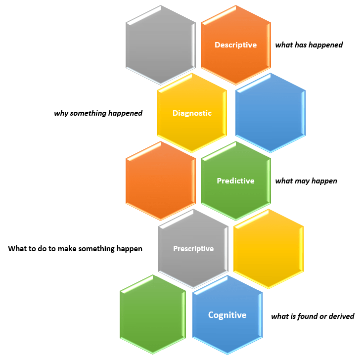
The diagram below summarizes the Workforce Analytics components to give you an overview of this article in a quick glance.
Of course, all organizations are different, and so the goals of an organization, the type of data available and the type of analyses of interest to an organization, will vary. But the importance and value of Workforce Analytics, which helps organizations make the most of their most important resource, is critical to just about all medium to large organizations, regardless of industry and prior success.
New capabilities and solutions have led to a new classification of analytics called Cognitive Analytics.
Cognitive Analytics involves bringing together technologies such as Artificial Intelligence (AI), Machine Learning (ML), and Deep Learning to apply human-like behavior to data tasks at unhuman scale, such as, searching through massive amounts of data and making sense of its contexts and be able to provide information from it, such as a likely answer or a sentiment score. This form of analytics provides new solutions that do not fit into any of the other four classifications and, in short, can be dubbed as “what is found or derived“.
There are many use cases that could benefit from this type of analytics, such as, personalization of services at scale, and improved customer service efficiency.
Thanks for reading and best wishes on your data journey!
Our team at work recently started using the Power BI platform. We are just getting going but I am already loving this tool. Our current enterprise BI platforms are Qlik and OBI (Oracle Business Intelligence), however, Power BI has has gained significant traction in business teams over the last couple years where it used for departmental reporting and analysis.
I see why the business teams love this tool and am excited about bringing it into our portfolio of tools for delivering analytic solutions across the company. These are some of the reasons I like Power BI:
First and foremost, we have not yet come across anything that we currently do in Qlik or OBI that we will not be able to do in Power BI. This was very important.
Power BI has a very intuitive and well laid out interface. You can easily switch between the visualizations, the data, and the data model. And within each of those tabs, you easily navigate using the well-placed objects and menu items. I found the interface easy to get accustomed to.
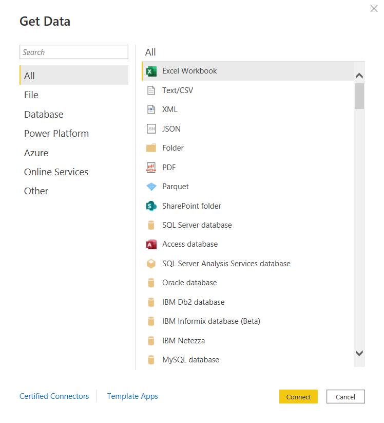
You can connect to just about any data source. The list is long. It seems the only source missing is an alien database on Mars. 🙂 I am kidding, but I did not find a native connector for Informix – the most uncommon database that we currently have as a source, but of course, ODBC and JDBC are available for those scenarios. Take a look.
and there are many more!
Some notable connectors are SQL Server Analysis Services, PostgreSQL, Amazon Redshift, Google BigQuery, Snowflake, various Azure data sources, Salesforce, Spark, GitHub, Databricks, and many more.
There are many awesome features for handling Excel data. And although we try to avoid Excel data as a source, it’s just not possible at times, and sometimes it makes sense to use those sources. However, the Power Query functionality allows users to perform ETL tasks on any data from any source.
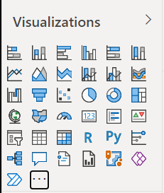
Power BI has many built-in visualization options.
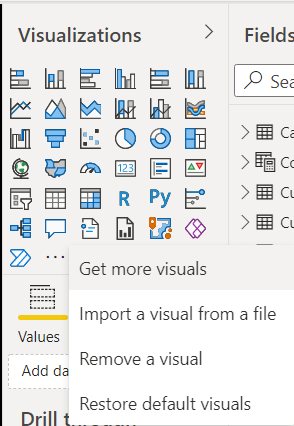
And you have the ability to “get more” from the marketplace.
Data modeling in Power BI is based on a methodology that our team is very familiar with: Dimensional Modeling, also known as, Star-Schema Modeling. And this is a proven method that works for efficient analytic solutions. In Power BI, it is also easy to create relationships between tables, change data types, and build hierarchies.
Within the data models, you can also use a versatile language called DAX (Data Analysis Expressions) to manipulate data, filter data, build measures, and more. I find that what’s possible with DAX brings Power BI into a whole other tier of flexibility compared to other tools. There is a bit of a learning curve for DAX, but you can start by focusing on a few key functions, and then expand your knowledge over time.
As you would expect in any modern BI platform, the security features in Power BI provide for object-level and data-level security. We have set up some simple security scenarios so far and it was straightforward. We will be digging more into setting up some more complex security scenarios soon and will report on that experience.
Data profiling features are built into Power BI, which may save you some time from having to jump into another query tool to profile your data.
Along with some standard analytic features, such as TopN, conditional formatting, and aggregate functions, Power BI also offers AI visuals, R and Python visuals, and advanced algorithms (such as key influencers and outliers) are available. I can foresee us using these features in the future.
Integration options with Office 365, SharePoint, and Teams.
Power BI is a great platform for one of the most significant trends in analytics – that is, users clamoring for Self-Service Analytics. With the ability to easily secure and share Power BI datasets, and users able to easily connect and use that data with an intuitive, optional code, tool that they may already have exposure to, it will be easier to implement self-service solutions. There are also some cool features for report consumers, such as personalization of visuals and mobile view.
A company called P3Adaptive delivered an awesome training for us, but there are tons of free resources available for learning. A good place to start is the Power BI lessons on Microsoft Learn – Power BI. And then, sign up for Dashboard in a Day (DIAD), a free one-day instructor-led training. You can find and register for DIAD classes here: Microsoft Events – DIAD
There are reasons why the Power BI platform has been at the top of the “Gartner Magic Quadrant for Business Intelligence and Analytics Platforms” for the last 3 years. It has a lot going for it and the company seems to be aggressive about continuous improvement.
I look forward to the Power BI journey and the ongoing quest to make our data as valuable as possible for our company.
There is an “issue” or “security feature” (depending on how you look at it) that exists in OBIEE 12c (Oracle Business Intelligence) and in OAS (Oracle Analytics Server). The OBIEE or OAS dashboard pages do not display external embedded content in most browsers.
We use multiple BI platforms, but wanted to avoid sending users to one platform for some reporting and to another for other reporting. This can be confusing to users. To provide a good user experience by directing users to one place for all dashboards and self-service reporting, we have embedded most of the QlikView and Qlik Sense dashboards into OBI pages. With that, the users can be provided with one consistent training and have one place to go.
However, the Qlik embedded content only shows when using the IE (Internet Explorer) browser and the others give some “error” message.
The Chrome browser gives this error message: “Request to the server have been blocked by an extension.”
And the Edge browser gives this message: “This content is blocked. Contact the site owner to fix the issue.”
Or you may get other messages, such as (from Oracle Doc ID: 2273854.1):
Internet Explorer This content cannot be displayed in a frame To help protect the security of information you enter into this website, the publisher of this content does not allow it to be displayed in a frame.
Firefox No message is displayed on the page, but if you open the browser console (Ctrl+Shift+I) you see this message in it: Content Security Policy: The page’s settings blocked the loading of a resource at http://<server>/ (“default-src http://<server>:<port>”).
Chrome No message is displayed on the page, but if you open the browser console (Ctrl+Shift+I) you see this message in it: Refused to frame ‘http://<server>/’ because it violates the following Content Security Policy directive: “default-src ‘self'”. Note that ‘frame-src’ was not explicitly set, so ‘default-src’ is used as a fallback
This situation, although not ideal, has been fine since our company’s browser standard is IE and we provided a work-around for users that use other browsers to access the embedded content. But this will change soon since IE is going away.
There are 2 solutions to address the embedded content issue.
Run Edge browser in IE mode for the BI applications sites/URLs.
This would have been a good option for us, but it causes issues with the way we have SSO configured for a group of applications.
Perform some configuration changes as outline below from Oracle Doc ID: 2273854.1.
We ended up going forward with this solution and our team got it to work after some configurations trial and error.
(from Oracle Doc ID: 2273854.1):
For security reasons, you can no longer embed content from external domains in dashboards. To embed external content in dashboards, you must edit the instanceconfig.xml file.
To allow the external content:
Make a backup copy of <DOMAIN_HOME>/config/fmwconfig/biconfig/OBIPS/instanceconfig.xml
Edit the <DOMAIN_HOME>/config/fmwconfig/biconfig/OBIPS/instanceconfig.xml file and add the ContentSecurityPolicy element inside the Security element:
After upgrading from OBIEE to OAS (Oracle Business Intelligence to Oracle Analytics Server), the prompts started showing NULL values in the drop downs. This was not happening in OBI because we had the <ShowNullValueWhenColumnIsNullable> config parameter set to “never” for prompts.
This setting looked something like this in OBIEE (note the first line after the <Prompts> tag):
In OAS, this parameter needs to be set in the new analytics/systemsettings page. Go to that page and set the option. Then restart by clicking on the Restart button on that page. After a restart, it resolved the issue for us.


 and there are many more!