Author: normatthedatacommunity

Why can’t I add search to my Power BI slicer?

Power BI makes it really easy to add the search capability to slicers to allow users to search for values. This is especially useful when there are many values available in the slicer. However, you might be wondering, “Why don’t I see the Search option on my slicer?” or ‘How can I add the Search option to my slicer since it’s not showing in the options?”

Unfortunately, this feature is not available on numeric or date slicers.

To access and activate (or deactivate) the search feature on a slicer, hover over the slicer, and then click the “3-dots” icon in the top right.

If the slicer contains text values, you will see the following options, from which you can simply click “Search” to activate the feature:

When it is “checked” as shown above, it’s activated, and it’s deactivated when not “checked”.

However, if the slicer contains date or number values, you will see the following options, which do not include the “Search” option:

A very ugly option is to set your slicer settings Style to “Between”, and then a user would be able to enter the same value in both the From and To values to find the specific value. Obviously, this is not ideal and will not be desirable in most cases, but it is an option for some cases, and maybe useful during testing.

Good luck on your data journey!

Errors loading data from Excel into Power BI

While loading some data from several Excel files into Power BI, I encountered the following errors:

Table1:
“Load was cancelled by an error in loading a previous table.”

Table2:
“OLE DB or ODBC error: [Expression.Error] The key didn’t match any rows in the table.”

Table3:
“A single value for column ‘Area of Responsibility’ in table ‘Requisitions-Load’ cannot be determined. This can happen when a measure formula refers to a column that contains many values without specifying an aggregation such as min, max, count, or sum to get a single result.”

As you know (since you are reading this post), these error messages are not very specific.  I did not immediately find anything obviously wrong.  After reading a couple posts, I checked the latest data files to see if there were any new, missing, or incorrect column names or sheet names.

Turns out, one of the files did not have the expected Sheet name. After updating the sheet name to the correct name, all the files loaded without an issue.

I hope this helped.

Workday report error – “Found a duplicate sort descriptor for Field”

I got the following error after adding multiple new fields to a Workday report.

“Found a duplicate sort descriptor for Field”

Turns out the solution was simple. There was a field that was inadvertently added twice in the “Sort” tab.

After removing one of the duplicates, the error was resolved. So, if you get this error, just check if you have a field listed twice in your Sort tab, confirm your comparison, and then remove one of them.

Good luck!

Why can’t I download my report from Power BI Service to a pbix file?

You might be attempting to download a report from the Power BI Service to a pbix file and do not see that option or that option is not active or selectable. The reason you cannot select the option is most likely because the report was created in the Power BI Service as opposed to using the Power BI Desktop.

When a report is created in the Power BI Service, you are not able to download that report to a Power BI pbix file. That option is only available when you create the report using the Power BI Desktop and then publish it to the Power BI Service.

Thanks for reading!

Activating or Deactivating “Preview Features” in Power BI

Microsoft frequently adds new features that are available for preview in Power BI. This is a way for Microsoft to launch the features and have them tested by the community before making them fully available in the Power BI application. These features are sometimes in preview mode for a long time, and you may find that you want to use one or more of these features before they become generally available.

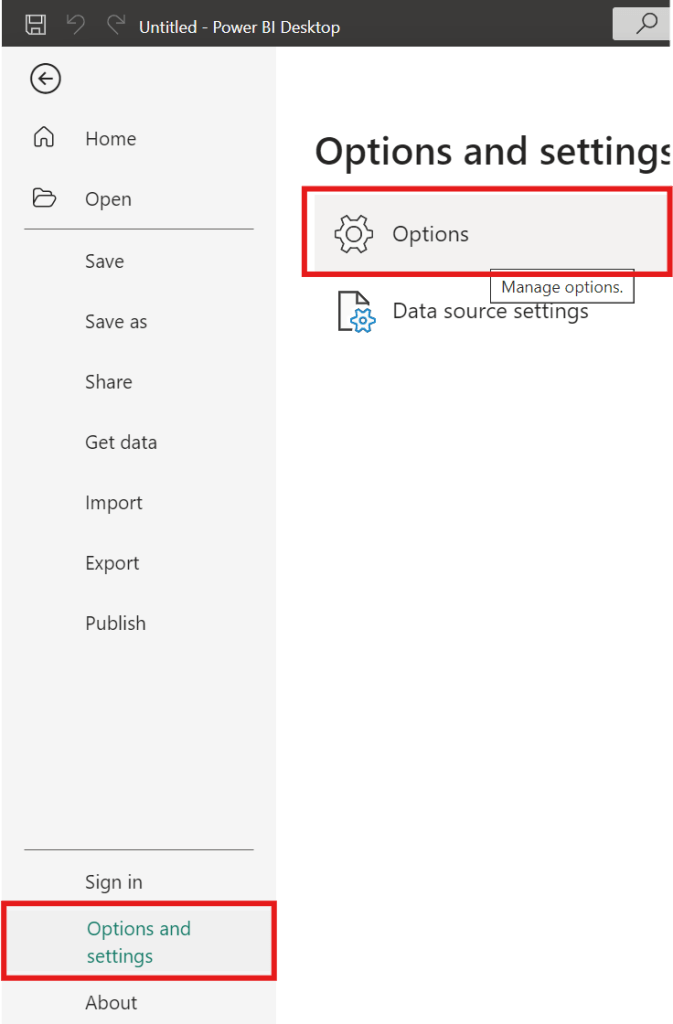
To activate (or deactivate) preview features, go to … File –> Options and settings –> Options

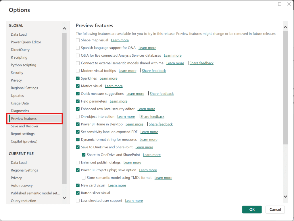
Then, in the Options window, select “Preview features” (on the left) as shown below.

Then, select the options you would like to activate or deactivate on the right side, such as checking “Shape map visual” to activate it or unchecking “Sparklines” to deactivate it. Once you have selected or unselected all the features you want, then click “OK”. Then, make sure to save whatever you need to, and then close and reopen Power BI for the activations or deactivations to take effect.

Thanks for reading.

SQL Tips: How to generate insert statements using the data from the output of a select statement using Toad

If you need to build insert statements for many rows of data for inserting that data into another table or into the same table in a different environment, there is a convenient way to do this in Toad. This is often needed to move data around.

In Toad, execute the appropriate select statement on the source table …

Select * from [my_schema].[my_simple_table];

I used a simple “select *” above, but your SQL statement can be any valid SQL statement that returns the data you want to insert into the other table. You may add specific columns, add filters, joins, and any other valid SQL operation.

Let’s say you want to insert the output into another table in a different schema.

Right-click on the output result data, and click “Export Dataset…”

From the “Export format” drop down menu, choose “Insert Statements”

In the Output section of the Export Dataset dialog box, enter the location and name of the Insert Script file that will be generated.

There are several other parameters that you could choose but we won’t cover them all here.

If you only wanted to generate inserts for some selected rows, select “Export only selected rows”.

If you need to specify the schema of the target table, select “Include schema name”

In the Table section, enter the name of the target schema and table

Note, there are data masking options available that can be very useful if, for example, you are moving some data from a Production environment to a Non-Production environment, and you do not want to expose the data there.

After you have set the parameters relevant to your scenario, Click “OK”.

The Insert Script file of all the data will be generated with the filename and at the location you specified. And the insert statements will include the name of the schema and table you specified.

Thanks for reading!

Data Cleaning methods

Data cleaning is an essential step in the data preprocessing pipeline when preparing data for analytics or data science. It involves identifying and correcting or removing errors, inconsistencies, and inaccuracies in the dataset to improve its quality and reliability. It is essential that data is cleaned before being used in analyses, reporting, development or integration. Here are some common data cleaning methods:

Handling missing values:

  • Delete rows or columns with a high percentage of missing values if they don’t contribute significantly to the analysis.
  • Impute missing values by replacing them with a statistical measure such as mean, median, mode, or using more advanced techniques like regression imputation or k-nearest neighbors imputation.

Handling categorical variables:

  • Encode categorical variables into numerical representations using techniques like one-hot encoding, label encoding, or target encoding.

Removing duplicates:

  • Identify and remove duplicate records based on one or more key variables.
  • Be cautious when removing duplicates, as sometimes duplicated entries may be valid and intentional.

Handling outliers:

  • Identify outliers using statistical methods like z-scores, box plots, or domain knowledge.
  • Decide whether to remove outliers or transform them based on the nature of the data and the analysis goals.

Correcting inconsistent data:

  • Standardize data formats: Convert data into a consistent format (e.g., converting dates to a specific format).
  • Resolve inconsistencies: Identify and correct inconsistent values (e.g., correcting misspelled words, merging similar categories).

Dealing with irrelevant or redundant features:

  • Remove irrelevant features that do not contribute to the analysis or prediction task.
  • Identify and handle redundant features that provide similar information to avoid multicollinearity issues.

Data normalization or scaling:

  • Normalize numerical features to a common scale (e.g., min-max scaling or z-score normalization) to prevent certain features from dominating the analysis due to their larger magnitudes.

Data integrity issues:

Finally, you need to address data integrity issues.

  • Check for data integrity problems such as inconsistent data types, incorrect data ranges, or violations of business rules.
  • Resolve integrity issues by correcting or removing problematic data.

It’s important to note that the specific data cleaning methods that need to be applied to a dataset will vary depending on the nature of the dataset, the analysis goals, and domain knowledge. It’s recommended to thoroughly understand the data and consult with domain experts when preparing to perform data cleaning tasks.

Custom Workday Report Types

There are eight (8) types of custom report in Workday. Users with the appropriate permissions (security domains) are able to create custom reports and when they do, they must select from one of these eight (8) types. The types are shown in the image below.

This article describes the different types of custom reports that users can create (and use) in Workday. 

Simple

As the name implies, this type is meant for the simplest reports – reports built on a single business object and has no calculated fields. Simple reports provide a straightforward user interface that allows the report creator to select a set of fields, and optionally set sort and filter criteria. This report type cannot be later modified to add additional business objects or calculated fields. Also, this report type cannot be used as a web service. For this reason, this report type is not often used. 

Advanced

This is the most used report type in Workday (estimated to typically be 90% of reports). As you might assume, this report allows for everything the Simple report offers plus some additional features. Data for the report can come from a Primary business object and Related business objects.

Also, these reports can have calculated fields, multiple levels of headings and sub-totals, sub-filtering, run time prompts, charting, worklets, and can be used as a web service. Reports used as a source for Prism Analytics must be of the Advanced type.

Composite 

Composite reports are made up of different existing matrix reports. 

Matrix

As the name implies, a Matrix report contains both row and column headers. It summarizes numeric data by one or two fields, that contain repeating values and displays them in a matrix that can be rendered as a drillable table or chart. As with other report types, Matrix reports also allow for filtering, run time prompts, worklets, and report sharing.

Trending

Trending reports group and summarize data by time periods allowing users to perform trend analysis.

Transposed

As the name suggests, Transposed reports turn the columns (of data) into rows (of data) and the rows into columns.

Search

Search reports display the various search results that are based on values selected/choices made for the report’s facet filters. Search reports can also be used as a web service in outbound EIBs.

nBox

nBox reports are used to calculate all the information, count data, and display the information in a two-dimensional matrix.

Thanks for reading!

Add a “Last Refreshed Date” notification on a Power BI dashboard

It is customary to add a “Last Refreshed Date” to dashboards to notify users of when the dashboard was last refreshed. Here will go through the steps of adding a “Last Refreshed Date” to a Power BI dashboard.

Open the dashboard you want to add the notification to in Power BI Desktop, and then Get Date -> Blank Query. Name the new query as “Last Refreshed Date” or something like that.

Then, set the value as shown below, by typing “= DateTime.LocalNow()” into the formula area:

Next, convert the value to a Table by clicking the “To Table” icon, and then clicking the “To table” option:

A table with the single date column is created

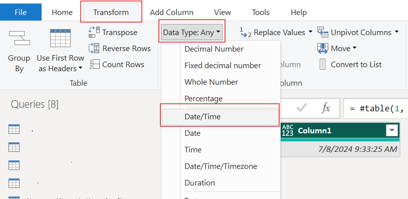
Set the data type as Date/Time …

… and rename the column to something meaningful, such as “Last Refreshed Date” …

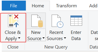
Close and apply your changes.

The table will be added to your Power BI model. It should have no relationships.

Now, add a Card visual to your dashboard, place it where it is visible but out of the way, such as in the top-right or bottom-right corner, and add the Last Refreshed Date column to it from the new table. Now, whenever your dashboard is refreshed, this new table and visual will also be updated/refreshed.

Thanks for reading!

Transpose vs. Pivot vs. Unpivot in Power BI

In this post, I will quickly show how to perform 3 key transformations in Power BI – Transpose, Pivot, and Unpivot – and what impact they have on the data they are applied to. These transformations are often needed to manipulate the original data to get it into the shape needed to create the Power BI model and reports. We will use a simple example so that you can see clearly the effect of each transformation.

This is the original dataset – Student Grades:

Transpose

Transpose the data by going to the Transform ribbon and clicking “Transpose”.

This is what the data looks like after the Transpose transformation is applied. The rows are converted into columns, and the columns are converted into rows. Default headers / column names are applied.

Pivot Column

Starting with the original dataset, we will now Pivot the dataset. Go to Transform ribbon, click on “Pivot Column”.

The Pivot Column dialog opens. As noted, it will use the values in the Names column to create new columns, and will use the Score column as the Values Column.

This is what the data looks like after Pivot is applied as described above. Pivot Column converts the selected Name column values into column headers.

Unpivot Columns

Starting with the original dataset, we will now Unpivot the dataset. First select all 4 name columns by using “Ctrl + Click”.

Then, go to Transform ribbon, click on “Unpivot Columns”. This is what the data looks like after the Unpivot Columns transformation is applied. Unpivot Columns converts the selected columns (the name columns in this case) into a column of values (Attribute) and the column values are stored in the Value column.

Thanks for reading!