Author: normatthedatacommunity

Self-Service Analytics: Empowering Users While Maintaining Trust and Control

Self-service analytics has become a cornerstone of modern data strategies. As organizations generate more data and business users demand faster insights, relying solely on centralized analytics teams creates bottlenecks. Self-service analytics shifts part of the analytical workload closer to the business—while still requiring strong foundations in data quality, governance, and enablement.

This article is based on a detailed presentation I did at a HIUG conference a few years ago.


What Is Self-Service Analytics?

Self-service analytics refers to the ability for business users—such as analysts, managers, and operational teams—to access, explore, analyze, and visualize data on their own, without requiring constant involvement from IT or centralized data teams.

Instead of submitting requests and waiting days or weeks for reports, users can:

  • Explore curated datasets
  • Build their own dashboards and reports
  • Answer ad-hoc questions in real time
  • Make data-driven decisions within their daily workflows

Self-service does not mean unmanaged or uncontrolled analytics. Successful self-service environments combine user autonomy with governed, trusted data and clear usage standards.


Why Implement or Provide Self-Service Analytics?

Organizations adopt self-service analytics to address speed, scalability, and empowerment challenges.

Key Benefits

  • Faster Decision-Making
    Users can answer questions immediately instead of waiting in a reporting queue.
  • Reduced Bottlenecks for Data Teams
    Central teams spend less time producing basic reports and more time on high-value work such as modeling, optimization, and advanced analytics.
  • Greater Business Engagement with Data
    When users interact directly with data, data literacy improves and analytics becomes part of everyday decision-making.
  • Scalability
    A small analytics team cannot serve hundreds or thousands of users manually. Self-service scales insight generation across the organization.
  • Better Alignment with Business Context
    Business users understand their domain best and can explore data with that context in mind, uncovering insights that might otherwise be missed.

Why Not Implement Self-Service Analytics? (Challenges & Risks)

While powerful, self-service analytics introduces real risks if implemented poorly.

Common Challenges

  • Data Inconsistency & Conflicting Metrics
    Without shared definitions, different users may calculate the same KPI differently, eroding trust.
  • “Spreadsheet Chaos” at Scale
    Self-service without governance can recreate the same problems seen with uncontrolled Excel usage—just in dashboards.
  • Overloaded or Misleading Visuals
    Users may build reports that look impressive but lead to incorrect conclusions due to poor data modeling or statistical misunderstandings.
  • Security & Privacy Risks
    Improper access controls can expose sensitive or regulated data.
  • Low Adoption or Misuse
    Without training and support, users may feel overwhelmed or misuse tools, resulting in poor outcomes.
  • Shadow IT
    If official self-service tools are too restrictive or confusing, users may turn to unsanctioned tools and data sources.

What an Environment Looks Like Without Self-Service Analytics

In organizations without self-service analytics, patterns tend to repeat:

  • Business users submit report requests via tickets or emails
  • Long backlogs form for even simple questions
  • Analytics teams become report factories
  • Insights arrive too late to influence decisions
  • Users create their own disconnected spreadsheets and extracts
  • Trust in data erodes due to multiple versions of the truth

Decision-making becomes reactive, slow, and often based on partial or outdated information.


How Things Change With Self-Service Analytics

When implemented well, self-service analytics fundamentally changes how an organization works with data.

  • Users explore trusted datasets independently
  • Analytics teams focus on enablement, modeling, and governance
  • Insights are discovered earlier in the decision cycle
  • Collaboration improves through shared dashboards and metrics
  • Data becomes part of daily conversations, not just monthly reports

The organization shifts from report consumption to insight exploration. Well, that’s the goal.


How to Implement Self-Service Analytics Successfully

Self-service analytics is as much an operating model as it is a technology choice. The list below outlines important aspects that must be considered, decided on, and implemented when planning the implementation of self-service analytics.

1. Data Foundation

  • Curated, well-modeled datasets (often star schemas or semantic models)
  • Clear metric definitions and business logic
  • Certified or “gold” datasets for common use cases
  • Data freshness aligned with business needs

A strong semantic layer is critical—users should not have to interpret raw tables.


2. Processes

  • Defined workflows for dataset creation and certification
  • Clear ownership for data products and metrics
  • Feedback loops for users to request improvements or flag issues
  • Change management processes for metric updates

3. Security

  • Role-based access control (RBAC)
  • Row-level and column-level security where needed
  • Separation between sensitive and general-purpose datasets
  • Audit logging and monitoring of usage

Security must be embedded, not bolted on.


4. Users & Roles

Successful self-service environments recognize different user personas:

  • Consumers: View and interact with dashboards
  • Explorers: Build their own reports from curated data
  • Power Users: Create shared datasets and advanced models
  • Data Teams: Govern, enable, and support the ecosystem

Not everyone needs the same level of access or capability.


5. Training & Enablement

  • Tool-specific training (e.g., how to build reports correctly)
  • Data literacy education (interpreting metrics, avoiding bias)
  • Best practices for visualization and storytelling
  • Office hours, communities of practice, and internal champions

Training is ongoing—not a one-time event.


6. Documentation

  • Metric definitions and business glossaries
  • Dataset descriptions and usage guidelines
  • Known limitations and caveats
  • Examples of certified reports and dashboards

Good documentation builds trust and reduces rework.


7. Data Governance

Self-service requires guardrails, not gates.

Key governance elements include:

  • Data ownership and stewardship
  • Certification and endorsement processes
  • Naming conventions and standards
  • Quality checks and validation
  • Policies for personal vs shared content

Governance should enable speed while protecting consistency and trust.


8. Technology & Tools

Modern self-service analytics typically includes:

Data Platforms

  • Cloud data warehouses or lakehouses
  • Centralized semantic models

Data Visualization & BI Tools

  • Interactive dashboards and ad-hoc analysis
  • Low-code or no-code report creation
  • Sharing and collaboration features

Supporting Capabilities

  • Metadata management
  • Cataloging and discovery
  • Usage monitoring and adoption analytics

The key is selecting tools that balance ease of use with enterprise-grade governance.


Conclusion

Self-service analytics is not about giving everyone raw data and hoping for the best. It is about empowering users with trusted, governed, and well-designed data experiences.

Organizations that succeed treat self-service analytics as a partnership between data teams and the business—combining strong foundations, thoughtful governance, and continuous enablement. When done right, self-service analytics accelerates decision-making, scales insight creation, and embeds data into the fabric of everyday work.

Thanks for reading!

Data Conversions: Steps, Best Practices, and Considerations for Success

Introduction

Data conversions are critical undertakings in the world of IT and business, often required during system upgrades, migrations, mergers, or to meet new regulatory requirements. I have been involved in many data conversions over the years, and in this article, I am sharing information from that experience. This article provides a comprehensive guide to the stages, steps, and best practices for executing successful data conversions. This article was created from a detailed presentation I did some time back at a SQL Saturday event.


What Is Data Conversion and Why Is It Needed?

Data conversion involves transforming data from one format, system, or structure to another. Common scenarios include application upgrades, migrating to new systems, adapting to new business or regulatory requirements, and integrating data after mergers or acquisitions. For example, merging two customer databases into a new structure is a typical conversion challenge.


Stages of a Data Conversion Project

Let’s take a look at the stages of a data conversion project.

Stage 1: Big Picture, Analysis, and Feasibility

The first stage is about understanding the overall impact and feasibility of the conversion:

  • Understand the Big Picture: Identify what the conversion is about, which systems are involved, the reasons for conversion, and its importance. Assess the size, complexity, and impact on business and system processes, users, and external parties. Determine dependencies and whether the conversion can be done in phases.
  • Know Your Sources and Destinations: Profile the source data, understand its use, and identify key measurements for success. Compare source and destination systems, noting differences and existing data in the destination.
  • Feasibility – Proof of Concept: Test with the most critical or complex data to ensure the conversion will meet the new system’s needs before proceeding further.
  • Project Planning: Draft a high-level project plan and requirements document, estimate complexity and resources, assemble the team, and officially launch the project.

Stage 2: Impact, Mappings, and QA Planning

Once the conversion is likely, the focus shifts to detailed impact analysis and mapping:

  • Impact Analysis: Assess how business and system processes, reports, and users will be affected. Consider equipment and resource needs, and make a go/no-go decision.
  • Source/Destination Mapping & Data Gap Analysis: Profile the data, create detailed mappings, list included and excluded data, and address gaps where source or destination fields don’t align. Maintain legacy keys for backward compatibility.
  • QA/Verification Planning: Plan for thorough testing, comparing aggregates and detailed records between source and destination, and involve both IT and business teams in verification.

Stage 3: Project Execution, Development, and QA

With the project moving forward, detailed planning, development and validation, and user involvement become the priority:

  • Detailed Project Planning: Refine requirements, assign tasks, and ensure all parties are aligned. Communication is key.
  • Development: Set up environments, develop conversion scripts and programs, determine order of processing, build in logging, and ensure processes can be restarted if interrupted. Optimize for performance and parallel processing where possible.
  • Testing and Verification: Test repeatedly, verify data integrity and functionality, and involve all relevant teams. Business users should provide final sign-off.
  • Other Considerations: Train users, run old and new systems in parallel, set a firm cut-off for source updates, consider archiving, determine if any SLAs needed to be adjusted, and ensure compliance with regulations.

Stage 4: Execution and Post-Conversion Tasks

The final stage is about production execution and transition:

  • Schedule and Execute: Stick to the schedule, monitor progress, keep stakeholders informed, lock out users where necessary, and back up data before running conversion processes.
  • Post-Conversion: Run post-conversion scripts, allow limited access for verification, and where applicable, provide close monitoring and support as the new system goes live.

Best Practices and Lessons Learned

  • Involve All Stakeholders Early: Early engagement ensures smoother execution and better outcomes.
  • Analyze and Plan Thoroughly: A well-thought-out plan is the foundation of a successful conversion.
  • Develop Smartly and Test Vigorously: Build robust, traceable processes and test extensively.
  • Communicate Throughout: Keep all team members and stakeholders informed at every stage.
  • Pay Attention to Details: Watch out for tricky data types like DATETIME and time zones, and never underestimate the effort required.

Conclusion

Data conversions are complex, multi-stage projects that require careful planning, execution, and communication. By following the structured approach and best practices outlined above, organizations can minimize risks and ensure successful outcomes.

Thanks for reading!

How to turn off Auto date/time in Power BI and why you might want to

Power BI includes a feature called Auto date/time that automatically creates hidden date tables for date columns in your model. While this can be helpful for quick analyses, it can also introduce performance issues and modeling complexity in more advanced or production-grade reports.

What Is Auto Date/Time?

When Auto date/time is enabled, Power BI automatically generates a hidden date table for every column of type Date or Date/Time. These tables allow you to use built-in time intelligence features (like Year, Quarter, and Month) without explicitly creating a calendar table.

Why Turn Off Auto Date/Time?

Disabling Auto date/time is often considered a best practice for the following reasons:

  • Better Performance
    Each date column gets its own hidden date table, which increases model size and can slow down report performance.
  • Cleaner Data Models
    Hidden tables can clutter the model and make debugging DAX calculations more difficult.
  • Consistent Time Intelligence
    Using a single, well-designed Date (Calendar) table ensures consistent logic across all measures and visuals.
  • More Control
    Custom calendar tables allow you to define fiscal years, custom week logic, holidays, and other business-specific requirements.

How to Turn Off Auto Date/Time in Power BI

You can disable Auto date/time in both Power BI Desktop and at the report level:

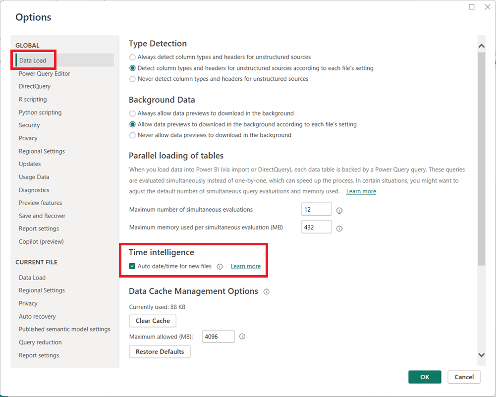
  1. In Power BI Desktop, go to FileOptions and settingsOptions.
  2. Under Global, select Data Load.
  3. Uncheck Auto date/time for new files.
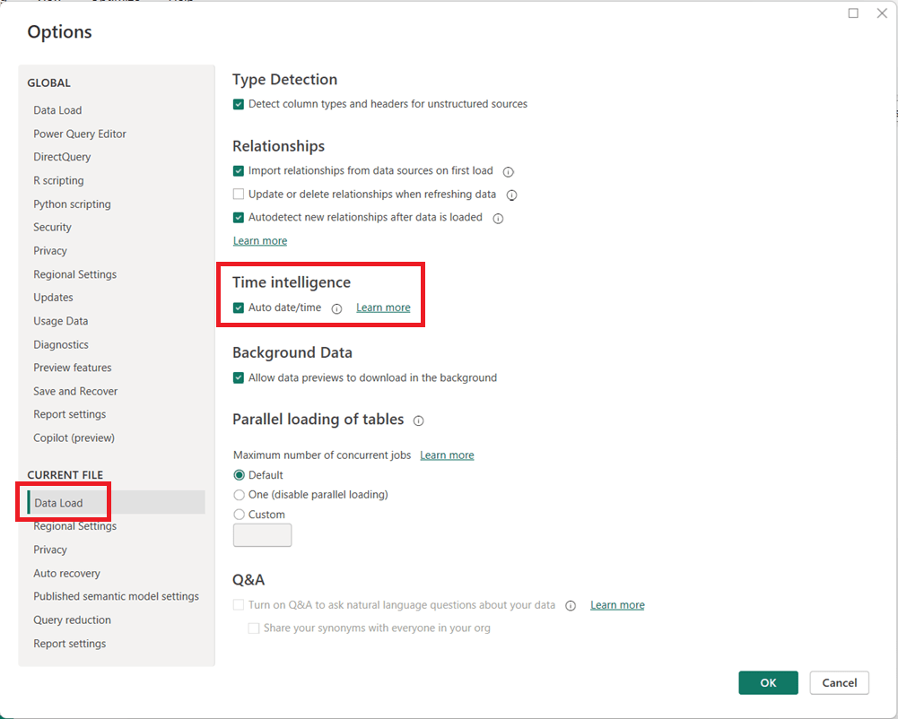
  1. (Optional but recommended) Under Current File, select Data Load and uncheck Auto date/time to disable it for the current report.
  1. Click OK and refresh your model if necessary.

When Should You Leave It On?

Auto date/time can still be useful for:

  • Quick prototypes or ad-hoc analysis
  • Simple models with only one or two date fields
  • Users new to Power BI who are not yet working with custom DAX time intelligence

Final Thoughts

For enterprise, reusable, or performance-sensitive Power BI models, turning off Auto date/time and using a dedicated Date table is usually the better approach. It leads to cleaner models, more reliable calculations, and greater long-term flexibility as your reports grow in complexity.

Thanks for reading!
AI in Financial Services: From Back Office Automation to Intelligent Decision-Making

Few industries have embraced AI as broadly—or as aggressively—as financial services. Banks, insurers, investment firms, and fintechs operate in data-rich, highly regulated environments where speed, accuracy, and trust matter. AI is increasingly the engine that helps them balance all three.

How AI Is Being Used Today

AI shows up across nearly every function in financial services:

  • Fraud Detection & Risk Monitoring
    Machine learning models analyze transactions in real time to identify suspicious patterns, often catching fraud faster and more accurately than rule-based systems. PayPal utilizes AI-powered systems to detect fraud by comparing transactions with historical patterns, reducing financial losses. This is extremely critical in this time of rampant fraud. Financial Institutions also use AI to analyze real-time working capital and historical data to forecast financial performance and predict trends with greater accuracy.
  • Credit Scoring & Underwriting
    AI evaluates borrower risk using far more signals than traditional credit scores, including transaction behavior and alternative data (where regulations allow). Upstart, an AI-based lending platform, uses non-traditional data to assess creditworthiness, approving loans quickly for customers who might otherwise be denied by conventional models.
  • Customer Service & Virtual Assistants
    Chatbots and voice assistants handle balance inquiries, dispute tracking, loan status updates, and more—freeing human agents for complex cases. Bank of America’s Erica, a virtual assistant, assists customers with account information, bill payments, and personalized financial advice through chat or voice.
  • Algorithmic & Quantitative Trading
    AI models analyze market signals, news sentiment, and historical trends to inform trading strategies and portfolio optimization. Goldman Sachs uses generative AI to optimize trading strategies and forecast market trends, gaining a competitive edge in dynamic markets.
  • Compliance & AML (Anti–Money Laundering)
    AI tools assist in ensuring compliance with regulatory requirements by automating the monitoring transactions and reporting. This reduces the risk if non-compliance and associated penalties. HSBC utilizes AI to process compliance documents efficiently, ensuring adherence to evolving regulations and minimizing manual errors. AI also helps identify money laundering patterns, reduce false positives, and prioritize investigations.
  • Personalized Financial Advice
    Robo-advisors and recommendation engines tailor savings, investment, and retirement strategies to individual customers. Wells Fargo’s predictive banking feature provides personalized prompts about future financial activities leading to improved user engagement.

Tools, Technologies, and Forms of AI

Financial services organizations typically use a layered AI stack:

  • Machine Learning & Deep Learning
    Core to fraud detection, risk modeling, and forecasting.
  • Natural Language Processing (NLP)
    Used to analyze customer communications, earnings reports, regulatory filings, and market news.
  • Generative AI & Large Language Models (LLMs)
    Emerging use cases include advisor copilots, automated report generation, customer communication drafting, and internal knowledge search.
  • AI Platforms & Infrastructure
    Cloud platforms like AWS, Azure, and GCP provide scalable ML services, while many firms also invest in proprietary, on-prem models for sensitive workloads.
  • Decision Intelligence & Optimization Models
    AI combined with rules engines to support pricing, underwriting, and capital allocation decisions.
  • Blockchain and AI Integration
    Blockchain and AI integration will redefine how financial transactions are managed, enhancing security, transparency, and efficiency. Blockchain technology ensures trust and accountability, while AI improves transaction validation and fraud detection. Together, these technologies will streamline cross-border payments, smart contracts, and digital identities, creating a more secure and efficient financial ecosystem.

Benefits Financial Institutions Are Seeing

Organizations that have successfully deployed AI are seeing tangible gains:

  • Reduced Fraud Losses and faster detection
  • Lower Operating Costs through automation of high-volume tasks and improved efficiencies
  • Improved Customer Experience with faster responses and personalization
  • Better Risk Management via more dynamic and data-driven models
  • Increased Revenue through smarter cross-sell, upsell, and pricing strategies

In short, AI helps firms move from reactive decision-making to proactive, predictive operations.

Pitfalls and Challenges

Despite the promise, AI in financial services comes with real risks:

  • Bias and Fairness Concerns
    AI models can unintentionally reinforce historical bias in lending or underwriting decisions, creating regulatory and ethical challenges.
  • Model Explainability
    Regulators and auditors often require clear explanations for decisions—something black-box models struggle to provide.
  • Data Quality and Silos
    Poor data governance leads to unreliable models and failed AI initiatives.
  • Regulatory Risk
    Financial institutions must ensure AI usage aligns with evolving regulations across regions.
  • Overhyped Projects
    Some AI initiatives fail because they chase cutting-edge technology without clear business ownership or measurable outcomes.

Where AI Is Headed in Financial Services

Looking ahead, several trends are emerging:

  • AI as a Copilot, Not a Replacement
    Advisors, underwriters, and analysts will increasingly work alongside AI systems that augment—not replace—human judgment.
  • More Explainable and Governed AI
    Expect increased focus on transparency, auditability, and model governance.
  • Real-Time, Embedded Intelligence
    AI will be embedded directly into workflows—credit decisions, claims processing, and trade execution—rather than sitting in separate tools.
  • Greater Use of Generative AI
    From personalized financial guidance to internal knowledge assistants, GenAI will reshape how employees and customers interact with financial systems.

How Financial Services Companies Can Gain an Advantage

To stay ahead in this fast-changing landscape, organizations should:

  1. Start with High-Impact Use Cases
    Focus on areas like fraud, customer experience, or risk where ROI is clear.
  2. Invest in Data Foundations
    Clean, well-governed data is more valuable than the most advanced model.
  3. Build AI Governance Early
    Fairness, explainability, and compliance should be part of design—not afterthoughts.
  4. Upskill the Workforce
    AI-literate business leaders and domain experts are just as important as data scientists.
  5. Blend Human and Machine Intelligence
    The most successful systems pair AI recommendations with human oversight.

Final Thoughts

AI is no longer experimental in financial services—it’s essential infrastructure. Firms that treat AI as a strategic capability, grounded in strong data practices and responsible governance, will be best positioned to innovate, compete, and earn trust in an increasingly intelligent financial ecosystem.

Are you using AI in the financial services industry? Share how and what you have learned from your journey.

This article is a part of an “AI in …” series that shares information about AI in various industries and business functions. Be on the lookout for future (and past) articles in the series.

Other “AI in …” articles in the series:

AI in the Hospitality Industry: Transforming Guest Experiences and Operations

AI in Gaming: How Artificial Intelligence is Powering Game Production and Player Experience

AI in Healthcare: Transforming Patient Care and Clinical Operations

Thanks for reading and good luck on your data journey!

How to update your Power BI source file location

The location of your source files has changed, and now you need to update your Power BI report to use the new location. To update the directory or location of your source file, in Power BI Desktop, click Transform Data -> Data Source Settings 

Then click on the entry that corresponds to the path you need to update.

Update or entirely change the path and click ok. Apply your changes.

It becomes a little more complicated when you are changing a local folder to a SharePoint location, which we will cover in another post, but for changing location of single files, it’s that simple. 

Thanks for reading!

Power BI load error: load was cancelled by error in loading a previous table

You may run into this error when loading Power BI:

"load was cancelled by error in loading a previous table"

If you do get this error, keep scrolling down to see what the “inducing” error is. This message is an indication that there was an error previous to getting to the current table in the process. The real, initial error will be more descriptive. Start with resolving that error(s), and then this one will go away.

I hope you found this helpful.

Power BI refresh error: Column ‘X’ in table ‘Y’ contains blank values and this is not allowed for columns on the one-side of a many-to-one relationship or for columns that are used as the primary key of a table

I was getting this error message when I attempted to refresh a Power BI application:

"Column 'Date' in table 'Date Dim' contains blank values and this is not allowed for columns on the one-side of a many-to-one relationship or for columns that are used as the primary key of a table"

However, despite what the message indicated, I double-checked and confirmed that I did not have any blank values in the ‘Date Dim’ table.

It turns out that you may also get this error (although incorrectly worded in my opinion) if the blanks are in the joining table. In my case, I had blanks in a ‘Snapshot Date’ column in the fact table that was joined to the ‘Date Dim’ table. Once these blanks were filled, the refresh ran without error.

One thing to look out for in these cases (since this is what happened in my case), if your source is Excel, undo all filters to make sure that you do not have any rows being filtered out when checking for blanks values across your columns, because this could potentially inadvertently hide the rows with the blank values and cause you to miss them.

I hope you found this helpful.

AI in Healthcare: Transforming Patient Care and Clinical Operations

Artificial Intelligence (AI) is redefining healthcare at every level—speeding and improving patient care, enhancing diagnostic accuracy, personalizing treatments, speeding drug delivery, and streamlining hospital operations. As global health systems grapple with rising costs, staff shortages, and complex patient needs, AI has emerged as a critical force for innovation. From radiology to drug discovery, AI is no longer experimental; it is becoming a cornerstone of modern medicine.

AI in healthcare is expected to exceed a whopping $600B by 2034, according to one forecast. The explosion of digital healthcare records has created vast opportunities for AI to uncover and use patterns and insights across the spectrum of healthcare.

How AI Is Being Used in Healthcare

AI’s applications in healthcare are vast and growing. Here are a few examples:

  • Medical Imaging and Diagnostics: AI algorithms can analyze X-rays, MRIs, and other medical images to detect diseases, such as cancer and heart conditions.
  • Virtual Health Assistants: As in every industry, AI chatbots and symptom checkers (e.g., Ada Health, Babylon Health) provide patients with 24/7 support proving information and answers to questions, triage guidance, medication refills, and appointment scheduling.
  • Predictive Analytics: Hospitals use AI to forecast patient admissions, identify those at risk for readmission, and anticipate Emergency / ICU demand. AI can predict the risk of developing certain diseases based on patient data, such as medical history, lifestyle, and genetic information.
  • Personalized Medicine: AI will help to develop with better precision personalized treatment plans and medications/supplements for patients.
  • General Research & Development: AI is being used in medical research to analyze massive datasets in order to develop new treatments and improve patient care and outcomes.
  • Drug Discovery and Development: AI models from companies like BenevolentAI and Insilico Medicine accelerate the identification of potential compounds, reducing the timeline from years to months.
  • Robotic Surgery: AI-powered robotic systems can assist surgeons with complex procedures, improving precision and minimizing invasiveness. Systems like the da Vinci Surgical System use AI-assisted robotics to improve surgical precision and minimize recovery times.
  • Administrative Automation: AI streamlines billing, coding, and claims management to reduce paperwork and human error. AI-powered systems can also automate appointment scheduling and reminders. This will help with staff shortages and reduce staff burnout.
  • Billing, coding and health insurance processing: AI can analyze medical records and automate insurance processing and billing, thus improving efficiency, reducing errors, and reducing staff hours.
  • Fraud detection: AI algorithms can identify suspicious patterns in healthcare claims, leading to reducing in fraud.
  • Pregnancy Management: AI applications are used to monitor the health of both mother and fetus through wearable devices and monitored data.

And the healthcare use cases go on and on.

Tools, Technologies, and Methods Behind AI in Healthcare

Healthcare AI encompasses a wide variety of solutions and, therefore, draws on a mix of advanced technologies and methods:

  • Machine Learning (ML) for patient risk stratification, disease progression modeling, and outcome prediction.
  • Natural Language Processing (NLP) to analyze unstructured clinical notes, extract insights from medical records, and power conversational interfaces.
    • for example: Healthcare Text Analysis: In the healthcare sector, Azure’s language solutions are used to extract clinical information from unstructured medical documents. Features like entity recognition and text analytics for health help identify symptoms, medications, and diagnoses, supporting faster and more accurate decision-making.
  • Computer Vision in radiology, pathology, and dermatology for image-based diagnostics.
  • Robotics for surgeries, rehabilitation support, and hospital logistics (e.g., delivery robots for medications).
  • Cloud AI Platforms such as Microsoft Azure Health Data Services, AWS HealthLake, and Google Cloud Healthcare API for data integration and analysis.
  • Generative AI for drug molecule design, synthetic medical data creation, and personalized patient communication.
  • Google’s DeepMind and IBM Watson Health assist radiologists in detecting conditions such as cancer, stroke, and heart disease earlier and with higher precision.
  • IDx-DR, an FDA-approved AI tool, diagnoses diabetic retinopathy by analyzing eye images, helping to prevent irreversible damage through early detection.
  • AI-powered drug discovery tool, Atomwise, has successfully identified potential treatments for diseases like Ebola within a day.
  • Aidoc, an AI-driven radiology platform, prioritizes critical cases and detects abnormalities in medical images, significantly enhancing diagnosis and treatment.
  • Dragon Medical One uses speech recognition and speech-to-text features to assist healthcare providers with documenting patient notes, leading to time savings and better accuracy.

Benefits of AI in Healthcare

The adoption of AI has brought measurable benefits across the sector:

  • Improved Diagnostics: AI-powered imaging tools have demonstrated higher sensitivity in detecting certain conditions than human experts alone.
  • Personalized Care: AI helps tailor treatment plans to individual patient profiles, improving outcomes.
  • Operational Efficiency: Predictive analytics optimize staffing, reduce wait times, and cut costs.
  • Faster Drug Development: AI-driven discovery platforms shorten the drug development cycle, lowering costs and improving pipeline success.
  • Accessibility: Virtual assistants extend care access to underserved populations by providing round-the-clock guidance.

Pitfalls and Challenges of AI in Healthcare

Despite the proven results and huge promise, several challenges and risks persist:

  • Data Quality: While significant amounts of data are available, not all of it is of high quality, and significant efforts are needed to ensure that the data driving AI solutions is clean and accurate.
  • Data Bias and Inequality: AI models trained on non-diverse datasets may produce biased outcomes, particularly for underrepresented populations.
  • Regulatory Hurdles: The FDA and other agencies require rigorous testing and approval, slowing AI adoption.
  • Failed Projects: IBM Watson Health, once hyped as a revolutionary tool, failed to meet expectations in oncology due to overpromising and underdelivering.
  • Data Privacy Concerns: With vast amounts of sensitive data, breaches or misuse pose serious risks.
  • Integration Challenges: Many hospitals face difficulties embedding AI into legacy systems and workflows.
  • High AI Costs: AI solutions are rarely cheap, and not all healthcare companies can afford what they desire. Companies need to carefully and strategically choose which solutions to implement.
  • Overreliance on AI: Excessive trust in algorithms could lead to errors if not combined with human oversight.

The Future of AI in Healthcare

The trajectory of AI points toward deeper integration into healthcare delivery:

  • Precision Medicine at Scale: AI will increasingly guide genomics-driven treatments, tailoring care to a patient’s DNA profile.
  • Real-Time Monitoring: Wearables and IoT devices paired with AI will continuously track patient health and alert clinicians to early warning signs.
  • Generative AI in Research: AI will help simulate clinical trials and accelerate hypothesis generation.
  • Holistic Care Platforms: AI-powered systems will unify patient data from hospitals, clinics, and home devices into seamless health records.
  • Ethical AI Frameworks: Future AI systems will be built with fairness, accountability, and transparency at their core.

How Healthcare Organizations Can Gain an Advantage

To stay competitive and maximize AI’s potential, healthcare providers and companies should:

  1. Invest in High-Quality Data: Ensure datasets are diverse, representative, and securely stored.
  2. Adopt AI Incrementally: Start with specific use cases—such as imaging, scheduling, or claims processing—before scaling enterprise-wide.
  3. Prioritize Human-AI Collaboration: Position AI as a support tool to augment, not replace, clinicians.
  4. Strengthen Compliance and Ethics: Build governance frameworks around data privacy, bias mitigation, and transparency.
  5. Train and Upskill Staff: Equip medical professionals and administrators with the skills to effectively use AI.
  6. Foster Partnerships: Collaborate with AI startups, academic research labs, and technology providers for faster innovation.

Conclusion

AI in healthcare represents both extraordinary promise and complex challenges. It is already improving patient outcomes, optimizing hospital operations, and reducing the time and cost of drug development. Yet, for every breakthrough, there are lessons in bias, regulation, and integration that remind us AI is not a silver bullet. However, its adoption and success rates in healthcare, and across the board, is expected to grow significantly. Not using AI is not an option. The future belongs to healthcare organizations that use AI responsibly and effectively—balancing innovation with ethics, automation with compassion, and efficiency with equity.

This article is a part of an “AI in …” series that shares information about AI in various industries and business functions. Be on the lookout for future (and past) articles in the series.

Thanks for reading and good luck on your data (AI) journey!

Other “AI in …” articles in the series:

AI in the Hospitality Industry: Transforming Guest Experiences and Operations

AI in Gaming: How Artificial Intelligence is Powering Game Production and Player Experience

Developing metrics for your analytics project

When starting an analytics project, one of the most important decisions you will make is identifying the right metrics. Metrics serve as the compass for the initiative—they show whether you are on the right track, communicate achievements, highlight challenges, uncover blind spots, and ultimately, along with guiding future decisions, they demonstrate the value of the project to stakeholders. But designing metrics is not as simple as picking a single “success number.” To truly guide decision-making, you need a holistic set of measures that reflect multiple dimensions of performance.

Why a Holistic View Matters

Analytics projects sometimes fall into the trap of focusing on only one type of metric. For example, a project might track quantity (e.g., number of leads generated) while ignoring quality (e.g., lead conversion rate). Or it may measure cost savings but fail to consider user satisfaction, leading to short-term wins but long-term disengagement.

Develop Metrics from Multiple Dimensions

To avoid this pitfall, it’s critical to develop a balanced framework that includes multiple perspectives:

  • Quantity: How much output is produced? Examples include number of units produced, sales revenue, or number of new customers added.
  • Quality: What is the quality of the output? Examples include accuracy rates, defect counts, or error percentages.
  • Time: How long does it take to achieve the output? Or in other words, what timeframe is the quantity and quality measured over? Is it Sales revenue per hour, per day, per month, or per year?
  • Costs: What resources are being consumed? Metrics might include infrastructure costs, labor hours and costs, materials costs, or overall project spend.
  • Satisfaction: How do stakeholders, customers, or employees feel about the results? Feedback surveys, adoption rates, product ratings, and net promoter scores (NPS) are common ways of identifying this information.

Each of these perspectives contributes to the full story of your analytics project. If one dimension is missing, you risk optimizing for one outcome at the expense of another.

Efficiency, Effectiveness, and Impact Metrics

Another way you can classify your metrics to achieve a holistic view is with three overarching categories: Efficiency, Effectiveness, and Impact.

  • Efficiency Metrics
    • These measure how well resources are used and answers “are we doing things right?“. They focus on inputs versus outputs.
      • Example: “Average work hours per product” shows how quickly work gets done.
      • Example: “Cost per customer acquired” reflects the efficiency of your sales operations.
    • Efficiency metrics often tie directly to quantity, cost, and time.
  • Effectiveness Metrics
    • These measure how well goals are achieved—whether the project delivers the intended results, and answers “are we doing the right things?“.
      • Example: “Customer satisfaction” demonstrates how happy customers are with our products and services.
      • Example: “Actual to Target” shows how things are tracking compared to the goals that were set.
    • Effectiveness metrics often involve quality, satisfaction, and time.
  • Impact Metrics
    • These measure the broader business or organizational outcomes influenced by some activity.
      • Example: “Market share and revenue growth” shows financial state from a broader market and overall standpoint.
      • Example: “Return on Investment (ROI)” is the ultimate metrics for financial performance.
    • Impact metrics communicates how we are doing with our long-term, strategic goals. They often combine quantity, quality, satisfaction, and time dimensions.

The Significance of the Time Dimension

Among all the dimensions used in metrics, time is especially powerful because it adds critical context to nearly every metric. Without time, numbers can be misleading. Just about all metrics are more relevant when the time component is added. Time transforms static measures into dynamic insights. For instance:

  • A quantity metric of “100 new customers” becomes far more meaningful when paired with “this month” versus “since company founding.”
  • A quality metric of “95% data accuracy” is less impressive if it takes weeks to achieve, compared to real-time cleansing.
  • A cost metric of “$100,000 project spend” raises different questions depending on whether it’s a one-time investment or a recurring monthly expense.

By always asking, “Over what time frame?”, you unlock a truer understanding of performance. In short, the time dimension transforms static measures into dynamic insights. It allows you to answer not just “What happened?” but also “When did it happen?”, “How long did it take?”, and “How is it changing over time?”—questions that are generally crucial for actionable decision-making.

Time adds context to every other metric. Think of it as the axis that brings your measures to life. Quantity without time tells you how much, but not how fast. Quality without time shows accuracy, but not whether results are timely enough to act upon. Costs without time hide the pace at which expenses accumulate. And satisfaction without time misses whether perceptions improve, decline, or stay consistent over an initiative’s lifecycle.

The Significance of the Timeliness

Another important consideration is timeliness. Metrics must be accessible to decision makers in a timely manner to allow them to make timely decisions. For example:

  • A metric may deliver accurate insights, but if it takes three weeks to refresh the data and the dashboard that displays it, the value erodes.
  • A machine learning model may predict outcomes with high accuracy, but if the scoring process delays operational decisions, the benefit diminishes.

Therefore, in addition to deciding on and building the metrics for a project, the delivery mechanism of the metrics (such as a dashboard) must also be thought out to ensure that the entire process, from data sourcing to aggregations to dashboard refresh for example, can all happen in a timely manner to, in turn, make the metrics available to users in a timely manner.

Putting It All Together

When developing metrics for your analytics project, take a step back and ensure you have a comprehensive, multi-angle approach, by asking:

  • Do we know how much is being achieved/produced (quantity)?
  • Do we know how well it is being achieved/produced (quality)?
  • Do we know how fast results are being delivered (time)?
  • Do we know how much it costs to achieve (costs)?
  • Do we know how it feels to those affected (satisfaction)?
  • Do we know whether we are efficiently using resources?
  • Do we know whether we are effective in reaching goals?
  • Do we know what impact this work is having on the organization?
  • And for the above questions, always get a perspective on time … when? over what timeframe?
  • When are updates to the metrics needed by (real-time, hourly, daily, weekly, monthly, etc.)?

By building metrics across these dimensions, you create a more reliable, meaningful, and balanced framework for measuring success. More importantly, you ensure that the analytics project supports not only the immediate technical objectives but also the broader organizational goals.

Thanks for reading! Good luck on your analytics journey!

Choosing the Right Chart to display your data in Power BI or any other analytics tool

Data visualization is at the heart of analytics. Choosing the right chart or visual can make the difference between insights that are clear and actionable, and insights that remain hidden. There are many visualization types available for showcasing your data, and choosing the right ones for your use cases is important. Below, we’ll walk through some common scenarios and share information on the charts best suited for them, and will also touch on some Power BI–specific visuals you should know about.

1. Showing Trends Over Time

When to use: To track how a measure changes over days, months, or years.

Best charts:

  • Line Chart: The classic choice for time series data. Best when you want to show continuous change. In Power BI, the line chart visual can also be used for forecasting trends.
  • Area Chart: Like a line chart but emphasizes volume under the curve—great for cumulative values or when you want to highlight magnitude.
  • Sparklines (Power BI): Miniature line charts embedded in tables or matrices. Ideal for giving quick context without taking up space.

2. Comparing Categories

When to use: To compare values across distinct groups (e.g., sales by region, revenue by product).

Best charts:

  • Column Chart: Vertical bars for category comparisons. Good when categories are on the horizontal axis.
  • Bar Chart: Horizontal bars—useful when category names are long or when ranking items. Is usually a better choice than the column chart when there are many values.
  • Stacked Column/Bar Chart: Show category totals and subcategories in one view. Works for proportional breakdowns, but can get hard to compare across categories.

3. Understanding Relationships

When to use: To see whether two measures are related (e.g., advertising spend vs. sales revenue).

Best charts:

  • Scatter Chart: Plots data points across two axes. Useful for correlation analysis. Add a third variable with bubble size or color to generate more insights. This chart can also be useful for identifying anomalies/outliers in the data.
  • Line & Scatter Combination: Power BI lets you overlay a line for trend direction while keeping the scatter points.
  • Line & Bar/Column Chart Combination: Power BI offers some of these combination charts also to allow you to relate your comparison measures to your trend measures.

4. Highlighting Key Metrics

Sometimes you don’t need a chart—you just want a single number to stand out. These types of visuals are great for high-level executive dashboards, or for the summary page of dashboards in general.

Best visuals in Power BI:

  • Card Visual: Displays one value clearly, like Total Sales.
  • KPI Visual: Adds target context and status indicator (e.g., actual vs. goal).
  • Gauge Visual: Circular representation of progress toward a goal—best for showing percentages or progress to target. For example, Performance Rating score shown on the scale of the goal.

5. Distribution Analysis

When to use: To see how data is spread across categories or ranges.

Best charts:

  • Column/Bar Chart with bins: Useful for creating histograms in Power BI.
  • Box-and-Whisker Chart (custom visual): Shows median, quartiles, and outliers.
  • Pie/Donut Charts: While often overused, they can be effective for showing composition when categories are few (ideally 3–5). For example, show the number and percentage of employees in each department.

6. Spotting Problem Areas

When to use: To identify anomalies or areas needing attention across a large dataset.

Best charts:

  • Heatmap: A table where color intensity represents value magnitude. Excellent for finding hot spots or gaps. This can be implemented in Power BI by using a Matrix visual with conditional formatting in Power BI.
  • Treemap: Breaks data into rectangles sized by value—helpful for hierarchical comparisons and for easily identifying the major components of the whole.

7. Detail-Level Exploration

When to use: To dive into raw data while keeping formatting and hierarchy.

Best visuals:

  • Table: Shows granular row-level data. Best for detail reporting.
  • Matrix: Adds pivot-table–like functionality with rows, columns, and drill-down. Often combined with conditional formatting and sparklines for added insight.

8. Part-to-Whole Analysis

When to use: To see how individual parts contribute to a total.

Best charts:

  • Stacked Charts: Show both totals and category breakdowns.
  • 100% Stacked Charts: Normalize totals so comparisons are by percentage share.
  • Treemap: Visualizes hierarchical data contributions in space-efficient blocks.

Quick Reference: Which Chart to Use?

ScenarioBest Visuals
Tracking trends, forecasting trendsLine, Area, Sparklines
Comparing categoriesColumn, Bar, Stacked
Showing relationshipsScatter, Line + Scatter, Line + Column/Bar
Highlighting metricsCard, KPI, Gauge
Analyzing distributionsHistogram (columns with bins), Box & Whisker, Pie/Donut (for few categories)
Identifying problem areasHeatmap (Matrix with colors), Treemap, Scatter
Exploring detail dataTable, Matrix
Showing part-to-wholeStacked Column/Bar, 100% Stacked, Treemap, Pie/Donut

The below graphic shows the visualization types available in Power BI. You can also import additional visuals by clicking the “3-dots” (get more visuals) at the bottom of the visualization icons.

Summary

Power BI, and other BI/analytics tools, offers a rich set of visuals, each designed to represent data in a way that suits a specific set of analytical needs. The key is to match the chart type with the story you want the data to tell. Whether you’re showing a simple KPI, uncovering trends, or surfacing problem areas, choosing the right chart ensures your insights are clear, actionable, and impactful. In addition, based on your scenario, it can also be beneficial to get feedback from the user population on what other visuals they might find useful or what other ways they would they like to see the data.

Thanks for reading! And good luck on your data journey!